Got a tip for us?
Let us know
Become a MacRumors Supporter for $50/year with no ads, ability to filter front page stories, and private forums.
Logo Feedback
- Thread starter John J Rambo
- Start date
- Sort by reaction score
You are using an out of date browser. It may not display this or other websites correctly.
You should upgrade or use an alternative browser.
You should upgrade or use an alternative browser.
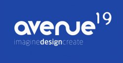
I like! I would probably pull the 1 and 9 a little closer but it's a rather cool looking wordmark.
I read it as "averue" first instead of "avenue". I agree that the 1 and 9 should be closer together. It also looks like the 9 is a bit taller than the 1.
As said, the 1 and 9 are too far apart, the 1 needs to be longer at the bottom, and a little longer in the top.
Why does the 19 text have soft blurred looking edges?
The stem on the a and the v could have a more similar angle.
The e's annoy me for some reason.
i find imagine and create a little too light, they wouldn't do well in smaller sizes. Maybe move all three words in underneath the a a little more, to balance out the optical illusion the sound shape of the a makes.
Otherwise, good looking logo - what is the idea?")
Why does the 19 text have soft blurred looking edges?
The stem on the a and the v could have a more similar angle.
The e's annoy me for some reason.
i find imagine and create a little too light, they wouldn't do well in smaller sizes. Maybe move all three words in underneath the a a little more, to balance out the optical illusion the sound shape of the a makes.
Otherwise, good looking logo - what is the idea?
The e's annoy me for some reason.
They don't look like they're the same font as the other letters, IMO
Overall... I have no problem with it.
Quibbles...
• I'd play with the width of the 'nu' it feels a little out of proportion
• The space between the 'av' should be the same width all the way.
• Not crazy about the typeface or kerning of the number 19. I'd look at tightening it up and moving it slightly away from avenue.
• I'd look at unbolding 'design'. I think it pops too much.
Otherwise... cool design.
BTW... critiqued it without looking at other opinions. Curious to see what others have to say.
My only small feedback would be that the "V" or the "NU" should be either straight or round, not both. That's the first thing that sticks out to me is that the v is straight and the nu is round.
The letterforms of the 1 and 9 are not working. The shapes that make up the forms are similar but don't match what you have going on with avenue. It starts to read as two separate marks. I suggest you look at a different type face for the 19. Perhaps something that shares some of the shapes of avenue (maybe Avenir?). Look at the counters on avenue and notice that they are round, whereas the counter on the 9 is more oblong. Plus the outline shape of the 19 is rather jagged and it says something entirely different than the stylistic shapes you have going on with avenue. How important is the 19? Perhaps make it smaller and use a sans-serif face that mimics the shapes within avenue to help unify it?
If you are intentionally trying to make the 19 different from avenue, then you just haven't pushed it far enough. You can make something drastically different but still give it the feeling it belongs to the same family.
And I agree with what another poster said about the e's on avenue. They need something. I think the it might be that you chopped the bottom arm of the e's too much. Make sure that the right angle of the arm's of the e's match the angle of the v and right side angle of the a (wow, that's a strange sentence!).
Thanks for all the feedback people! Its really good to get an opinion from fresh eyes. Im going to take everything thats been said on board and re-post with some changes.
To answer the question about the origins of the logo or name, it is for a design site im starting up. Im calling it avenue19 as its the street and house number I was brought up in as a child and I just thought it had a nice feel to it.
thanks again guys
To answer the question about the origins of the logo or name, it is for a design site im starting up. Im calling it avenue19 as its the street and house number I was brought up in as a child and I just thought it had a nice feel to it.
thanks again guys
This is just my opinion, but I feel like the imagedesigncreate text conflicts with the "19". Your eye wants to focus on the "19" in the upper right hand, but it also wants to look at the bottom left-justified subtext.
Seeing as Avenue is the main text, and the 19 is probably the 2nd most important thing, I would actually center align the "imagedesigncreate". And make the 19 a little smaller and tighter.
Just my 2cents, good work though. see attached-
Seeing as Avenue is the main text, and the 19 is probably the 2nd most important thing, I would actually center align the "imagedesigncreate". And make the 19 a little smaller and tighter.
Just my 2cents, good work though. see attached-
Attachments
Also an opinion; if you are starting a "design" site, why are you asking us for help when you're the designer? Are you going to commission work? Are you going to ask us again when you get a design job for a client? Do you have a portfolio? Any formal training? If you are doing this for experience, that's great but from what I can see you have a lot to learn before you start a design business. I'm going to school for graphic design, and wouldn't even feel comfortable now starting a business or site.
Bottom Line: if you can't design the logo for your own design site by yourself, you shouldn't be starting one.
Now of course you can do whatever you want and no one is forcing you to stop, but I think you've jumped ahead too far.
It's a good start and very ambitious though. Sorry if I sounded harsh
Bottom Line: if you can't design the logo for your own design site by yourself, you shouldn't be starting one.
Now of course you can do whatever you want and no one is forcing you to stop, but I think you've jumped ahead too far.
It's a good start and very ambitious though. Sorry if I sounded harsh
To Andrew K
I am a fully "qualified" designer Andrew, in that I have a qualification in Graphic Design, but I am of the opinion that as a designer you never stop learning. I never asked for "help" as you say. All I asked for was a critique, you'll probably understand as a designer yourself that sometimes you can mess with something a little too much and I was beginning to think I was approaching that point.
Why do you think I have a lot to learn, you don't actually know anything about me other than what I have told you. From the one logo I have posted I dont think its a fair conclusion to jump to.
Andrew W,
Critique is absolutely vital to any successful design. It's important to always seek the opinions of peers in order to make sure you are attacking the problem with the correct perspective.
I do not know whether the OP is an experienced designer either (I've never met him before), but to insinuate that by merely posting this thread he has somehow proven himself unqualified is a bit pretentious in its own right.
Like I said sorry if I sounded harsh. I'm glad you have training, it just seemed odd to me that some small points in the logo that were missed. Here's a critique then:
1. The slant on the right side of the "a" next to the "v" looks awkward and is not inline with the slant of the "v".
2. The "e"s end tale suddenly stops and kills the flow of typeface.
3. I do like the combined "un" idea but where they meet looks a little rough, I can see a sharp edge where it connects.
4. the "19" I like. It feels more organic than the main title. Why don't you try a subtle blur around it?
5. like the previous poster said, your slogan should be more centered under avenue, maybe even the same length.
Is there any other work you have that I could see, I love seeing other design work. Have you been to abduzeedo.com? They have some great stuff over there for graphic design.
Andrew W,
Critique is absolutely vital to any successful design. It's important to always seek the opinions of peers in order to make sure you are attacking the problem with the correct perspective.
I do not know whether the OP is an experienced designer either (I've never met him before), but to insinuate that by merely posting this thread he has somehow proven himself unqualified is a bit pretentious in its own right.
Sorry, I've just seen way too many people claim to be designers, or just give it shot and expect other forum members to do their work for them and then get paid for it. It's not about pretension.
It's true, this place does attract a lot of scavengers and parasites. The trick as a responder is to help in such a way that is beneficial but doesn't actually do any work for them, whether that work be physical or mental.
I certainly understand where you're coming from, and I respect that opinion. Also, I apologize for calling you Andrew W. I must have Andrew WK on the brain.
I certainly understand where you're coming from, and I respect that opinion. Also, I apologize for calling you Andrew W. I must have Andrew WK on the brain.
It's true, this place does attract a lot of scavengers and parasites. The trick as a responder is to help in such a way that is beneficial but doesn't actually do any work for them, whether that work be physical or mental.
I certainly understand where you're coming from, and I respect that opinion. Also, I apologize for calling you Andrew W. I must have Andrew WK on the brain.
Haha no problem!
Sorry, I've just seen way too many people claim to be designers, or just give it shot and expect other forum members to do their work for them and then get paid for it. It's not about pretension.
I must say I agree with you. But, this thread has been refreshing compared to most "help me design" threads on MacRumors. At least the OP had a solid concept before asking for crit. Most other threads throw up the first crap they think of and then whine for people to help them fix their problem. And lately it seems to be getting worse! I noticed a new thread pop-up where someone came straight out and asked for someone to create them a logo. No mention of compensation or what their intentions are; it appears they are posting to see if they can get someone to do the work for free. What bothers me the most is that some idiot, er... person will probably do it.
I can see both sides of the coin, but at any decent design firm you will always have designers bouncing creative concepts off each other, in fact it is encouraged.
With this being a "design" forum, I don't see the problem with people posting projects or ideas to ask for critiques from other qualified designers. Sure there will be the kids with no formal training in design and others who are looking for a handout but I don't see either in this thread myself personally. Just my opinion.
As for the logo, I like the concept and any revisions I would have suggested have already been stated in the posts above.
Logo feedback
Hi, looking good! it just needs some fine tuning.
First of all try to work in positive, sometimes when you work in negative over a dark color filling up the negative space things look good and then when you need the logo in positive some big gaps appear.
I agree with some of the comments of the 19 but I'd suggest you to use the same font as the imagine design create line. Or the same as on Avenue so you only have 2 fonts that should be enough to make the logo cleaner and easy to recognize.
The nu needs some study, maybe adding some serif or easing the curve, again look at this as apositive, it might look good as is. You can also condense this element since is more a graphin than a font now...
A final comment, both fonts (avenue and imagine...) are too rounded and similar, why don't you try a more square font or a serif one for the imagine line so it could have some contrast (this contrasty font could be used for the 19 as well). And check your fnt weight imagine and create are very thin and cold create problems for printing.
Wait, what about some color to stand out the Design part instead of just making it bolder...
Good luck and keep woking on it until you find a good solution...
Z
In order to critique a design we need to see what the brief is. If it is a logo that will be part of a brand, then we need to understand what the brief is for that brand. Otherwise it's very difficult to properly assess the design...
For example, if in your brand characteristics you are aiming for something that is "edgy", "random", "unexpected" then it might be appropriate to mix a few different typefaces that clash. But if you are looking for something that is "simple", "elegant" then it would not be appropriate.
I suspect quite a bit of this is going on unconsciously anyway, since you are designing for your own business. But it might be worth making it explicit. So my advice would be to start thinking consciously about your brand - the 'visual personality' of your company - before tackling the logo.
Register on MacRumors! This sidebar will go away, and you'll see fewer ads.