Got a tip for us?
Let us know
Become a MacRumors Supporter for $50/year with no ads, ability to filter front page stories, and private forums.
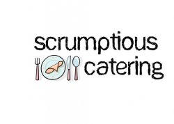
Logo for catering company
- Thread starter Jhanson09
- Start date
- Sort by reaction score
You are using an out of date browser. It may not display this or other websites correctly.
You should upgrade or use an alternative browser.
You should upgrade or use an alternative browser.
What sort of 'level' are you so we know how to provide constructive crit?
Looking for a design professional, design student, design hobbyist, design newbie kinda distinction...")
/Doug
Looking for a design professional, design student, design hobbyist, design newbie kinda distinction...
/Doug
Font Choice
While I'm not a designer, the choice in font doesn't match catering. The font looks "dirty", something that I wouldn't want to associate with a catering company.
While I'm not a designer, the choice in font doesn't match catering. The font looks "dirty", something that I wouldn't want to associate with a catering company.
I am not a designer either so I cannot offer you a critique with a professional perspective. But as a consumer / potential customer this logo does not inspire me to want to employ this company. If I were looking to hire catering company I would be looking for Cleanliness, quality and professionalism and I am afraid that is not the message i'm getting from this logo.
What sort of 'level' are you so we know how to provide constructive crit?
Looking for a design professional, design student, design hobbyist, design newbie kinda distinction...
/Doug
I'm in college but not for graphic design. I took a few entry level graphic design classes in high school. So maybe design hobbyist.
I am not a designer either so I cannot offer you a critique with a professional perspective. But as a consumer / potential customer this logo does not inspire me to want to employ this company. If I were looking to hire catering company I would be looking for Cleanliness, quality and professionalism and I am afraid that is not the message i'm getting from this logo.
thanks for the tip. So maybe a cleaner font with defined lines might give it a "cleaner" look?
Spend a few hours (yes, hours) on some font sites. Many have the ability to show you your text in the font before you download:
http://youfont.com/
http://www.1001freefonts.com/
http://www.abstractfonts.com/
Try at least 10 before you decide what KIND of font you think works best. Then, based on that...choose 10 more in that style and find what works.
Youd be surprised how much a font does for a design, both good and bad.
And NEVER pay for a font...if you do...you're doing it wrong (this is not advice a pro would take, but who cares)
Spend a few hours (yes, hours) on some font sites. Many have the ability to show you your text in the font before you download:
http://youfont.com/
http://www.1001freefonts.com/
http://www.abstractfonts.com/
Try at least 10 before you decide what KIND of font you think works best. Then, based on that...choose 10 more in that style and find what works.
Youd be surprised how much a font does for a design, both good and bad.
And NEVER pay for a font...if you do...you're doing it wrong (this is not advice a pro would take, but who cares)
Thanks for the advice. I will play around with it and see if i can find a better one.
Ah no, not a hobbyist (kidding)
As said already, the message you're giving out is a little confused. I'm feeling 'kids story book' rather than 'quality service with quality food'. Your choice of typeface is the main reason, but the clip-art style imagery re-enforces it well.
You need to talk to your friend and work out what key points (unique selling point(s) / usp) you want to get across to the potential clientele.
Then, as suggested above, research many different type styles and faces until you find one you feel fits with the usp and projects the image you want.
keep in mind, good logo looks good and still conveys it's message when small, large, in colour, monotone etc etc. Many suggest you develop it in black and white and think about colour application later on.
Hope that helps a little...
/Doug
(kidding)As said already, the message you're giving out is a little confused. I'm feeling 'kids story book' rather than 'quality service with quality food'. Your choice of typeface is the main reason, but the clip-art style imagery re-enforces it well.
You need to talk to your friend and work out what key points (unique selling point(s) / usp) you want to get across to the potential clientele.
Then, as suggested above, research many different type styles and faces until you find one you feel fits with the usp and projects the image you want.
keep in mind, good logo looks good and still conveys it's message when small, large, in colour, monotone etc etc. Many suggest you develop it in black and white and think about colour application later on.
Hope that helps a little...
/Doug
jAh no, not a hobbyist
As said already, the message you're giving out is a little confused. I'm feeling 'kids story book' rather than 'quality service with quality food'. Your choice of typeface is the main reason, but the clip-art style imagery re-enforces it well.
You need to talk to your friend and work out what key points (unique selling point(s) / usp) you want to get across to the potential clientele.
Then, as suggested above, research many different type styles and faces until you find one you feel fits with the usp and projects the image you want.
keep in mind, good logo looks good and still conveys it's message when small, large, in colour, monotone etc etc. Many suggest you develop it in black and white and think about colour application later on.
Hope that helps a little...
/Doug
haha yes hobbyist. No where close to patient enough to make it into a career. I am actually a business finance major at the University of Missouri.
Yes it definitely does. I appreciate you're help very much!
I'm feeling 'kids story book' rather than 'quality service with quality food'.
/Doug
My first impression as well. I think that the picture could benefit from being less clip-arty.
Sorry the font is just too Papyrus for my liking.... I understand what you're trying to do her but you need to use a nice Humanist styled font like Vegur or Optima. Even Futura LT or Helvetica would be a nice clean font to start with.
The overall composition look staggered, to me where the icon is placed breaks the meaning an readability (although I think the icon is pretty good, it's just not placed right).
For icon ideas I would check out these:
Smashing Mag
Logopond
Logolounge
Good luck !
The overall composition look staggered, to me where the icon is placed breaks the meaning an readability (although I think the icon is pretty good, it's just not placed right).
For icon ideas I would check out these:
Smashing Mag
Logopond
Logolounge
Good luck !
I created this logo for a friend of mine's new catering company just curious on what everyone thought or any suggestions.
If you replaced the text with "Dish Washers" then the font and logo would kinda work.
What sort of 'level' are you so we know how to provide constructive crit?
If you have to ask...?
(Actually, it's kind of you.)
First thought which came into my head was 'kids story book'. Probably not what your trying to achive from the design.
I'd say smarten up the text face and work from there.
I'd say smarten up the text face and work from there.
Friends don't let friends design logos. Seriously, with due respect to your attempt - do your friend a favor and tell him to hire a designer. A logo for a business is like naming your child; it will stay with them a long time. Already people are saying that your "logo" is dirty due to the type. Well, that is true, but there are a lot of other things wrong too.
You might think you are saving your friend a few bucks by helping him out, but in the long run, you might cause him to lose money or not be successful. Yeah, for a startup business... identity is that important. Especially one that is trying to impress the public to purchase a service.
You might think you are saving your friend a few bucks by helping him out, but in the long run, you might cause him to lose money or not be successful. Yeah, for a startup business... identity is that important. Especially one that is trying to impress the public to purchase a service.
Unless perhaps you're catering to schools and summer camps?
I've definitely seen worse, though, just look around Google Images and you'll see what I mean.
One thing to look at is the competition in your area, style, and price range. Look at what their logos and advertising materials look like. I'm not saying to copy them, but get a feel for who you're up against. If their materials are all super nice and clean, then yours must be too in order to be seen as an "equal".
While I'm not a designer, the choice in font doesn't match catering. The font looks "dirty", something that I wouldn't want to associate with a catering company.
Same here friend. I didn't like it. It doesnt look like professional logo.
Register on MacRumors! This sidebar will go away, and you'll see fewer ads.