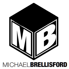
I'm creating a logo for my own personal Branding (mostly for use in my physical portfolio).
The whole concept behind it is a building block. Something that is easily identifiable and easy to relate to by many people. I believe that a good project always starts with a solid foundation and careful planning, and I think that a building block is a perfect (and simple) example of what I'm trying to convey.
The logo is currently in Black & White because I believe a logo needs to first look good in black and white (to ensure its simplicity and recognition).
Tell me what you think!
Many Thanks!
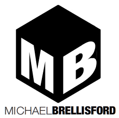


")
