Become a MacRumors Supporter for $50/year with no ads, ability to filter front page stories, and private forums.

LeviG

macrumors 65816
Original poster
Nov 6, 2006
1,277
3
Norfolk, UK
Okay this is driving me mad. I've got this idea for a rebrand of my company but I've got this feeling that theres either one very similar or the same as it. Might not be the same letters and I can't find anything on google that I think it could be but that feeling is still there, maybe it's in my head because the design's been floating around for a while.

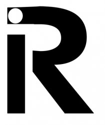
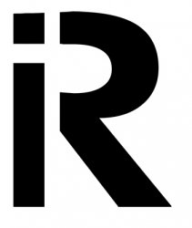
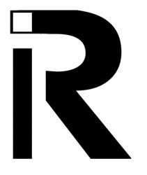
I've done a quick knock up (so its not finished :)) to show the basis of the idea (letters are i and r).

So I call on the knowledge of the d&g section to save my sanity :eek:

thanks in advance :D
 

Attachments

  • ir.jpg
    ir.jpg
    38.8 KB · Views: 114
Who knows if it has been done before? You can check with a copyright lawyer who will research the design. But I see some potential with your idea. Some comments on the design, however:
1. The top bowl stroke of the "r" looks a little narrowed.
2. The dot on the "i" should have it's circle extend to the edge of the r's top to enhance the positive-negative space you are trying to achieve with the reverse dot.
 
ok no offence here but did you (alic57) even read my post properly before commenting?

I said that it was a "quick knockup (so its not finished) to show the idea", you know a picture describes the idea better than a sentence and while I've got this feeling (which I suspect is probably right) there's no way I'm going to spend time designing it properly (note I do this for a living).
Blimey all I did was pick a font with a decent enough R and then chop a bit here and there to make the white bits :rolleyes:
 
this is the thing it just seems like such an obvious approach and the fact it might have been done with ANY letter not just an r is what's throwing me.

It's late here so will see what else comes up while I sleep and if nothing obvious comes up will have a play tomorrow if I get some spare time :)
 
TinEye says no

Acording to TinEye there are no other images like it in their database. I am not saying that means it hasn't been done, just that TinEye hasn't seen it before.

One a side note I like the design and would love to see a complete version if you decide to go with it.
 
it's "mock up" not "knock up"

dur

it can be both (regional thing atleast in the UK), ie I'll just knock one up real quick or I'll mock one up real quick.

Will probably have a go at it over the weekend (yes I'll do some posts when its done) as it doesn't seem to be out there, I still swear I've seen it before, maybe it's the stuck on a design for too long syndrome kicking in :D

bbeers - tineye is pretty handy, thanks for that as I hadn't come across it, sticks in bookmarks :)
 
Acording to TinEye there are no other images like it in their database. I am not saying that means it hasn't been done, just that TinEye hasn't seen it before.

TinEye is rather lame. I uploaded an logo that was trademarked and copyrighted in 2001. It has been on the web in many forms since then but returned no results. Perhaps TinEye will evolve to a useful resource but I would not assume a green light just because it says there are no matches.

BTW, the design is not very original. I wouldn't be surprised if variations are in use. Simple monograms are often the first sketched ideas. Experienced trademark designers generally go deeper into iconic representations of company purpose or goals.
 
As already mentioned there are attorneys that specialize in trademark research. They can determine status of similar designs and advise whether potential legal action can result. Just googling "ri logo" and "ir logo" returned the following designs. That's not even beginning to search "ip" or "id" or other similar letterforms.

http://www.ricassolink.com/images/ri_logo.jpg
http://farm4.static.flickr.com/3132/2869229520_8e566a76da_m.jpg
http://www.immersionresearch.com/products/tshirts_hats/logo-shirt/
http://phare.osf.sk/home.html

Full disclosure: I am a professional trademark designer.
 

Attachments

  • ri+ir_logos.jpg
    ri+ir_logos.jpg
    13.8 KB · Views: 783
Tried these two things, I messed up the one on the right, the R is meant to be
the same same just a mock-up

R
 

Attachments

  • ir.jpg
    ir.jpg
    44.1 KB · Views: 109
  • ir2.jpg
    ir2.jpg
    43.8 KB · Views: 89
Most of the other ones with a similar concept at least try to convey what the company does in some way. I think if it doesn't it's not that strong of a direction.
 
I'd only say that this is permissible if the following is all true:

- your company does some sort of business that is absolutely indescribable through illustration, icon, pictogram, or visual suggestive communication (hard to believe)
- the nature of your business is very visually boring (say, you make countertops or clean carpets or fix computers), so even if you could illustrate it it would be quite hackneyed and overdone or it would not translate well (and even those examples could be made into some really creative and smile-worthy logos if illustrated in iconic fashion)
- no one in your industry uses a vignette-based typography logo so it is totally original (this will be the toughest one as these are dime-a-dozen just about anywhere and any industry, ESPECIALLY if your business is a graphic/print/web design company like I'm guessing)
 
perhaps you were thinking of the old JD sports logo:

%5Cjd%20sports%20logo.gif


i certainly did when i first saw it for some reason
 
Everything has been done.

as one of my graphic designer teacher says "everything has been done"... the point is to refresh the idea every time you can, so back to your design, I like it and I thought I'd never seen it before, but after going through the replies, it seems like it has been done a lot. Maybe do something different or outside the box:rolleyes:
 
Register on MacRumors! This sidebar will go away, and you'll see fewer ads.