My father is starting up his own electrical business and I started to play around with some logo ideas. So far I came up with this one. I don't do any graphic design by any means so be openly critical. Any other creative ideas that I can do or play around with will be much appreciated. Thanks!
Got a tip for us?
Let us know
Become a MacRumors Supporter for $50/year with no ads, ability to filter front page stories, and private forums.
Logo Opinions
- Thread starter damesJ
- Start date
- Sort by reaction score
You are using an out of date browser. It may not display this or other websites correctly.
You should upgrade or use an alternative browser.
You should upgrade or use an alternative browser.
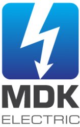
first thing - move away from the electric shock symbol, not exactly a good image for an electric business is it 
first thing - move away from the electric shock symbol, not exactly a good image for an electric business is it
I'm not so sure... at first I thought the same thing, but on the flip side, it does say 'electricity' in no uncertain terms, and reinforces the fact that electricity isn't something to *%$# with without professional help.
Just a thought.
ok another perspective (as you think it makes sense) - if electric shock is the clearest form of identification how many other companies are going to be using it (or a plug for that matter) in their own logos
< rant >
How many times have I heard, 'I'm not a designer but here's the one logo concept I came up with"? Perhaps I'll retire from the salaried logo design business and enter the free logo critique business. There is much more of a demand.
< /rant >
At any rate, do more research. I'm quite certain your father has more than extension cords and bolts of electricity in his company truck. There's all sorts of wires and conduit and tools that can form the basis for interesting visuals.
I think the icon is actually very good but I'm not crazy about the "MDK Electric" part, especially the color.
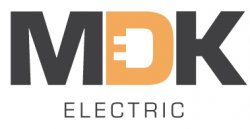
Ok well I decided to take a new direction and use something else besides the bolt. Do you guys think this one is any better than the previous logo?
Edit: For some reason the quality and colors came out kinda bad... but you get the idea.
much better. i like. now work on the 'electric'. that's just hanging down there like a lost baby.
Quite a bit better. As mentioned earlier, do something to bring the word "electric" into a better balance with the rest of the logo. Don't stretch it out, add an element on either side to fill the space. Maybe move the word to the left and add a simple graphic in the right.
And yes, you have talent.
And yes, you have talent.
Thanks for all the input and compliments. I really appreciate it.
As for the electric on the bottom, I'm not to sure what I want to do with that. I agree that it seems "lost" but I really don't want it to take attention away from the MDK. Its late now but I will play around with it tomorrow lol.
As for the electric on the bottom, I'm not to sure what I want to do with that. I agree that it seems "lost" but I really don't want it to take attention away from the MDK. Its late now but I will play around with it tomorrow lol.
I think both concepts have potential. I think the MDK in the second one needs to stand out a little more. I know you said that the color didn't didn't display quite right. You also do need to do something with the electric like others have said.
Overall, you are on track with either one. A little tweaking and you will have something that should represent your dad's company well.
Overall, you are on track with either one. A little tweaking and you will have something that should represent your dad's company well.
I like the plug in D. It makes me smile.
I didn't even notice it looked like a plug until you pointed it out haha, I thought it was just supposed to be an "E" for electric.
I like it.
The "D" as a plug is cute. I like it. The "Electric" sittin down there all alone is kinda sad. I would incorporate the word electric with the MDK in some way but keep the lettering simple block. Add a company slogan below the MDK.
~Local Electric Guru~ ... or somethin'.
The best way to come up with a good slogan is to sit around an outdoor campfire and get silly... then get serious the next morning and make sure it's only 2 to 4 words long. You'll find a catchy keeper that people won't forget after they see/hear it the first time.
Ok well I decided to take a new direction and use something else besides the bolt. Do you guys think this one is any better than the previous logo?
Edit: For some reason the quality and colors came out kinda bad... but you get the idea.
The "D" as a plug is cute. I like it. The "Electric" sittin down there all alone is kinda sad. I would incorporate the word electric with the MDK in some way but keep the lettering simple block. Add a company slogan below the MDK.
~Local Electric Guru~ ... or somethin'.
The best way to come up with a good slogan is to sit around an outdoor campfire and get silly... then get serious the next morning and make sure it's only 2 to 4 words long. You'll find a catchy keeper that people won't forget after they see/hear it the first time.
Ok well I decided to take a new direction and use something else besides the bolt. Do you guys think this one is any better than the previous logo?
This direction has more potential. There have been several comments on the tiny "E" within the plug. Perhaps it draws too much attention to one letter. Another thing that makes the entire concept appealing is the subliminal association of positive and negative energy implied by use of positive and negative spaces. I suggest taking it bit further. Why not actually plug the right half of the logo into the left? Also modify or come up with a font that looks like conduit or electrical cord.
It takes a great deal of humility to subject yourself to open criticism. Good work so far. Before getting married to any concept, do a bit of research to see how really unique it is (or isn't).
Attachments
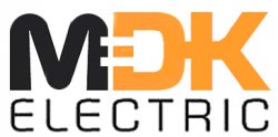
This direction has more potential. There have been several comments on the tiny "E" within the plug. Perhaps it draws too much attention to one letter. Another thing that makes the entire concept appealing is the subliminal association of positive and negative energy implied by use of positive and negative spaces. I suggest taking it bit further. Why not actually plug the right half of the logo into the left? Also modify or come up with a font that looks like conduit or electrical cord.
It takes a great deal of humility to subject yourself to open criticism. Good work so far. Before getting married to any concept, do a bit of research to see how really unique it is (or isn't).
It's coming along, but I don't really like how skinny and "weak" the word electric looks. It is definitely improving by leaps and bounds though!
Ok well I decided to take a new direction and use something else besides the bolt. Do you guys think this one is any better than the previous logo?
Edit: For some reason the quality and colors came out kinda bad... but you get the idea.
I love the "plug inside the D" concept; it's recognizable, and not as cliche as the lightning bolt concept.
I also think you virtually nailed the colors and fonts.

Register on MacRumors! This sidebar will go away, and you'll see fewer ads.