Become a MacRumors Supporter for $50/year with no ads, ability to filter front page stories, and private forums.
I like your site quite a lot. Very modern-looking and and easy to read.

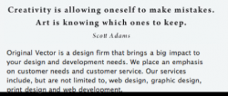
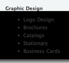
One problem I've noticed is that the background image is cut off before the text ends. This is likely caused by the image being set to 100% height. In the event scroll-bars need to be activated, the browser doesn't display the background beneath the initial space. I've attached screenshots for you.

Again, good work, and nice job on the blog too.
 

Attachments

  • Picture 9.png
    Picture 9.png
    66.2 KB · Views: 79
  • Picture 10.png
    Picture 10.png
    14.6 KB · Views: 242
Thank you for the kind words Fleetwood Mac!

Thanks for the screenshots, I will see if I can fix that. May I ask if you were using Firefox, Safari and what OS? would help me alot! thx!
 
Thank you for the kind words Fleetwood Mac!

Thanks for the screenshots, I will see if I can fix that. May I ask if you were using Firefox, Safari and what OS? would help me alot! thx!
I'm using Safari 2, but this problem will show its self on any browser. Simply decrease the size of the window to the point where there are vertical scroll-bars. Now move the page down, and you'll see where the background is cut off.

I usually avoid this problem by creating a container div that sets the width of the page, contains the content, and displays the background image/colour. I'm sure there are other (possibly better) ways around it, but I found this to be the most hassle free.

Thanks a million! I always have a heck of a time with setting 100%, that helps alot.
 
Two small remarks:
I somehow have a feeling that logo would be better without the tree, just plain and simple L. Another remark is mismatch between menu fonts and the logo.

But anyway, site is very artistic, pleasant and easy on the eyes. Nice work.
 
I'm using Safari 2, but this problem will show its self on any browser. Simply decrease the size of the window to the point where there are vertical scroll-bars. Now move the page down, and you'll see where the background is cut off.

I usually avoid this problem by creating a container div that sets the width of the page, contains the content, and displays the background image/colour. I'm sure there are other (possibly better) ways around it, but I found this to be the most hassle free.


Hi Fleetwood Mac,

I am starting to pull my hair out trying to fix this. Maybe you could take a look at my css?

http://originalvector.com/includes/css/master.css

I have the html, body set to 100% and the global and mainbody container set to 100% but the problem still persists.
 
Got it fixed, ended up using this:

height: auto !important;
height: 100%;
min-height: 850px;
 
I think your site looks great! The only small thing which bothers me a bit is the blog - though it comes somewhat close, it doesn't match the rest of your site. If it fit into the same template as the rest of your site, I think it would be a lot better.

In addition (this is really a miniscule thing, though), the popups on the "work" page could be a little more... I'm not sure what the word is, perhaps, "classy" looking? Something more like LightBox, which has no lines or boxes. Right now, it just doesn't look as elegant as the rest of your site.

But still, I think your site looks wonderful! I'm a bit jealous, as a matter of fact... :D

Thanks for the kind words! I completley agree about the work page, I know it needs a bit more work. Im still deciding how I want to fill it. it seems like some people use images and some people use a combination like i have. Hopefully Ill have that part of the site polished up in the next few days. I agree about the blog too, I am new to wordpress so I am still learning on how to customize it hehe
 
small grammer error

I like your site too, very clean and easy to navigate. However on your rationale of Imagepad you're confusing "there" with "their"

"Users will be able to mark there images private and... "

Since you're talking about user property the sentance should be:

"Users will be able to mark their images private and..."

A minor error, but it's a pet peeve of mine. Too often I see this mix-up and it drives me up the wall.:)

I would also get a third person to read over the rationales/site content

for instance for the Lectos rationale:

Lectos is a upcoming website devoted for people that enjoy reading. Key features will include tracking and sharing books that users read. Expected release is by the end of 2007.

In my opinion sounds a bit better like this:

Lectos is an upcoming website devoted to people who enjoy reading. Key features will include tracking and sharing books that users have read. Expected release is by the end of 2007.

Sorry for the nit-picking but these little details will go a long way to help enhance your professional image as a communicator.

This is why I need to stick in photoshop and not try and write anything =P

Thanks! I will get those fixed tonight =)
 
Nice site!

I really love the look and ease of your site, but I think adding an About page would be helpful as well as a pricing page for your services. What software did you use to create your site?
 
I really love the look and ease of your site, but I think adding an About page would be helpful as well as a pricing page for your services. What software did you use to create your site?

Hi there, I agree about an about us page, I need to get on that! I dont used fixed pricing or contracts so thats why I left out the rates page.

I use a TextEditor for all the programming called TextMate. For graphics I used adobe illustrator and photoshop.

thanks!
 
Register on MacRumors! This sidebar will go away, and you'll see fewer ads.