I originally intended on publishing this review to a blog I normally write for, but someone there already bought and published one page review of the M1. So, my 'thorough' review ended up in limbo. I decided to share it with the community. My thoughts are based on initial experiences, but certainly remain true almost 12 months later. With the second generation of Apple Silicon based MacBooks almost here, I thought it would be great share my experiences with the product.
MacBook Pro M1 Review
The year 2020 introduced many challenges, but for Apple Inc. the Cupertino, CA based behemoth continued its relentless progress on product releases. The pandemic even delayed the release of some of its most iconic products such as the iPhone but that didn’t stop it from launching three major products over throughout the year from its Apple Park campus. Over the summer, Apple announced a major transition at its developer’s conference promising to move its Macintosh platform from Intel processors, which have powered its computers since 2006. Company executives promised to release souped up versions of its iPhone and iPad SoC’s for Macs. In November 2020, Apple launched its first series of Macs with this new processor called the M1, a transition it expects to complete by 2022 across its Mac product line. It is the first of which, I’ve had the pleasure of writing this review on.
What makes the M1 Mac different?
It’s a technical question that requires deep analysis to fully explain what the benefits are. But just for a quick synopsis, what Apple has done is bring the same sophisticated approach to SoC (system on a chip) development to its Macintosh line of computers. Using a design called Unified Memory Architecture, M1 frees up a lot of resources that would normally require copying data between the memory and processor. Instead, all resources: graphics, processor pull from same pool of memory removing a common bottleneck of x86 CPU’s. The M1 uses an 8-core configuration, with four of those cores used for light task like word processing or web browsing. If you are going to be doing more intense task like video editing, the high-performance cores will kick in. I got to see this firsthand while editing a video in iMovie. Apple did this by bringing those disparate components together to form one single chip. But what further differentiates the M1 is Apple’s building a unique solution optimized just for their platform: operating system (macOS), applications and services.
The company’s cache of building excellent mobile processors provides a lot of opportunity to show off what they can do in a space they have depended on others for (Motorola, IBM, Intel). Apple after all has been developing their own processors since 2010 with the A4, which launched with the first iPad. ARM intellectual property has of course been a foundation for building much of Apples own unique optimizations, but what differentiates it over others is really the optimizations and integrations they have been able to introduce year after year since the A4. Every year, the A series outperforms the industry and even the latest Android devices are still trying to catch up with 4-year-old designs from Apple. Now, applying this same level of optimization to the desktop is certainly a new challenge Apple believes it can offer something unique. With Intel’s continued refinement of processor technology for years (14 NM, 10 NM) while Apple jumps to smaller geometries at a breakneck pace with each generation (11, 7, and now 5 NM); the company has certainly elected to move to where the puck is going to be on its own turf.
I’m going to be honest, I was not really in the market for a new computer, although, with my aging conventional desktop and laptops, I make an ideal candidate. Also, my thoughts were swaying between, we are in a pandemic, save your money, this is a first gen product, what you have already works just fine. The biggest one being the M1 chip powering it all is radically different from its x86 CISC based Intel architecture. In fact, my original upgrade plan was going to happen in 2023. The intention was to switch to a larger screen Mac, either an iMac or a 16-inch MacBook Pro this time around; you can never go wrong with a larger screen.
But I just could not wait any longer and maybe it was the rabbit hole of YouTube reviews, benchmarks and the constant tweets from early adopters praising Apples first homegrown processor for the Mac. For the average user, there hasn’t been any showstoppers I can point out that would make me feel regretful about purchasing this Mac. Unlike other Apple operating system transitions over the past three decades: application compatibility, support, availability; all the pieces are there, mostly, on day one. There is another stark reality too, that 2020 is not 2005 or 2000. We live in a world where most of our productivity takes place in a web browser or web-based apps that are based on technologies like Electron, which I won’t even go into explaining, but if you use something like Slack, Microsoft Teams, you already know what I am talking about.
But there is another constant companion that has also made transitions like these even easier, the smartphone. It’s the preferred device I use for most activities that don’t require that I sit at a desk. I recently started working from home and after a full day sitting in front of a Windows 10 PC, I don’t even want to look at Windows. My iPad is the first thing I grab and load up YouTube.
Apple has created this change in behavior that has also translated to other devices and platforms like Android. When I look around my room these days, I only have two Windows devices, one from work and my trusty old Surface Pro 3. A decade ago, that would have been the opposite. The change in device usage is due to the maturity of the software and also an integrated ecosystem: iPad, iPhone, Watch and finally the Mac. The philosophy of me is, I want everything to work together. Unfortunately, Microsoft has not been able to capitalize on that. The numerous stumbles, starts and stops has made the Windows ecosystem unattractive.
What did I get this time?
One of the things I am not going to spend much time on in this review is speeds and feeds and I think Apple doesn’t really want too, either. If you open the About this Mac menu on an M1 Mac, you won’t find the actual speed. Computers today are just darn fast and unless you are a rocket scientist looking for something to take you to the moon, you won’t be disappointed with this system. My last Mac I bought was the early 2015 13-inch MacBook Pro and it has served me quite well over the years. On this occasion I swayed between should I go with the Pro again or downgrade to the lighter MacBook Air. The reviews were all pointing to the Air as the best choice because of its light and thin design, fan less chassis and the fact that the processor is the same M1 in the Pro. But I’m person who likes the nicer things in life, in reason of course.
The Pro offers some nicer, but minor improvements over its wedged sibling: 500 nit display, studio quality mics/speakers and the infamous touch bar. Yes, that same old Touch Bar, which I have only played with sparingly on my brothers 2017 MacBook Pro and at the Apple store a few times. This does fall in that geek list mentality, but I thought, if I am going buy this thing, let me get something that has some features and uniqueness. Besides, I’m likely to keep this for another 4 to 5 years before I upgrade again. So, I went with the Pro and opted for a larger SSD. I really think Apple should just make 512 GBs standard these days without charging you extra for the privilege. Coming from my 2015, I was barely hanging on with the 12 GBs of space remaining.
Why did I choose 512 GBs though with the changing landscape of media consumption: the cloud, streaming services, social media, web-based mail? Solid points, but I have not fully committed to these just yet. I still have a large local iTunes library that I am not going to subscribe to Apple Music for; I like keeping my photos on device and just have enough space without worrying about another nickel and dime to pay into the cloud, so, that was my only upgrade. As for RAM, the default 8 GBs is more than sufficient, especially with a fast SSD already built in, 16 GBs of RAM didn’t make sense particularly because my computing habits have changed over the past year. I am not providing product support anymore requiring that I have multiple VMs running, which probably is the most likely reason I would need that much. With Windows support for the M1 being up in the air (as of this writing, experimental support is currently available using Parallels and Windows 10 Insider Preview for ARM), and the type of average user I have become, 16 GBs would have been overkill.
The Unboxing
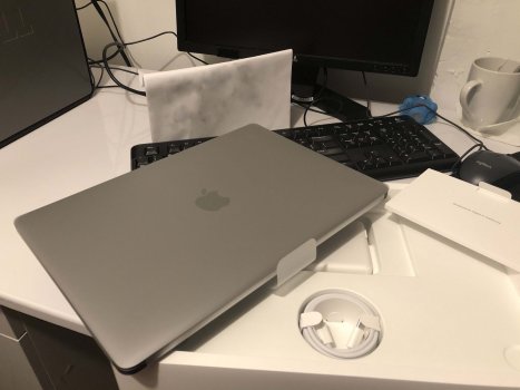
It’s always fun unboxing a new Apple product, but not much has changed since 2015. In fact, you are getting less in the box these days. I distinctly remember getting a lint free cloth with my previous Mac, but when you are a trillion-dollar company, it's too expensive to include things like that these days. Upon opening you are greeted by the MacBook itself, charging brick, which is now USB C, literature and space gray stickers.
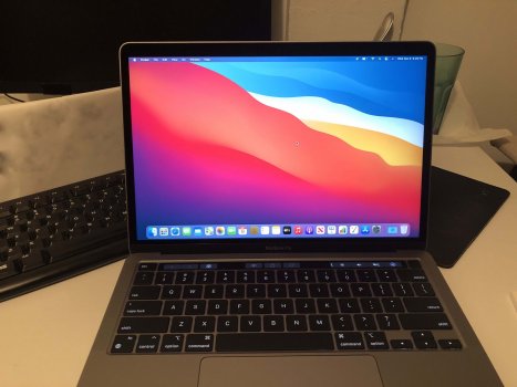
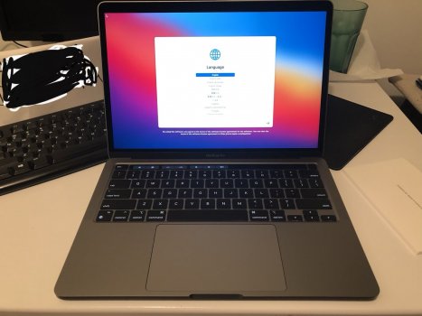
For this round, I went with space gray just as a different, more svelte choice. In comparison to the 2015 MBP, the M1 looks smaller and I believe that is in part due to the slimmer bezels. Personally, I think it could be slimmer too like those found on the Dell Latitude XPS. The MacBook Pro feels slightly lighter but has a solid, sturdy construction that feels premium and looks attractive. It’s a gorgeous piece of hardware engineering and you immediately fall in love the minute you pick it up. I do miss the backlit Apple logo, but it’s over and done, Apple has moved on and it’s not coming back. I hardly saw it anyway unless I was looking at myself in the mirror (who does that anyway?). Apple honestly doesn’t need stand out in the crowd symbols anymore for advertisement. As for the power brick, USB Cover MagSafe might take a little getting used to. It’s just not a perfect replacement, but the idea of being able to use the same port for data and charging is a nice trade off. The utility of MagSafe being a safe way to protect your expensive device from accidental trips was definitely smart. Maybe the fact that I will rarely need to charge my Mac will make up for it too. Speaking of ports, you only get two on this model. After all, this first gen rev is a drop-in replacement for the previous entry level Intel MacBook Pro with Touch Bar.
Also, there are rumors about the M1 chip not having the bandwidth to support more than two USB C ports. That is debatable, Apple might be squeezing the revenue stream psychologically out of this transition, perhaps thinking you will trade in or sell your M1 Mac for an M2 Mac with 4 more ports a year or two from now. It’s not a big deal, I’ve had a test run for 5 years with my Intel MacBook Pro, in the early days when I had to go to an Internet cafe, I would bring with me a Thunderbolt 2 Ethernet adapter. Outside of those unique circumstances, my port usage has declined and the last external hard disk I bought included an extra USB C cable, so doing my backups will be fine.
Ports like HDMI, memory card reader has been gathering dust and are rarely used these days. Don’t get me wrong, there are some users such as my sibling who’s a DJ on the side might need. An audio jack is still there, but it’s only a matter of time before Apple removes that too, hey they are now selling AirPod Max for 550 dollars that will go well with your M1. But the DAW setups popular among Mac users, it’s going to be a long while before that happens. The M1 does have some nice perks, like faster Wi-Fi 6 support. I see the benefits of it, since my Early 2015 with its 802.11 AC is notorious for dropping the connection every time the display goes to sleep. Using the M1 for nearly a week on battery, I’ve never experienced that. The USB C ports mentioned earlier are also USB version 4, the latest standard which supports transfer speeds of 10 GBs per sec. Thunderbolt 3 which is integrated provides up 40 GBs for supported devices. Didn’t I say I was going to avoid feeds and speeds? Right!
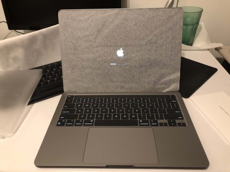
Setup was a breeze, upon opening the lid, I was greeted by the return of the base rich bong the company omitted on their 2016 to early 2020 Intel lineup. Its back, but if you appreciated not being the source of distraction, you can turn it off in the Settings. A noticeable out of box change when you open the lid for the first time, the Mac automatically starts. It’s a functionality Apple introduced in the 2016 lineup that’s still around. Obviously, it’s a logical behavior since that’s the first thing you are likely to do when you first unbox your Mac or opens it lid in a coffee shop. Setting up the Mac was fast and it’s amazing how much you get done through the process: Touch ID, connect to a network, iCloud account; you can even setup Apple Pay. It’s a reflection of how much Apple has been working its way into aligning the Mac with the rest of its family of devices. The experience was pretty much akin to an iPhone.
I definitely went with the iCloud sign in just to take away some of the chore of having to enter passwords, sync bookmarks and retrieve some files. After reaching the desktop, I was greeted by a familiar desktop; redesigned Dock ala iOS, but the classic global menu bar was there. Going back to the Dock a bit, here we see where younger sibling iOS has rubbed off tremendously on its older sibling, Big Sur. Icons now align with iOS using the same rounded square easel or whatever you call it. It’s OK I guess, not a big fan, personally, I think its kind of lazy.
From 10 to 11
For almost 20 years, Apple incremented each revision of its desktop operating system keeping the major version at 10 followed by a minor number, which signified a new revision. Big Sur puts this versioning to an end, jumping to 11. That does not mean you need an M1 to benefit from all that Big Sur has to offer, Intel Macs dating back to 2013 can also take advantage of the upgrade. Version 11 also puts an end to the point releases, as discovered in the first maintenance update for Big Sur labeled 11.1. This likely means next year’s version will likely be called version 12. Kind of strange if you ask me considering, Catalina was version 15 of macOS, which would technically make Big Sur version 17, since OS X Cheetah was version 10.0. Let’s not even get into how this makes iOS seem older than macOS now.
Many years ago, when I started following development on OS X, what I admired about the platform over Windows at the time was its iconography. It’s a design philosophy that Apple really pushed with the skeuomorphic (photo realistic icons), gel like buttons and soft shadows. Even companies like Adobe, Microsoft and many others embraced the philosophy on their respective platforms and applications. Microsoft even promised to bring similar realism to its platform with the heavy use of transparency in Windows Vista (aka Longhorn). If it’s not apparent by now, I do miss the old designs from back in the day and this feels like an opposition to Steve Jobs bicycle of the mind and space for creativity. There is just not much uniqueness and individuality anymore because of course, the thing in your pocket; everything around it has to look and work the same.
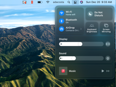
We see that more in other areas of Big Sur, a new Control Center that is a literal rip off from iOS. I kid you not, you can actually rip off buttons and add them to the global menu bar for quick access; I like that actually. This makes customizations such as switching between dark and light mode and Do not disturb easier. It’s not like they were out of reach in the first place either. Rumors suggest this could be an early hint at Touch support coming to the Mac. I will admit, there have been times I tried touching my Mac due to my heavy usage on iPad OS.
My brain does a good job of calibrating quickly though. Do I need touch on the Mac? Honestly, no, but it would be a nice bucket list feature to have, but the ergonomics of it always seem to make this seems pointless. This would also likely require more rejiggering of apps from developers and the smears I’m steering at right now on my iPad and Surface Pro doesn’t make it any more desirable. But it’s only a matter of time; especially as the collection of iPad apps for Mac grow. The notification center gets an overhaul, taking a page out of iOS 14 again with useful widgets you can install to get a glance at information such as weather, stocks, or world clocks. It’s ironic, but 15 years after Windows Vista’s Sidebar Gadgets, we see Apple doing the same thing and you know it’s going to become popular as evidenced by the healthy collection of widgets already available. Another irony here is Apple had a similar function it introduced in OS X Tiger back in 2005 but ended up deprecating in 10.15.
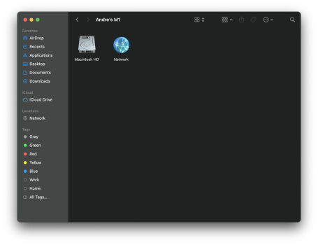
Other areas of Big Sur interface such as the Finder has been refreshed with a cleaner design. The sidebar bleeds into the title bar, with larger title bar padding that intelligently contracts when you resize a window.
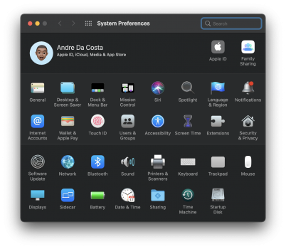
System Preferences sees some minor updates too, with improved battery settings, refreshed icons and more centralized access to adjusting different parts of the Mac. Apple first introduced the dark theme in 2018’s Mojave, but this is my first time getting to use it extensively. I must say its nicely done with subtle contrast that does not feel like it was a bucket of black paint thrown on. Even webpages optimized for Safari embrace this difference, not all do a great job, but you definitely get a sense of cohesiveness to the experience. Also, the apps like iWork and iLife all adhere to it and even Microsoft’s own applications fit in nicely. Overall, this is unmistakably Mac and if you are coming from an older version, you will feel just as comfortable using it as you did on your older device.
Speaking of older Mac’s, there are differences that you start observing right away and some of it is subtle. Something minor as Hey Siri or just touching the Touch ID button make using the Mac feel a little more convenient. I’m seriously sick of passwords, Apple makes them forgettable with Touch ID. With a simple tap, I can sign into websites, make a payment, quickly ask the woefully inadequate Siri trivia and insert my favorite emoji in the comments and social media post. The Touch Bar became controversial starting with the 2016 lineup and its due to some of the early design decisions. The lack of a dedicated Esc button annoyed users such as developers who depended on it. Apple has since split this off along with Touch ID. I feel indifferent about it, it has some nice aspects I guess such as the quick access to your emoji’s, but that feeling like it was a solution searching for a problem still lingers. Brightness and Volume controls can come across frightening, because you fear you might do something wrong, but with some practice it works. Some apps do support it, like Word and Excel, but the tools offered are redundant since they are easily accessible with a mouse. Would I miss it if Apple were to remove, the answer is an honest no.
It Keeps Going and Going and Going
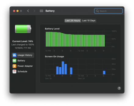
A key differentiator between the M1 and an Intel based Mac for the average user is the battery life. It’s what most users have been raving about since its availability. I have seen where it matters in my home environment. There are so many devices fighting for a plug in my room. I can’t even leave my old Mac on battery for one night without it dying by the next morning or in the 10% range begging for some juice. And it’s not like the battery cycle is bad either, since it’s just 200 cycles out of the 1000 remaining. With the M1, even notorious energy apps like Chrome, I could experience the same iPhone/iPad like experience of forgetting the charger feeling and not worrying about using significant energy. It's just keeps going and going and going. Another nice aspect of having a souped iPhone processor is, it doesn’t get hot plugged in or unplugged. My Intel Mac by contrast gets warm to the touch just playing music or web browsing.
A huge opportunity unique to M1 Mac’s, is the ability to run iPhone and iPad apps on macOS, sorry intel Macs. So far, I have not found any must haves and I will just put it out there, I haven’t installed any either. I am not betting against this opportunity Apple Silicon supports, it’s still early days yet and Apple’s cryptic path to supporting such apps partially is why its limited. Remember, this all started back in 2018 when the company first ported apps like Stocks to Mojave. The 2020 announcement of the transition put all the pieces together with third party developers getting early access with Mac mini dev kits. Of course, it will take devs time to refine apps that were designed for an iPad first to adjust on a Mac using the proper desktop guidelines.
I’ll look at this in follow-up articles to see how the app ecosystem matures, but right now, it’s too early to say this is a benefit of owning an M1 Mac and if that’s your sole intention for purchasing one, I recommend you sit on it a bit and probably consider an Intel based system; or just wait it out.
For traditional desktop apps, while writing this review, major developers such as Microsoft released optimized versions of their apps for the M1. I tested out Microsoft Office, which worked just fine even when it was Intel only. You are not going to notice anything different if you are an everyday user. Excel certainly flies (10 bounces on Intel vs one on M1) open and works just the same as it did before. I initially planned on forgoing third party apps and let Apples own apps do the talking, but it’s surprising how much of my online life is synced in Google, Microsoft and Firefox.
Eventually I loaded those apps and they worked just as they did on my other Mac. The desktop application story on M1 is remarkably smooth, but it doesn’t mean its complete. Adobe is yet to release a native version of Photoshop, but you can download a beta if you want to get a feel of what’s coming.
Update: Adobe has since transitioned most of the Creative Cloud to M1.
I personally stopped at CS6 and don’t want to bother installing the trial, but early reviews indicate the Intel version should work just fine, too. Zoom is another app I tried and needed for a for meeting, this required enabling Rosetta 2, which lets older x86 apps run on the M1. The app installed just fine, but I just could not get the audio settings to work no matter what I tried, so I ended up switching over to my iPad. So, something you should be aware of before you make the jump. An Intel app when first launched will bounce quite a lot before it opens. I saw this with the Intel version of Outlook, but this cached which results in faster load times the next time its opened.
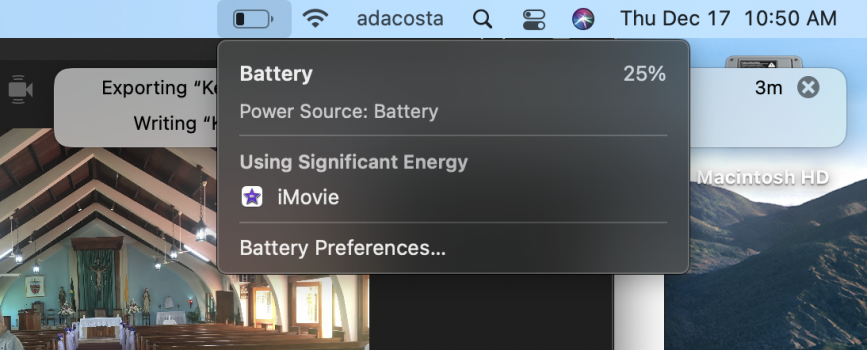
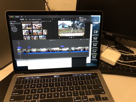
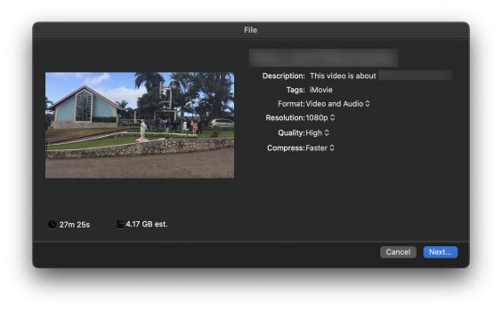
The MacBook Pro includes a fan and part of the benefit is the sustained performance you get when working in applications like Final Cut Pro or Adobe After Effects. Because it's been one of the most tested aspects of the M1, I thought it would be essential to give it a spin for those interested. Using iMovie, I imported 15 4k videos recorded on an iPhone 6s, which range in length from two to three minutes. The entire project came out to about 4 GBs, resulting in a 27-minute 1080p video including a variety of transitions and titles. With only 26 percent of battery power remaining, I was able to export the final project in just 5 minutes.
All this time, I had apps like Pages, Excel, Safari with numerous tabs open and chassis barely got warm. I wouldn’t even think of trying this on my older Intel based MacBook Pro. But, to really see the difference, I decided too, anyway. The same project on a 5-year-old Intel MacBook Pro with 98% of battery life remaining took about 15 minutes to complete. During that time, the Intel MacBook Pro fans started kicking in like a 747 about to take off. Looking at the end-to-end experience, not only was I able to complete the project on 29% of battery life, but I had enough to battery life to complete other tasks. I could browse the web, switch between apps and not feel like I was putting a strain on the M1 MacBook Pro. Completing the same project on Intel utilized 17% battery power.
I’m sure if you are coming from a more recent Intel MacBook Pro such as the Early 2020 or even 2019 model, you are likely to see better results. But let’s be realistic here, if there was ever a reason to upgrade from a 2015 or 2016, these results definitely make the case for it. You are going to see not only better performance from applications that require long sustained usage of the CPU, but you will also be able to flex your muscle even more and do multiple activities while not impacting the other.
Apple ultimately focused on areas where it knew customers would see dramatic differences, not only from their previous generation, but dramatic contrast from industry competitors in the Windows world. The 20-hour battery life, the tight integration and optimization with their own apps and services, and the out of the box compatibility with existing x86 applications. For a system that is as technologically disruptive as it is, Apple somehow managed to do that tablecloth magic trick without you even noticing. Yes, there are hiccups, its early days and based on my testing so far, it can only get better from here on out.
So, should you pick up the M1 MacBook Pro? If your budget isn’t tight, your existing Mac or Windows device is not pulling its weight, then it’s definitely a recommended upgrade. This is especially true if you are coming from much older devices. If you bought a computer in the last 2 to 3 years, I would wait and see where Apple takes this level of performance in the next revs. I feel like they are not even trying here. These are just entry level first gen models after all. Should you choose a Pro or Air? It depends, if you are going to be using complex applications like Final Cut, get the MacBook Pro. For office usage and basic editing in iMovie, browsing the web, its more than sufficient. Storage is really the deciding factor. I recommend you get as much as you can afford; same goes for RAM. These things are expensive, but you can’t upgrade the device either if you want to keep it for a long time.
Apple has always been known to be ahead of its competitors and maybe this is just a sign of where Windows devices will be heading in the next decade of having their own custom designs. Microsoft has been trying something similar with its SQ1 SoC in the latest Surface Pro X devices. With Apples impressive start to this transition, I only expect more investment from other companies like Dell, HP and Lenovo possibly building their own SoCs and optimizing them to differentiate their product line in some way. The potential for creating incompatibilities in a world of Windows everywhere and the expectation of compatibility. Its even harder to see how that’s going work considering the unique position Apple has with its own operating systems, devices, applications and services. Guess we’ll just have to wait and see.
In the meantime, let me know what you think in the comments and what else would you like to know about the M1?


