Hello, my name is Riho Kroll. I'm new to these forums, in fact, this is my very first post. I am a web & user interface designer and I design stuff.
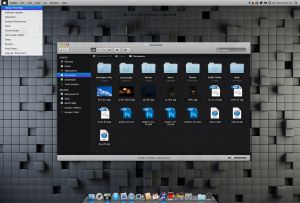
Recently, I decided to make a concept design of Mac OS X.") As I'm not a regular mac user (and the design itself was designed in the Windows version of Photoshop), there are bound to be things that I have maybe missed or don't know about. Maybe there's something that users who use Mac regularly would like to see added? Whatever the case, I want all the feedback that I can get.
As I'm not a regular mac user (and the design itself was designed in the Windows version of Photoshop), there are bound to be things that I have maybe missed or don't know about. Maybe there's something that users who use Mac regularly would like to see added? Whatever the case, I want all the feedback that I can get.
Anyway, here's the design (on DeviantART):
Thanks for your interest!
Cheers,
R. Kroll
Recently, I decided to make a concept design of Mac OS X.
As I'm not a regular mac user (and the design itself was designed in the Windows version of Photoshop), there are bound to be things that I have maybe missed or don't know about. Maybe there's something that users who use Mac regularly would like to see added? Whatever the case, I want all the feedback that I can get.Anyway, here's the design (on DeviantART):

Thanks for your interest!
Cheers,
R. Kroll