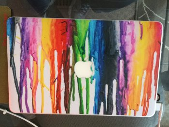
Let me join this MBA love in with this!

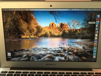
I'm finding the MacBook Air just perfect. The longer I have it, the more I find myself carrying it with me wherever I go. I have the 11 inch. And for something with the footprint of a large tablet and keyboard case, I have something that I can always carry with me and do actual work on.
I used to be in the "no one needs laptops, tablets can do it all" camp, but I think I've fully crossed over into the "can't get real work done on a tablet" world.
Back when the iPad Air 2 was released, I noticed the power in the iPad was nearly that of Computers now. So it's easy to assume that a tablet trumps a notebook, which is what I thought. I thought I would never use a notebook again.
I used to carry around an iPad Air 2 with me along with a decent portable keyboard. And I used the tablet about the same way I use my MacBook now, carry it everywhere and be ready to use it at a moments notice. But the process of setting it up and tearing it down everytime was just too cumbersome with the tablet. Plus the switch from typing to touch screen was too much hassle for small edits. And there isn't enough great killer apps on the iPad yet. It's a great novelty that you can get stuff done on it, and it does quite a lot. But the software is nowhere near as refined as conventional PC/Mac software which have streamlined workflows and are very robust in features.
I actually started carrying around an old White Unibody MacBook instead just to compare. And that computer was bulky, slow and fragile, but I noticed I was much more efficient and happy making music on that Dinosaur than the iPad Air 2.
There's an inherent interface density problem in iPad apps. In order to make the interface usable, buttons have to be a large enough. But in a pro app you will need a ton of buttons for all the edits that fully featured programs need. So what happens in these pro apps is that you get these sliding and moving of icons, but the main editing screen gets squeezed and you end up with less usable area to do edits. I think Apple is on the right track now with the pencil, because now you could make an interface that is less bulky and more precise. But because it's not an assumed tool, the interface will still need default to finger size.
With an interface that is driven by keyboard and mouse, you can make the targets much smaller. So you can then put more on the screen. So on a device with a small screen you get much more usable screen. Plus with a keyboard always available you get key commands to further improve productivity.
With the 11 inch Air I feel I get everything I need, power, portability and all the software I need to be productive. I actually find the portability better than a tablet, at least for getting work done. A tablet that is going to be used effectively will always need a stand, and once you consider a stand/quality keyboard a notebook almost always is the better design. Just fold it up and go.... everything is there that is needed.
As for the MacBook. I tried the keyboard a little, and I actually didn't mind it. I probably would get used to it. I'm really not that impressed by Retina screens though. It's a nice to have thing, but I don't have any issue with seeing pixels. I wish the Air had an IPS screen, but the resolution is no big deal. I feel the core m cpus sacrifice too much in performance for the thin tradeoff. I want the engineers to maximize performance first and then make it as thin as possible. The MacBook has this backwards, making it as thin as possible with performance that is good enough given the thinness. I also need the usb ports. And at least 1 more port to plug something in while charging. And more battery life, because when I'm really pushing the computer I know the battery life is nowhere near the claimed all day battery life.
My dream now is a quadcore CPU in the frame of the 11 inch MBA. This will NEVER happen. But I'm still happy to use such a small and powerful computer.


