Got a tip for us?
Let us know
Become a MacRumors Supporter for $50/year with no ads, ability to filter front page stories, and private forums.
Macbook air Monetery OS How do I get rid of annoying grey bars on sides of preview images?
- Thread starter Paradax
- Start date
- Sort by reaction score
You are using an out of date browser. It may not display this or other websites correctly.
You should upgrade or use an alternative browser.
You should upgrade or use an alternative browser.
I'm on Catalina but I think I know what you mean.
Borderless when initially opening the image but then resizing the window places them to the side, or above/below. Just drag the corner on the diagonal slightly off axis until the grey bars disappear.
Edit: you can place multiple images w/out borders together once the windows are resized.
Edit (part 2): if comparing two images for example, you can open each in full screen, then merge both windows.
Last edited:
Think the OP means opening an image (.jpg for example) in Preview.When you open an image where, with what app?
What kind of image?
Screenshot helps.
Hi there, thanks for responding.
When I was on mojave, just the image would open if I clicked on it as a jpeg on my desktop or from a folder.
Since I'm now usuing Montery, I get these grey side bars.
The image usually opens full screen, so I can't lose the side bars when I shrink it, they just get bigger.
Is there a settings solution I'm missing?
As mentioned a screenshot helps.
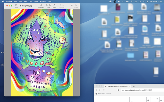
But I guess you mean, if an image has a different aspect ratio than the Previews window, the window doesn't resize itself to the image but fills the "empty" space with grey? Like vertical "letterboxing" of a 4:3 movie on a 16:9 screen.
I can only recommend Xee as an alternative viewer which always resizes its window to the images aspect ratio.
Works with multiple windows at the same time, no bars.
EDIT: If you resize the preview window to an aspect ratio with a greater height than the image and press "cmd+9" you have no bars left and right, but on top and bottom.
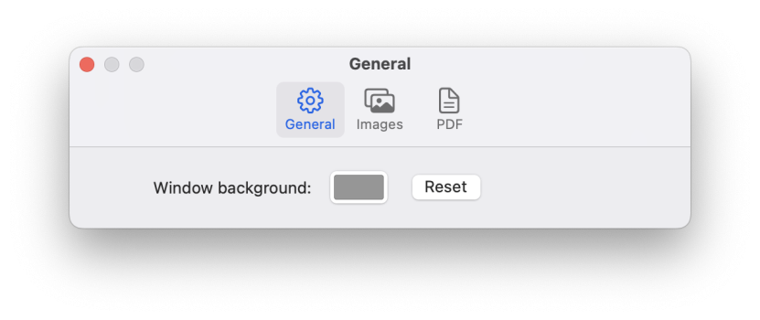
And maybe the following setting helps to open each file without letterbox (if available in Monterey):
Preview > Preferences > Images > Open each file in a separate window
Last edited:
As HDfan mentioned the preview window is ending up larger than the image. I've seen that happen sometimes when the image is small. Larger images, it usually scales to fit the image in the window. If the window is wider than the image then you'll see the window background behind it.
If you use View/Zoom to Fit (shortcut key is ⌘ 9) it should make the image fit again.
Using fullscreen for the window will make this much more likely as the window is less likely to fit the aspect ratio of the image. Try to avoid fullscreen.
If you use View/Zoom to Fit (shortcut key is ⌘ 9) it should make the image fit again.
Using fullscreen for the window will make this much more likely as the window is less likely to fit the aspect ratio of the image. Try to avoid fullscreen.
Also trueI don't think the window can be narrower than the toolbar.
This is one of the most irritating "features" of the Preview app. There is absolutely no reason for it to have a border on the sides of images like that. Hiding the toolbar and markup bar doesn't fix it and neither does ⌘-9.
It just happens when the preview window is larger than the image inside. What else should happen?This is one of the most irritating "features" of the Preview app. There is absolutely no reason for it to have a border on the sides of images like that. Hiding the toolbar and markup bar doesn't fix it and neither does ⌘-9.
The Preview window should adjust accordingly (to the images aspect ratio).It just happens when the preview window is larger than the image inside. What else should happen?
Like Xee does and according to OP, like it was on some previous version of Preview.
On the other hand I understand the behaviour/motivation, as I use Preview mainly for pdfs and there it would be annoying.
Last edited:
Normally. It does fit to the image but if the image is small, it may be smaller than the minimum size of the window. Are the bars really so offensive? Seems like a pretty small annoyance.The Preview window should adjust accordingly (to the images aspect ratio).
Like Xee does and according to OP, like it was on some previous version of Preview.
On the other hand I understand the behaviour/motivation, as I use Preview mainly for pdfs and there it would be annoying.
View attachment 2111764
Let‘s just say I can understand/accept OPs annoyance when s/he‘s used to placing images side by side gaplessly.Are the bars really so offensive? Seems like a pretty small annoyance.
Thankfully alternative apps exist.
Register on MacRumors! This sidebar will go away, and you'll see fewer ads.


