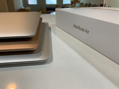
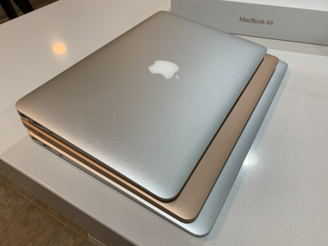
Just got my M1 MBA. It is amazing to see how the current generation compare to the last generation (late 10 ~ mid 17) of 13' and 11' in terms of form factor.
The current MBA 13' is basically the same width as the MBA 11' with a bit longer in terms of depth, while retaining the 13' screen size. The edge of the current MBA is less sharp than the last, making it feel nicer. In terms of weight distribution, the current MBA feels, for a lack of a better term, more "solid".
I was lucky enough to skip the butterfly keyboard. There is a noticeable difference between the current scissor switch vs. the old scissor switch. I like the new one much better. Instead of like a mush in the old keyboard, the new one "pop" and still give you decent travel. Also not to mention the actual screen is a vast improvement.
My only wish is that it has more ports and magsafe. I need the Air, so I am not waiting. It will be interesting to see what the MBA will be like next year.
Below are 2 pics for comparison. The 3 Airs are aligned together at the top left corner so you can see the size difference.
Top: Old MBA 11'
Middle: M1 MBA 13'
Bottom: Old MBA 13'
Attachments
Last edited:


