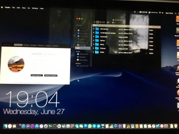
My goodness. I think macOS has taken mostly palatable and favourable turns over the years, but I've never stopped missing the original dark-style Notification Center when it was delineated by lines and margins, back before individual notifications became bright rounded-rectangle panel things. I've never looked back from the dark menu and Dock, but they leave so much still untouched.
There have been indications for ages that some kind of system-supported dark appearance has been brewing in macOS' native code – something that would be available to the entire Finder and any supported apps. It seems like some customers have longed for this enough that developers' implementations of their own optional dark interfaces are weighed almost as strongly as major features by them.
Is it finally time? o _ o


