Become a MacRumors Supporter for $50/year with no ads, ability to filter front page stories, and private forums.

Atreyu25

macrumors 6502
Original poster
May 31, 2005
289
163
Friends,

I am interested in hearing any thoughts or comments about my current project.

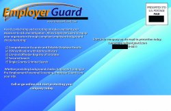
I work as a graphic designer for an insurance firm and this is the latest postcard mailer. 8.5x5.5, high gloss heavy stock card.

Looking for thoughts about graphic placement, general design, etc.

Thanks!

PS The backdrop isn't the Tiger desktop, though it looks similar.
 

Attachments

  • MailerFront.jpg
    MailerFront.jpg
    1.1 MB · Views: 88
Clean, simple.

The headline and the bullets carry the same visual weight. You may want to experiment with making the headline a bit bigger. Maybe even select words of the headline? Just a thought. :)
 
Clean, simple.

The headline and the bullets carry the same visual weight. You may want to experiment with making the headline a bit bigger. Maybe even select words of the headline? Just a thought. :)

Thanks,

are you saying it is clean/simple, or needs to be? I have thought about the text size for sure. The creepy guy isn't too much is it? I want the eye drawn there then to the message in an unsettling way.
 
Thanks,

are you saying it is clean/simple, or needs to be? I have thought about the text size for sure. The creepy guy isn't too much is it? I want the eye drawn there then to the message in an unsettling way.

I think it already is clean and simple. I don't think the graphic is too much but it really depends on what you do with the headline. You don't really have to make the headline much bigger or go crazy, just find a way to draw a little more attention to it. Could even be color and not size?

If you find you need more room, you could always reduce the photo of the guy just a bit and run the headline across the top - but that may be too much. Just keep tinkering.
 
This is kind of random, but the skin tone on the photo seems odd - maybe pushing red a bit. Given that the background is blue, try adjusting so it's not as jarring.
 
Here are the potential finished products.


I adjusted the color saturation, wording size and hopefully this will draw the eye to the right areas. Ignore the blacked out boxes, I don't think the client wants their info divulged quite yet.

Thanks!
 

Attachments

  • Mailerrear.jpg
    Mailerrear.jpg
    1 MB · Views: 83
  • MailerFront.jpg
    MailerFront.jpg
    1 MB · Views: 88
Quick thought: I don't care for how the text (including the mark) overlaps the image. It doesn't seem intentional enough to be a design element. Also, the background seems superfluous- it doesn't add to the design at all. Keep working at it. You'll get there.
 
Here are the potential finished products.


I adjusted the color saturation, wording size and hopefully this will draw the eye to the right areas. Ignore the blacked out boxes, I don't think the client wants their info divulged quite yet.

Thanks!
How are the addresses being attached to these cards?

If your ink jetting directly onto the card (and not using white mailing labels), you're going to have to ditch the background behind the address area.

Also, you'll want to knock out any UV or Varnish behind the address area and the barcode area or your labels will fall off or the inkjet ink will rub off in mailing.

http://www.overnightprints.com/main.php?A=USPS

Overnight Prints is great. Yea I'm familiar with the mailing requirements, this isn't my first rodeo.

As far as making the wording over the graphic "intentional," do you have any suggestions?
 
I'd be a bit more careful about your text that seems to be getting dangerously close to the left edge. You may want to increase your bleed.

Also, as some others have said, I'm not a fan of that background. maybe some other smooth gradient may work better.
 
Here's my quibble...

The "sex offender" is gesturing in a way that indicates your service keeps secrets, when it is instead a service that reveals secrets.

What is that sex offender really saying about your company?
 
I'd be a bit more careful about your text that seems to be getting dangerously close to the left edge. You may want to increase your bleed.

Also, as some others have said, I'm not a fan of that background. maybe some other smooth gradient may work better.
I've kept a close eye on that bleed. Actually I've changed the text size considerably in current revision. It's within the "safe zone" considering this is a 5.5x8.5 .


Here's my quibble...

The "sex offender" is gesturing in a way that indicates your service keeps secrets, when it is instead a service that reveals secrets.

What is that sex offender really saying about your company?

I've modestly changed the design to "get the point across" so to speak. I'll upload the revisions when I get to my desk in the A.M.

The goal for the creepy figure is to cause the viewer to be uncomfortable and see their exposure to poor employee hiring. The revised card-rear provides the solution to the problem, thus saying our company is the solution.

Thanks for the comments, it has been a great help!
 
Register on MacRumors! This sidebar will go away, and you'll see fewer ads.