Become a MacRumors Supporter for $50/year with no ads, ability to filter front page stories, and private forums.

dubnew

macrumors newbie
Original poster
Mar 17, 2009
12
0
Novice Here(term used lightly)

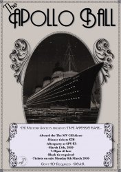
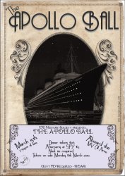
Basically the poster is for a 1920's themed party on a boat. That's what I'm trying to convey.

From looking at it briefly would you assume the above?

I find the whole thing very flat looking, and tips or advice to remedy this?

Thanks in advance,

D
 

Attachments

  • apollo_ball3.jpg
    apollo_ball3.jpg
    455.1 KB · Views: 420
Hey, I think it is a good start. I can see what you mean in terms of it looking flat, you need something to make it pop. I think your use of colours could be contributing to the flat look.

Instead of a flat grey background, what if you were to do a worn paper/old photograph, vintage wash type background? Then perhaps make the boat appear more b&w. Adding some golds and maybe a single splash of washed colour (maybe red). Generally, posters appeared aged in this era due to the quality of paper and ink.

Here is a good example of what I am thinking:

http://psd.tutsplus.com/tutorials/d...to-create-a-retro-boxing-poster-in-photoshop/

Some other techniques that could be beneficial:

http://www.picturesocial.com/video/1483478:Video:93367

http://gungurru.com/blog/tutorials/design-a-vintage-wwii-poster-a-photoshop-tutorial/

Good examples of vintage typography. I would revisit your typography in your body, remove the ( - ) dashes for starters.

http://www.smashingmagazine.com/2008/10/26/retro-and-vintage-typography-showcase/

I think with some revisions, it will look great!

Some further inspiration I pulled from Flickr

http://www.flickr.com/photos/dajw/395666364/

http://www.flickr.com/photos/grainne_quinlan/3400469067/
 

Attachments

  • 3113101416_a37a1c4d74.jpg
    3113101416_a37a1c4d74.jpg
    108.9 KB · Views: 141
  • 2885672623_d4a4258309.jpg
    2885672623_d4a4258309.jpg
    34.4 KB · Views: 140
  • 2432656770_ce9da6e180.jpg
    2432656770_ce9da6e180.jpg
    178.3 KB · Views: 149
WOW! Thanks a million for taking the time to get back to me! Everything you suggested makes complete sense!

Thanks again, D
 
texture

You need some textures, especially for vintage project like this. Search smashingmagazine.com for "Textures" and you will find some nice free ones. Or take some photos of them and use your own!
 
My suggestions center around it looking, to me, like it was more turn-of the century or 'teens rather than 20s. The 20s, to me, always screams Art deco while your fonts and presentation with the nature-esque leaves/framing, seems like something you would see a decade or two earlier...even into the 1890s.

The 1920s featured industrial-looking designs and curves were not widely used...almost always angles, like these items:

art-deco.jpg


I'm no designer, but if you want me to think 1920s, use Art Deco items/framing...your font choice is OK though. :D
 
I realize the titanic was black. And this event is at night. But more contrast between the ship and the sky might also help make the central image pop a bit.
 
I realize the titanic was black. And this event is at night. But more contrast between the ship and the sky might also help make the central image pop a bit.
Except that the image used is not the Titanic…
;)

OP, as mstrze pointed out, you need more Art Deco.
In fact, think SS Normandie and you'll be heading in the right direction. (Yes I know it was built 1930s, but…)
vintage_ss_normandie_poster-p228603844663288756tdcp_400.jpg
normandieposter.jpg


Edit: I see you have been using the Normandie after all. ;)
ss_normandie_vintage_ocean_liner_poster-p228828467705982023t5wm_400.jpg
 
my two contributions.

exaggerated perspective - I mean the front of the boat.
shadows - let the nose of the boat cast a 'shadow' on the background.
 
Hey,

Thanks for all the replies!

Unfortunately I ran out of time on this little project (printers) so I didn't get to use the wealth of advise provided. However, the advice and pointers I did have time to use made a huge difference!

Thanks again,

Below went to print, not perfect! But it's only a small college thing!
 

Attachments

  • Picture 1.JPG
    Picture 1.JPG
    262.1 KB · Views: 155
Hey,

Thanks for all the replies!

Unfortunately I ran out of time on this little project (printers) so I didn't get to use the wealth of advise provided. However, the advice and pointers I did have time to use made a huge difference!

Thanks again,

Below went to print, not perfect! But it's only a small college thing!

Very nice! I was hoping you'd come back to post the progress....and it looks great!
 
Register on MacRumors! This sidebar will go away, and you'll see fewer ads.