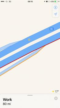
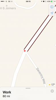
Firstly the main point - is anyone else having an issue with maps, in that the icons for traffic info are far too small to be seen clearly, especially if the phone is mounted to the dash / windscreen? They're really tiny and I don't remember them being that small in iOS 9. Also the coloured lines representing delays are so thin as to be barely visible in the wrong light. Screenshots attached.
Secondly, and I've had this niggle since PB1, am I the only one who isn't a fan of maps now defaulting to a satnav type approach and the search bar is a "where do you want to go" bar now?
Secondly, and I've had this niggle since PB1, am I the only one who isn't a fan of maps now defaulting to a satnav type approach and the search bar is a "where do you want to go" bar now?


