Become a MacRumors Supporter for $50/year with no ads, ability to filter front page stories, and private forums.

HouseLannister

macrumors 65816
Original poster
Jun 8, 2021
1,388
2,838

I far prefer Material 3 Expressive. It just gets out of your way and lets you focus on your content instead of unnecessary bling.

What do you think?
I think it’s an android publication saying android is better than iOS. That’s hardly shocking.

iOS 26 just came out in Beta. It’s going to receive tons of changes before it gets released. It looks like some of the transparency can be difficult to see in certain situations, but it looks like they went out of their way in those pictures to create those situations.

I’m tempted to download iOS 26 but I’m going to wait just a little bit in case there’s some major issues
I mean, you are right about it being an Android publication, but Material 3 Expressive is also only in beta.
 
  • Like
Reactions: aggie99
I don't like the ME of Android. It looks too busy and cluttered and trying too hard with flashy colors. Hopefully, Apple's LG gets tweaked enough to take care of all the legibility issues before the public release. Don't hate the change as much as I thought I would in iOS.
The glass is supposed to change automatically based on what's in the background so my guess is it's going to look much better in September.
 
Liquid glsss has not given me a headache (sorry to the article writer) but it definitely needs some improvement for readability and accessibility.
 
Google's UI design direction is one of the things that pushed me away from Android several years ago. Questionable color choices, strange UI paradigms, all the excessive padding. It took minimalism way too far - as if having UI elements at all was a bad thing.

Now, Apple is heading that direction in some aspects. Ugh.
 

I far prefer Material 3 Expressive. It just gets out of your way and lets you focus on your content instead of unnecessary bling.

What do you think?
I… think I agree. I mean it’s still on the first beta, and I hope they improve the readability, but for me, and seeing that comparison, I’d chose the Expressive Material 3 over the liquid crystal.

However, I think it’s good for both companies and consumers that they chose different design paths. Once they were both on the flat design wagon, but Google has doubled down on flat, soft colors and shapes, while Apple is going back to the textures they left behind when Jonny Ive took charge of the software design. Unfortunately, I think they aren’t embracing neumorphism hard enough, and staying in a meh middle ground. There are concepts based on frosted glass (instead of liquid glass) with shapes and buttons that seem to pop out of the screen, that are better looking than what Apple did. In my opinion, of course.
 
I don’t like the visual style of material. Ugly color choices, very bland, lacking texture, and extremely flat. Always just looked like construction paper cutouts to me.
 
  • Haha
  • Like
Reactions: one more and BMox81
Android gives you more options to customise your devices and places less restrictions, which is a big plus, yet Apple still excels at design and visual polish. The same third party apps look much better in iOS vs Android.

Apple will fine-tune their Liquid Glass over the next months and years and it should be very good once it matures. What we see today is just the beginning.
 
I don't think these are competing. Material design is a flat UI which has been around for a while now while liquid glass is moving away from that. Google's answer to liquid glass will come later if they choose to move in that direction. And on iOS we're only seeing the earliest beta version so there's likely still lots of change to come.
 
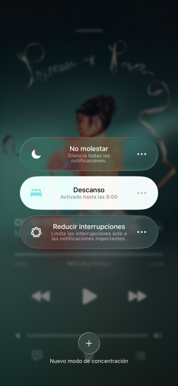
Just looking at the pics from the article I choose Liquid Glass. The ME Modes list looks quite boring, just a list and the buttons just with space between. And the control center quite the same, zero sense of deep.

Also checking in my own iPhone the modes list is not as “nauseating” as the one in the screenshot, I feel that the frosted effect is perfect and everything is readable.

IMG_6627.png
 
I think Google's ME3 looks rather boring. I've been running iOS 26 Dev Beta 1 on my iPhone 14, as it's my backup until I can get the screen fixed, and I like the new design direction so much, it's become my main again, despite the shattered screen. Picking up an iOS 18 phone now feels old.

I'm very keen to see how the new design gets polished (pun intended) over the next three months.
 
Just looking at the pics from the article I choose Liquid Glass. The ME Modes list looks quite boring, just a list and the buttons just with space between. And the control center quite the same, zero sense of deep.

Also checking in my own iPhone the modes list is not as “nauseating” as the one in the screenshot, I feel that the frosted effect is perfect and everything is readable.

View attachment 2520436
In your screenshot, everything IS readable. But it is very distracting and busy. It's not a good design.

It looks awesome at first and usability is not aligned with Apple's simplicity ethos.

When Mac OS X started 25 years ago with Aqua, it looked great in demos (with its high transparency and Aqua elements). But real-world usage found it distracting, unnecessary and it was processor intensive. We shall see what Apple does in Beta 2!
 
It basically boils down to "boring but functional" (Android) or "busy and distracting" (iOS).

I'd far rather have my OS feel boring than have it get in my way by screaming "Look at me!"
 
It basically boils down to "boring but functional" (Android) or "busy and distracting" (iOS).

I'd far rather have my OS feel boring than have it get in my way by screaming "Look at me!"
That’s not my experience using it. If it felt busy and distracting, it wouldn’t make me choose to use a phone with a badly cracked screen instead of the perfectly good one sitting next to it…

It’s does have a few bugs, and isn’t quite finished yet, but actually using it makes me excited for the future of iOS. There are a lot of small interface tweaks for better usability that I already know are going to make life easier.
 
  • Like
Reactions: jdavid_rp

I far prefer Material 3 Expressive. It just gets out of your way and lets you focus on your content instead of unnecessary bling.

What do you think?
I'd have to agree with you. I like solid backgrounds I think for readability.
 
I am not a huge fan of Liquid Glass but I think it looks WAY better than whatever Google is thinking with Material Design 3. I have thought the same thing since it was first shown, that it looks god awful. Big flat shapes around everything and that weird ugly bubbly circle...and fonts that looks like something from the 70's. No no no. At least Apple is still keeping a minimal and classy look. I am sure they will tweak it over the next year or two to make it look even better and increase readability problems. I think it looks the most atrocious on macOS.
 
I personally prefer the Liquid Glass over the Material 3 Pastel Hell. Liquid Glass once refined will be better. This is a precursor for the Apple Glasses, just as the Vision Pro is. What better way to acclimatize your customers than throw them in the frying pan en masse and skip the pot. It will be the execution of refinement that will be the most telling in regards to where Apple is headed.
 
Register on MacRumors! This sidebar will go away, and you'll see fewer ads.