Got a tip for us?
Let us know
Become a MacRumors Supporter for $50/year with no ads, ability to filter front page stories, and private forums.
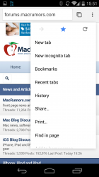
Material Design Hits Chrome Beta (Pics)
- Thread starter Lloydbm41
- Start date
- Sort by reaction score
You are using an out of date browser. It may not display this or other websites correctly.
You should upgrade or use an alternative browser.
You should upgrade or use an alternative browser.
There's no number for your amount of tabs? Because if so that sounds annoying....
Certainly would be. Probably an oversight that they'll fix.
Waiting for people claiming Google had copied the tab view from iOS 7
(PS: I know it was the other way around)
They certainly had it first but you can't deny they're moving closer to the Safari version of it with L

Waiting for people claiming Google had copied the tab view from iOS 7
(PS: I know it was the other way around)
Google is moving to a more IOS centric look.
Google is moving to a more IOS centric look.
I think both iOS and Android are just simply arriving at the same point of design evolution at the same time, albeit for completely different reasons.
There's no number for your amount of tabs? Because if so that sounds annoying....
It is! Not sure why Google would remove that. Pretty useful information.
Otherwise, Material Design is shaping up quite nicely.
He he... L is for Lollipop
Where is your source that Android 'L' is for Lollipop ?
Most expect it to be another corporate tie in like Kit Kat was, and will most likely be a name brand candy like Lemon Heads or Lifesavers
Where is your source that Android 'L' is for Lollipop ?
Most expect it to be another corporate tie in like Kit Kat was, and will most likely be a name brand candy like Lemon Heads or Lifesavers
Because......they need the money?
I really see no incentive and KK was the first. Not that it matters. Some people get caught up in names. Android L is fine with me.
Where is your source that Android 'L' is for Lollipop ?
Most expect it to be another corporate tie in like Kit Kat was, and will most likely be a name brand candy like Lemon Heads or Lifesavers
Nope. No corporate tie in this time. The story behind KitKat is interesting, but had nothing to do with money or corporate sponsoring.
Not a fan of how the refresh button has moved under the menu button. Weird design change as it now takes two taps to do what used to take one.
Not a fan of how the refresh button has moved under the menu button. Weird design change as it now takes two taps to do what used to take one.
I just noticed that! Yeah, that isn't a good move on their part. I know they are trying to keep a minimal theme, but I hope they at least allow an option under settings for us to have refresh button in the search bar.
Where is your source that Android 'L' is for Lollipop ?
Most expect it to be another corporate tie in like Kit Kat was, and will most likely be a name brand candy like Lemon Heads or Lifesavers
Or maybe it's just L.
L = 50 -> 5.0.
They could've decided to drop the desserts.
I think both iOS and Android are just simply arriving at the same point of design evolution at the same time, albeit for completely different reasons.
Yep agreed. It's like a convergence of design ethos has led them to the similar end product design aesthetics wise ....
Or maybe it's just L.
L = 50 -> 5.0.
They could've decided to drop the desserts.
That would actually be a cool way to name versions, but 7.4 would be funny at best: LXXIV
Not a fan of how the refresh button has moved under the menu button. Weird design change as it now takes two taps to do what used to take one.
You can still do it on one press, though it requires a bit of a slide. You can hold the menu button and slide directly to the refresh button, which happens to be right underneath the menu button. Then let go.
Still one tap, technically.
----------
I just noticed that! Yeah, that isn't a good move on their part. I know they are trying to keep a minimal theme, but I hope they at least allow an option under settings for us to have refresh button in the search bar.
I agree. I would prefer the refresh button available right away. But look at my above post -- you can still technically refresh with one tap.
You can still do it on one press, though it requires a bit of a slide. You can hold the menu button and slide directly to the refresh button, which happens to be right underneath the menu button. Then let go.
Still one tap, technically..
Thanks for the tip. The design change makes more sense now given the shift to gesture-based actions. Still not a fan, especially since the tablet version still has the refresh button broken out separately, but I'll get used to it.
Thanks for the tip. The design change makes more sense now given the shift to gesture-based actions. Still not a fan, especially since the tablet version still has the refresh button broken out separately, but I'll get used to it.
Yeah. I like the slide gesturing more for helping me reach the Bookmark button easier.
Register on MacRumors! This sidebar will go away, and you'll see fewer ads.


