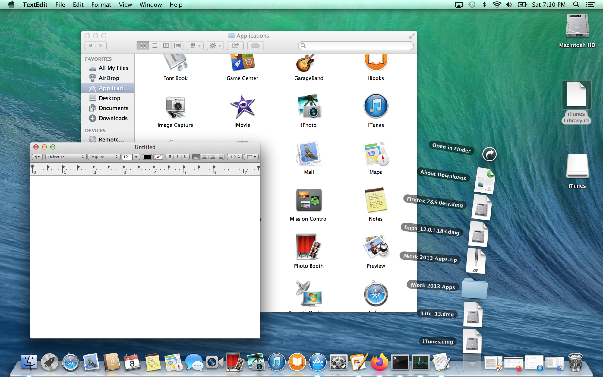
I recently picked up a few 15 inch MacBook Pro's that were heading to e-waste and one had a recovery for OS X Mavericks, version 10.9. My official journey with OS X started with Yosemite, prior to that prior experiences were running Tiger on a Hackintosh. Mavericks on the retina display is probably the most beautiful revision of the old world design that started with OS X Leopard. Its extremely refined, the texture of menus is just right, the photo realistic icons are well defined and pop on screen. The Dock also looks really amazing, I can't tell what texture/material it represents, but its definitely a stage, as indicated by the stage light below each open application. When I compare it with subsequent releases I feel like Apple has probably gone too far with the subdued design aesthetics in later releases. The uniformity with iOS has really killed the fun, whimsy and beauty of the desktop OS. Sure, newer releases are extremely modern, professional and highly refined too, but just feel so over utilitarian.
Since I reinstalled it, its like I can't stop playing with. Sure, its showing its age especially where web browsing is concerned. The latest supported version of Safari 9.5 can't manage todays modern websites. Imagine that, a browser from 2016 is outdated for todays Internet, let alone Safari 7, which originally came preininstalled. Right now, I am using Firefox 78 ESR as the default browser, but I know I won't be able for too long. My plan is to keep this Mac on Mavericks for nostalgia purposes. I do have a modern Mac with Big Sur.
There is something about about the Bluish/greenish Mavericks OS X wallpaper, too, that really makes this release stand out. I hope for the future, what becomes old returns as new again. But, the design from todays macOS almost feels a bit lazy. The illustrations seen in the icons on Mavericks shows a sense of care that went into making them. I want that to come back to macOS. I want to even see things like the CD icon with the three musical notes come back to the OS. Yes, many of us don't use CD's anymore, but even if its metophorical like the Save icon bring represented by a floppy disk, it can be for many aspects of the interface.

