First off, nice photography,
macgfxdesigner.
Regarding the logo. Overall I think they're all quite nice.
Logo 1 (starting from the left):
+ I like the touch of color. It's something you can carry on to the rest of the site as a design element.
- For some reason the bottom right of the "M", "clark", and "Photography" draws attention away from the rest of the logo. I think this is caused by the overlapping of the "M" and "clark", and "photography" adds to it and you have to colors (black and orange) and the black seems to be over powered by the orange. At a smaller size it may make "clark"
slightly hard to read. And you can't make the "M" black because that will blend with "clark" But that's me.
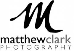
 Logo 2
:
+ This would work very well when shrunk down because the entire logo is black and doesn't have any overlaps.
- Can't think of anything I don't like about it right now.
Logo 3:
+ I do like the "M", nice and solid.
+ I do like how you made "mathewclark" one word but screened back "clark" to make separate them. Nice touch. (also with logo 1)
- Can't think of anything I don't like about it right now.
Anyways that's just a quick critique for you. If you have any revisions, post them!


