Become a MacRumors Supporter for $50/year with no ads, ability to filter front page stories, and private forums.

shrimpdesign

macrumors 6502a
Original poster
Dec 9, 2005
609
2
060222_mystery_apple_cube.jpg


This image was posted tonight on MacDailyNews with this comment from the alleged photographer:

I was only able to snap one quick shot of this as I was only in there for about 30 seconds. I sort of stumbled upon it - can't say more about how or why. I only got about half a sec to look around back - there are a bunch of ports (and maybe a button or two) neatly arranged on the back (?) of the cube in a line along the bottom edge. It's about 8-inches square and 8-inches tall - a perfect cube. It seems to be made out of a similar material as a Power Mac - aluminum perforated with a round hole pattern, but they're smaller holes than found on a Power Mac. The top is the same material as the sides with the addition of the Apple logo, even though it doesn't look like it in the photo - I had to snap it quick, sorry.

I don't have any real detail on exactly what it's designed to do, but I know from other things I can't mention that it's media-related. Apple "Media Cube," maybe? Anyway, thought you guys would be interested.

I think it could very well be fake, since the ports he mentioned aren't in the shot. Not to mention perspective is a little skewed.

Some thought it was an Apple Design Award, but the ADA is made from a different material and the logo is bigger.

What do you think? I'd love another cube-based Mac design, but I doubt this is it.
 

Chundles

macrumors G5
Jul 4, 2005
12,037
493
I'd believe it more if it was in an elevator.

Is it just me or does the top look like it's been upholstered? The first computer that's also a nice warm place to put your feet at the end of a hard day's work.
 

TBi

macrumors 68030
Jul 26, 2005
2,583
6
Ireland
It looks like something made in 3D Studio Max. Just look at the front lighting and the texture of the "table".
 

jacobj

macrumors 65816
Apr 22, 2003
1,124
87
Jersey
Is it me or is the little apple logo missing its little bit at the top?

OK, the perspective is wrong (as already mentioned), the ports are not in shots (more difficult to fake) and it is no Jonathan Ive work... I'd put money on that.

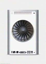
Edit: I found the real Media Mini. It has 10 2.15GHz Core Duos in it and 5TB of storage... honest ;)
 

Attachments

  • MediaMini.gif
    MediaMini.gif
    103.2 KB · Views: 182

riciad

macrumors 6502
Oct 10, 2005
354
0
Ireland
TBi said:
It looks like something made in 3D Studio Max. Just look at the front lighting and the texture of the "table".
That's what I think too. The box doesn't seem to be grounded to the table.
My initial thought was why didn't he take a picture of the computer instead of just the box.
 

MRU

macrumors Penryn
Aug 23, 2005
25,370
8,952
a better place
The point being if Apple had paid that photographer and all he produced was a low res blurry image then both Apple & said Photogrpaher should be shot :rolleyes:

'Bag a *****' as they say in the North of England
 

ReanimationLP

macrumors 68030
Jan 8, 2005
2,782
33
On the moon.
jacobj said:
Is it me or is the little apple logo missing its little bit at the top?

OK, the perspective is wrong (as already mentioned), the ports are not in shots (more difficult to fake) and it is no Jonathan Ive work... I'd put money on that.

Edit: I found the real Media Mini. It has 10 2.15GHz Core Duos in it and 5TB of storage... honest ;)

And yet still only one DVI output. :p
 

Chaszmyr

macrumors 601
Aug 9, 2002
4,267
86
cwedl said:
Yeap thats the box for Apples new cell phone!
No you fool, it is Apple's new cell phone! :p


A perfect 8'' x 8'' cube is just about the most uninspired design I could possible think of. Oh, and I'm offended by how bad of a fake this is.
 

russed

macrumors 68000
Jan 16, 2004
1,619
20
is it me or does the top just look like a powerbook (sorry macbook pro)?
 

turbopants

macrumors regular
Feb 11, 2006
124
0
Chicago
I don't think so at all. I would think it would be more designed to fit into an entertainment center setting. Not as square and boxy. Good try. :D
 

shrimpdesign

macrumors 6502a
Original poster
Dec 9, 2005
609
2
Malcster said:
It looks a lot like an apple design award.. but the dimensions seem different..

http://www.panic.com/extras/designawards/
No, the logo is bigger on the ADA.

jacobj said:
Edit: I found the real Media Mini. It has 10 2.15GHz Core Duos in it and 5TB of storage... honest ;)
Nice, I like that. Althought that fan could kill someone if it was on ... not to mention that is friggin big fan for a low watt Core Solo/Duo ...
 

balamw

Moderator emeritus
Aug 16, 2005
19,365
979
New England
shrimpdesign said:
that is friggin big fan for a low watt Core Solo/Duo ...
He said there were 10 :eek: 2.15 GHz Core Duos in there. The fan seems about right. ;)

The cube seems like a fake, unless it is the cardboard box that something cool comes in. For one thing, I think the edges are too sharp compared to Apple's current designs.

B
 

shrimpdesign

macrumors 6502a
Original poster
Dec 9, 2005
609
2
balamw said:
He said there were 10 :eek: 2.15 GHz Core Duos in there. The fan seems about right. ;)

B
Ooohh. Right. I misread that part, yeah, .......... so that huge fan seems justified now.
 
Register on MacRumors! This sidebar will go away, and you'll see fewer ads.