Become a MacRumors Supporter for $50/year with no ads, ability to filter front page stories, and private forums.

blenditall

macrumors newbie
Original poster
Mar 6, 2011
22
4
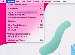
For context, here is an menu directly on top of my desktop image. This appearance makes sense – you see the desktop blurred.
blur-desktop.png


Now here is a menu on top of an application. Although the pink is lighter, the overall effect is that you see "through" the application window to the blurred desktop. A little odd, but fine if that's how it works.
blur-desat.png


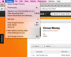
But this third case threw me off. The saturated part of the page is so overpowering in the blur that it appears you don't see "through" the application window anymore. Meanwhile the upper part of the menu still "sees" the desktop.
blur-sat.png


It seems like the content of the blur has more to do with colour saturation than the "layering" that has been established by the concept of application windows that sit on top of each other in a certain order. Thoughts? Was this even worth bringing up?
 

n-evo

macrumors 68000
Aug 9, 2013
1,909
1,730
Amsterdam
The menu hue is a blend of both the desktop picture color and windows stacked on top of it. Since only the desktop picture can be behind the menu bar only it influcences its hue: Menus can overlap windows, the menu bar cannot.
 

Badagri

macrumors 6502a
Aug 9, 2012
500
78
UK
Bizarre. It would make more sense to blur whats below it. Not blur and smear the pink from the menubar. Which looks like the pink is bleeding through the menu.


You'd need to choose a suitable background for this.
 

mrchinchilla

macrumors 6502
Mar 6, 2009
478
164
Yeah, it's terrible. This horrible illogical translucency seriously needs to go. At most it should only reveal the object directly under it. It's also far too transparent, it needs to go back to <10.10 opacity.
 

blenditall

macrumors newbie
Original poster
Mar 6, 2011
22
4
The appearance of the bar definitely makes sense. The actual dropdown menu is what's behaving strangely.

Think about it this way: The menu is an extension of the menu bar, which has the hue from the desktop background.

Yes, except for when it somehow picks up content from an application window, as in the last image I posted.

I think it only only does this when the application colour is saturated – the orange in my example. But if you look at the lightening (of the pink) effect of the application window in image 2, you'd expect the orange to blend with the pink below it. But perhaps the blending is just really subtle and not visible.

In other words, it appears that the content of the blur in the menu (not talking about the bar at all) is inconsistent: sometimes it's the desktop; sometimes it's something directly behind the menu; sometimes it's both. Basically:

illogical translucency
 
Last edited:

leman

macrumors Core
Oct 14, 2008
19,515
19,661
You might want to watch the WWDC14 video "Adopting Advanced Features of the New UI of OS X Yosemite", especially the segment about vibrancy.

More precisely, the effect that puzzles you is a form of color burn with multiple blending targets (I do not know the math behind the particular effect that Apple is using here though).

----------

Yeah, it's terrible. This horrible illogical translucency seriously needs to go.

It never meant to be only translucency. And what is terrible about it? People have often complained that OS X is too 'boring'. Now they can personalise the menu appearance in a fun and dynamic way.
 

blenditall

macrumors newbie
Original poster
Mar 6, 2011
22
4
You might want to watch the WWDC14 video "Adopting Advanced Features of the New UI of OS X Yosemite", especially the segment about vibrancy.

Thanks for pointing that out. It seems you're right – potentially strange combinations of blending modes are at work here.

I'm sure it all makes sense under the hood, but I guess my point is that it appears inconsistent.
 

leman

macrumors Core
Oct 14, 2008
19,515
19,661
I'm sure it all makes sense under the hood, but I guess my point is that it appears inconsistent.

I do not think that this is inconsistent. A menu is a special case, different from other kind of overlapping content. The current blending is — as I have mentioned earlier - a way to personalise your UI by choosing a desktop background you like.

I certainly agree that it can result in some less legible combinations or weird colours, but that's the cool part of the system — it can be tweaked. personally, I think that this is a very nice artistic touch. Its subtle, playful, but ultimately non-obtrusive and feels very personal.
 

tkermit

macrumors 68040
Feb 20, 2004
3,586
2,921
People have often complained that OS X is too 'boring'.

I've heard that complaint from Windows users (the sort that would never get a Mac anyway), never from Mac users... Nor do I think it's an issue for an OS to be 'boring'.
 

leman

macrumors Core
Oct 14, 2008
19,515
19,661
I've heard that complaint from Windows users (the sort that would never get a Mac anyway), never from Mac users... Nor do I think it's an issue for an OS to be 'boring'.

I meant the complains about the lack of personalization.
 

tkwolf

macrumors 6502
Apr 11, 2012
308
25
Yeah, it's terrible. This horrible illogical translucency seriously needs to go. At most it should only reveal the object directly under it. It's also far too transparent, it needs to go back to <10.10 opacity.

I love the translucent UI! :D
 
Register on MacRumors! This sidebar will go away, and you'll see fewer ads.