Become a MacRumors Supporter for $50/year with no ads, ability to filter front page stories, and private forums.
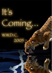
Mock WWDC Poster!!!! L@@K!!!!
- Thread starter corywoolf
- Start date
- Sort by reaction score
You are using an out of date browser. It may not display this or other websites correctly.
You should upgrade or use an alternative browser.
You should upgrade or use an alternative browser.
I'd like it better if you removed the big "It's Coming" statement and went for more subtlety.
Just "wwcd 05" and the picture speaks for it self. Nice concept though.
Just "wwcd 05" and the picture speaks for it self. Nice concept though.
Tone down the X (fade it out some, more subtle), remove the It's Coming, and leave WWDC '05... put it in Myriad Semibold too, just like Apple... then it'd look like something they might make.
Good concept!
Good concept!
nice, i like it, try some of the suggestions that others have posted, they might work well....good job though
Cless said:Tone down the X (fade it out some, more subtle), remove the It's Coming, and leave WWDC '05... put it in Myriad Semibold too, just like Apple... then it'd look like something they might make.
Good concept!
yeah, I was trying to remember the font they use, good ideas
tech4all said:Sweet. I dig it. Really nice concept. At first I thought that the font hindered it a bit and I was going to say to use Apple's main font. But I think this font gives it a more "jungle" look, which may or may not be a good thing.
yeah, after I looked for an apple font and coudln't remember it or find it, I thought it looked kinda of jungle like. But apple wouldn't do it I know. It took me a while to find a way to mask the image being reflected. I like the results a lot though. Maybe I am giving myself too much credit?
I think the tiger looks too cute. Just show a little fur, a shiny sharp tooth, and a pair of glowing sinister eyes...
It's alright . . . The tiger is too prominant, maybe just show a little fur, not the whole tiger.
Also the no periods between WWDC, it reminds me too much of W.W.J.D.
Also the no periods between WWDC, it reminds me too much of W.W.J.D.
Sooooooo much respect for anyone who can use photoshop!
:::eyes to the ceiling with a look of admiration in my furrowed brow:::
The only bit of advice I can offer is that the font you used screams 2002 IMO - kinda like a movie I saw about some little dude with a serious jewellery problem...
It looks wicked though!
:::eyes to the ceiling with a look of admiration in my furrowed brow:::
The only bit of advice I can offer is that the font you used screams 2002 IMO - kinda like a movie I saw about some little dude with a serious jewellery problem...
It looks wicked though!
Thomas Veil said:I like it. It's nice and subtle.
Haha... (You're kidding, right??)
Seriously, though, Napoleon dynamite would love that poster.
Here's my version. Can anyone tell me what font that Apple uses? I spent 30 minutes but this is my best one so far.
Attachments
iindigo said:
That second one is really cool iindigo. It's captured the style that Apple uses too.
Wow, that second one looks sweet... Bet you could sell it to Apple in exchange for eh... maybe... an alpha-version PB G5iindigo said:
"So fast, it'll melt your pants off... Literally"
iindigo said:
WOW think that you could get quite a bit of cash/apple products for that 2nd one
Register on MacRumors! This sidebar will go away, and you'll see fewer ads.


