Become a MacRumors Supporter for $50/year with no ads, ability to filter front page stories, and private forums.

Stuey3D

macrumors 6502a
Original poster
Jul 8, 2014
836
953
Northamptonshire, United Kingdom
Hi all

Just some advice for those like me who rushed in on the Modular Ultra face be careful which complications you choose or you’ll find the battery getting hit quite hard.

I know this advice also applies to other watch faces too but as Modular Ultra can have so many complications it’s very pronounced.

Usually on my Ultra (1st gen for those reading after 2nd gen launch day) I can get 2.5-3 days of battery life out of it just by turning off the Always on screen.

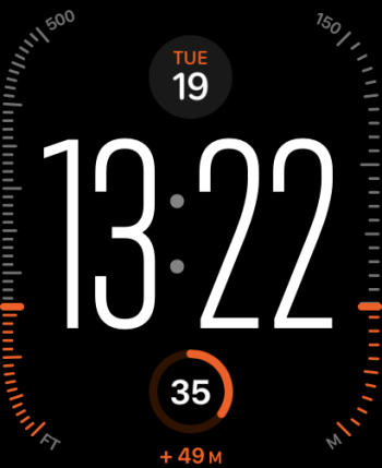
Just by having the seconds active on the time row and the compass and altimeter active I spanked the battery to below 50% in one day. I knew some complications use more power than others but I didn’t think it would be so pronounced.
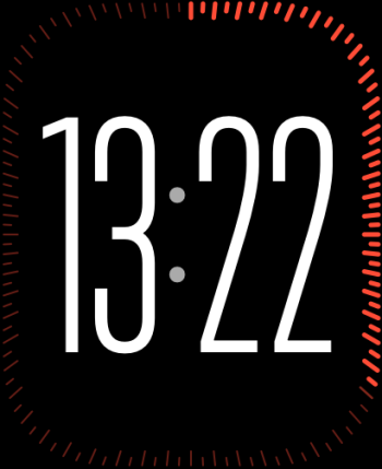
Simply switching the altimeter to the seconds round the bezel and the compass to the Rain conditions my battery life is back to where it was before I’m currently sitting at 52% after 36 hours of use.

I mean extra power drain for extra sensors being active is expected I was just surprised to see how much extra it used. Don’t get me wrong though the altimeter around the bezel did look cool as hell and the compass at the top right was nifty but ultimately it’s data I wouldn’t normally use all the time so switching them off for battery gains was the best course of action for me personally.

IMG_0562.jpeg

Before

image.jpg

After
 

Stuey3D

macrumors 6502a
Original poster
Jul 8, 2014
836
953
Northamptonshire, United Kingdom
As for the bugs I’ve found.

The auto night mode can be a bit finicky and really needs a sensitivity slider. I’ve had it go red in a fairly well lit room making it difficult to see the smaller elements on the screen. I have then subsequently had it full colour in a pitch black room only fixing itself when I’ve moved from a dark room into a lit room and then back again.

The heart rate complication in the middle that I have (see above post screenshots) I have seen it where the BPM readout is offset to the how many minutes ago text with the chart being squished underneath. Next time this happens I’ll take a pic. It’s not a major issue just an odd visual bug that makes the face look a bit cheap and as if I’d used a 3rd party face creator rather than a genuine Apple face.
 

xDKP

macrumors 68020
Feb 27, 2011
2,488
2,634
Denmark
I've had elevation active as well and think it looks cool (but have zero use for it) so will change it if it can give more battery.
 
  • Like
Reactions: Stuey3D

BenGieCruz

macrumors regular
Nov 8, 2012
141
76
US/Belgium
The night mode needs to go back to the crown! I don't want it on auto and certainly don't want to mess with the app to get it turned on. this update seems counter intuitive as far as night mode goes....
 

Stuey3D

macrumors 6502a
Original poster
Jul 8, 2014
836
953
Northamptonshire, United Kingdom
IMG_0565.jpeg


Here is an example of that heart rate complication bug. It’s almost as if when they coded it they didn’t code in enough space so the complication is offsetting it as you see even though loads of dead space to the side.
 
  • Like
Reactions: xDKP

Pagemakers

macrumors 68030
Mar 28, 2008
2,904
1,201
Manchester UK
Holy crap. I’m more concerned about the state of the bezel. Think that’s just put me off upgrading to the ultra. I have a series 5 SS and it’s in waaaaaay better condition and I don‘t molly-coddle my watch. I think you’ve just answered my concerns about the Ultra bezel.
 
  • Like
Reactions: Bryan Bowler

Stuey3D

macrumors 6502a
Original poster
Jul 8, 2014
836
953
Northamptonshire, United Kingdom
Holy crap. I’m more concerned about the state of the bezel. Think that’s just put me off upgrading to the ultra. I have a series 5 SS and it’s in waaaaaay better condition and I don‘t molly-coddle my watch. I think you’ve just answered my concerns about the Ultra bezel.
Do bear in mind and the orange work wear gives it away, but I work for a water company and this watch goes into some pretty nasty places. The fact that it looks this good after nearly a year is nothing short of spectacular especially as the screen doesn’t have a mark on it.
My aluminium Series 3 & Series 6 looked like they’d done a tour of a war zone within a month.

IMG_0049.jpeg

Here is my Series 6 for comparison, so for me the Ultra is holding up bloody well.
 

Pagemakers

macrumors 68030
Mar 28, 2008
2,904
1,201
Manchester UK
I get the aluminium and plastic screen would mark like that but I am surprised with the Ultra. Thanks for posting and sorry for hijacking your thread!
 

Stuey3D

macrumors 6502a
Original poster
Jul 8, 2014
836
953
Northamptonshire, United Kingdom
I get the aluminium and plastic screen would mark like that but I am surprised with the Ultra. Thanks for posting and sorry for hijacking your thread!
The aluminium has a standard glass screen, the ultra and the SS are sapphire screens which kinda explains how it is holding up so well.

There is one incident that really impressed me with the Ultra which would’ve destroyed the aluminium standard model and probably even the SS model with its sapphire screen.

I was up a ladder chiseling away at the crappy rendering on the side of my house when a massive chunk came off and dropped down right onto my wrist smashing the Ultra full force on the face, I thought for sure I’d be using Apple care for the first time on an Apple Watch as the impact was hard and it proper hurt my wrist. However I blew the dust off the Ultra and not a mark on it. The flat screen really proved itself with this one, I suspect the domed screens of the standard models would’ve smashed no matter the material.
 
  • Like
Reactions: Allen_Wentz

Friscochris

macrumors member
Jul 22, 2009
74
62
Holy crap. I’m more concerned about the state of the bezel. Think that’s just put me off upgrading to the ultra. I have a series 5 SS and it’s in waaaaaay better condition and I don‘t molly-coddle my watch. I think you’ve just answered my concerns about the Ultra bezel.
I ride dirt bikes (in very gnarly places), snowboard, etc with mine on. It still looks pristine.
 

Bryan Bowler

macrumors 601
Sep 27, 2008
4,067
4,442
These great posts about the durability of the Ultra is why I chose not to get Applecare. I also saw a video where they literally put an Ultra though hell and back, like beating it against the asphalt and also dragging it behind a car doing 40mph and the screen was still pristine...
 

theotherphil

macrumors 6502a
Sep 21, 2012
899
1,234
These great posts about the durability of the Ultra is why I chose not to get Applecare. I also saw a video where they literally put an Ultra though hell and back, like beating it against the asphalt and also dragging it behind a car doing 40mph and the screen was still pristine...
I got AppleCare with the Ultra but won't be renewing after the 7 days with the Ultra 2
 

Stuey3D

macrumors 6502a
Original poster
Jul 8, 2014
836
953
Northamptonshire, United Kingdom
Oh back to the watch face for a minute something I never noticed but it is a nice little attention to detail thing. I am using the multicoloured mode on the watch face so now look at the 2 pictures in the first post and focus on the seconds digits and then look at the bezel complication, yup the seconds are coloured to whatever complication you have around the bezel at the time so orange for the altimeter and grey for the seconds increments. I never noticed it to begin with, but its a real nifty attention to detail thing they've added.
 
  • Like
Reactions: the future and xDKP

Allen_Wentz

macrumors 68040
Dec 3, 2016
3,378
3,829
USA
I get the aluminium and plastic screen would mark like that but I am surprised with the Ultra. Thanks for posting and sorry for hijacking your thread!
It’s not the screen I’m concerned about. It’s the bezel.
It sounds you miss the fact that the Ultra is very tough, far superior to the lower end Apple Watches. I have beaten up on the AW Ultra 1 for a year and consider it much more durable than my previous two AWs. For me the Ultra is more than twice as good as the others in every regard.
 

Debauch

macrumors regular
Jul 6, 2013
216
371
I don’t think battery issues have anything to do with the new face. I’m using the same face as pre WatchOs 10 and I’m down from 100% to 79% is 3 hours. That’s with minimal use since I’ve been in meetings all afternoon.

There may be a bug or it’s doing something in the background.
 

Frankfurt

macrumors 6502a
Dec 4, 2016
740
889
USA
Where did all the weather complications go? Temp, UV, conditions. I don’t see them in the complications listing?
 

Stuey3D

macrumors 6502a
Original poster
Jul 8, 2014
836
953
Northamptonshire, United Kingdom
I don’t think battery issues have anything to do with the new face. I’m using the same face as pre WatchOs 10 and I’m down from 100% to 79% is 3 hours. That’s with minimal use since I’ve been in meetings all afternoon.

There may be a bug or it’s doing something in the background.
It may have been background stuff but the reason I suspect it’s the complications is overnight just after the update it drained around the same rate as normal and if it was doing background stuff post update I would assume it would be doing it overnight too.
 

xDKP

macrumors 68020
Feb 27, 2011
2,488
2,634
Denmark
Just for fun - do people have other small things they do to stretch the Ultra battery? I have once turned off the raise to turn-on feature of the display, because the always-on is clear enough to always see the time anyway.

Alternatively is to turn off the AOD but how much extra does it really give?
 

GDF

macrumors 68000
Jun 7, 2010
1,514
1,617
Really not a fan of the new watch face. Can it be any busier? At least we have lots of other choices. 🙂
 

the future

macrumors 68040
Jul 17, 2002
3,646
5,942
It’s not the screen I’m concerned about. It’s the bezel.

But it is the bezel’s job to take the hits in order to protect the screen. If you get a dent on the Ultra bezel, any other Watch would probably have had a broken screen.
 

RPhoto

macrumors 65816
Jul 18, 2010
1,130
2,294
Surrey, UK
Really not a fan of the new watch face. Can it be any busier? At least we have lots of other choices. 🙂
It can be as busy or minimal as you like, right down to just the time in that lovely large font in the middle - with nothing else on the screen. The full complication setup, especially in multi-colour, isn’t to my liking either. I’m playing with two setups at the moment.

One with large font and seconds on the bezel. One with altitude (just because it’s quite cool looking) on the bezels, date and battery.

And I pick a colour that suits the band and or what I’m wearing.

But like I say you can go even more basic, with just the time, by turning off all complications.
 

Attachments

  • incoming-291D63EA-9816-43E9-B9D1-6D0E6B2E6A71.png
    incoming-291D63EA-9816-43E9-B9D1-6D0E6B2E6A71.png
    31.8 KB · Views: 206
  • incoming-0162BD7F-9B7E-416C-8175-5AC72FBFCFD0.png
    incoming-0162BD7F-9B7E-416C-8175-5AC72FBFCFD0.png
    48.2 KB · Views: 190
Last edited:
  • Like
Reactions: GDF
Register on MacRumors! This sidebar will go away, and you'll see fewer ads.