Become a MacRumors Supporter for $50/year with no ads, ability to filter front page stories, and private forums.

theorist9

macrumors 68040
Original poster
May 28, 2015
3,853
3,036
Suppose I have Word open on the left of my screen, and Finder on the right. Further suppose I use the sidebar as it's designed, and have all my frequently-used folders displayed in it. In the last OS I used (High Sierra), if I wanted to open a new doc, I'd scan down the sidebar, click on the desired folder, and select the doc. Clean and straightforward.

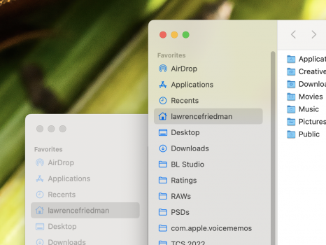
High Sierra does make the text in the dock of the non-active window *slightly* less black, but the difference is subtle, and not enough for me to notice (see first screenshot).

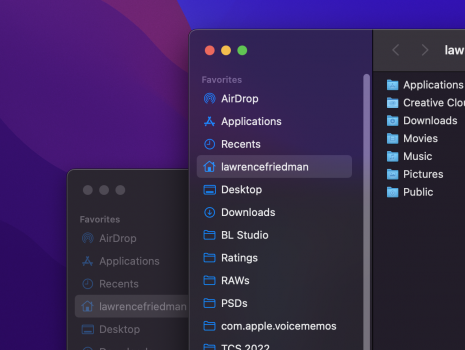
The problem with Monterey* is that it grays out the dock of the non-active window much more agressively (see 2nd screenshot), which also has the effect of making the text look a bit blurry to me (not saying it actually is less sharp, just that this its perceptual effect for me). And blurry text really annoys me :). It's like bokeh for text!

Thus, if I'm working in Word, Finder's sidebar is overly grayed-out, making it harder to read. Thus I have to either scan through the grayed-out text to find the folder I want, or do the extra step of first clicking on Finder to make it active, and then doing my scan, and then clicking on the desired folder

This is also the case if I have two Finder windows opened side-by-side: Only one of their sidebars will be easily readable at a time. Thus this is based on the active window, not the active app. See comparison of High Sierra and Monterey, both on high-contrast settings, below.

Is there any way to defeat this behavior (e.g., via a Terminal command)? I checked Tinker Tool, in the hope that this mind be a hidden setting it can adjust, but it doesn't seem to be:

*I say Monterey, but I don't know when Apple made this change; it may exist in earlier OS's as well.

Finder, Inactive Window on L, Active on R. Note that I have "Increase Contrast" applied in System Preferences/Accesibility, which say it also reduces transparency, but in fact seems to eliminate it entirely. The High Sierra and Monterey screenshots were from 163 ppi and 218 ppi displays, respectively ,which is why the text in the active window of the latter appears both sharper and smaller).

HIGH SIERRA

1653863426389.png


MONTEREY
1653863350628.png
 
Last edited:

FNH15

macrumors 6502a
Apr 19, 2011
822
867
Try Increase Contrast in Accessibility (under System Preferences -> Display).
Not exactly what you want, but it does make text a bit more readable. I personally have it turned off as it makes things a bit too wireframe for my tastes, but you might like it.
 

theorist9

macrumors 68040
Original poster
May 28, 2015
3,853
3,036
Try Increase Contrast in Accessibility (under System Preferences -> Display).
Not exactly what you want, but it does make text a bit more readable. I personally have it turned off as it makes things a bit too wireframe for my tastes, but you might like it.
Already have it on. That helps, but it's still grayed-out as compared to its appearance when it's active.
 
Last edited:

gilby101

macrumors 68030
Mar 17, 2010
2,922
1,617
Tasmania
The problem with Monterey* is that it grays out the UI of any window that's not active.
It is a feature! I agree that it can be annoying. And I don't think there is a complete solution.

macOS does more than just greying the text of the inactive app. For the active app, macOS allows for the sidebar (only the sidebar) of the active app to become slightly transparent allowing the colour of the app behind or the desktop to shine through. This can have the effect of increasing the contrast of the sidebar of the active app.

Try this with just 2 apps with sidebars (e.g. Finder and Safari) with a brightly coloured desktop. Try moving the active window and the sidebar changes according to what is behind.

Try Increase Contrast in Accessibility (under System Preferences -> Display)
You may find Reduce Transparency helpful too.

-------

I use an app called Haze Over which dims all inactive windows (not just their sidebars). Just opposite of what you want.
 

theorist9

macrumors 68040
Original poster
May 28, 2015
3,853
3,036
It is a feature! I agree that it can be annoying. And I don't think there is a complete solution.

macOS does more than just greying the text of the inactive app. For the active app, macOS allows for the sidebar (only the sidebar) of the active app to become slightly transparent allowing the colour of the app behind or the desktop to shine through. This can have the effect of increasing the contrast of the sidebar of the active app.

Try this with just 2 apps with sidebars (e.g. Finder and Safari) with a brightly coloured desktop. Try moving the active window and the sidebar changes according to what is behind.

Ha!

The transparency can increase contrast if the window of the active app happens to be over the default purple desktop of Monterey. But often the window will be on top of another window. So its effect is inconsistent.

You may find Reduce Transparency helpful too.

Since I'm using Increase Contrast, I get Reduce Transparency automatically (and unavoidably):
1653844359606.png


I use an app called Haze Over which dims all inactive windows (not just their sidebars). Just opposite of what you want.
Of course, different users will have different preferences—you like the opposite of what I do. The problem I have with Apple's decision is that instead of offering the non-active-window-UI-dimming as an added option, and letting users choose what works for them, they removed the older functionality. That seems to violate the basic principle that people shouldn't have to adjust to computers, computers should adjust to people.
 

Slartibart

macrumors 68040
Aug 19, 2020
3,140
2,815
Not following how that would help. That seems to increase focus on the active window. My issue is with the non-active windows.
focus-follow-mouse and autoraise will activate the window under the mouse pointer and move it to the foreground.
You move the mouse over the window of choice - on the second, third, whereever monitor - and it becomes active.
If you want it even moves a partial visible windows under the mouse pointer to the foreground.
No clicking required.
 

darngooddesign

macrumors P6
Jul 4, 2007
18,355
10,106
Atlanta, GA
Im not arguing against your preference but as far as I can remember OSX has always greyed-out and reduced the contrast of background windows.

Edit. The change a couple of versions ago when apple started adding transparency to the sidebar. I checked Leopard and while the background window sidebar is low-contrast, the text remained the same black. I can see why it would bother you, but I don't think there is a fix.
 
Last edited:
  • Like
Reactions: theorist9

theorist9

macrumors 68040
Original poster
May 28, 2015
3,853
3,036
I'm not arguing against your preference but as far as I can remember OSX has always greyed-out and reduced the contrast of background windows.
You know, you are right! I've been focusing on the text in the docks, since that's what I like to be able to see across multiple windows. And, on High Sierra, while there is some difference, it's subtle enough that I didn't notice it until I just looked closely (see compative pics below). [There is more of a difference with the other portions of the UI.]

By contrast, with Monterey, the loss of contrast in the docks of non-active windows is much more striking. I've edited my original post to reflect this (see the screenshots I added above).

Edit. The change a couple of versions ago when apple started adding transparency to the sidebar. I checked Leopard and while the background window sidebar is low-contrast, the text remained the same black. I can see why it would bother you, but I don't think there is a fix.
Except I'm using Increase Contrast, which says it also reduces transparency, but actually seems to eliminate it entirely. So for the configuration I'm using, the difference isn't because of transparency, it's because the text is grayed-out.
 
Last edited:

darngooddesign

macrumors P6
Jul 4, 2007
18,355
10,106
Atlanta, GA
Except I'm using Reduce Contrast, which says it also reduces transparency, but actually seems to eliminate it entirely. So for the configuration I'm using, the difference isn't because of transparency, it's because the text is grayed-out.
I think the issue is that back when the sidebar had a color to it, it could change to white and indicate the window's background state easily, but now that there is no color to the side bar, fading the sidebar text is the only way to indicate the window's background state.

Turning off "Allow wallpaper tinting in windows" might help a little. System Prefs > General.
 

gilby101

macrumors 68030
Mar 17, 2010
2,922
1,617
Tasmania
Just so we are all on the same page, Apple Human Interface Guidelines for Sidebars are here: https://developer.apple.com/design/human-interface-guidelines/macos/windows-and-views/sidebars/

Scroll down to "Apply the correct background appearance to a sidebar" to see how Apple intends sidebars should look in both application main windows and in panels.

I find it hard to believe that anyone could think that attractive, but then I was incredulous when the purple wallpaper appeared!
 

theorist9

macrumors 68040
Original poster
May 28, 2015
3,853
3,036
Just so we are all on the same page, Apple Human Interface Guidelines for Sidebars are here: https://developer.apple.com/design/human-interface-guidelines/macos/windows-and-views/sidebars/

Scroll down to "Apply the correct background appearance to a sidebar" to see how Apple intends sidebars should look in both application main windows and in panels.

I find it hard to believe that anyone could think that attractive, but then I was incredulous when the purple wallpaper appeared!
Thanks for that link, though I didn't see any mention in it of the question at hand, which is how Apple handles sidebars for non-active windows.

Also, I was confused by this: "Use an opaque background when a window contains more than one sidebar", because their example of when you'd use an opaque sidebar seemed to show a window with only one sidebar.
 

darngooddesign

macrumors P6
Jul 4, 2007
18,355
10,106
Atlanta, GA
Just so we are all on the same page, Apple Human Interface Guidelines for Sidebars are here: https://developer.apple.com/design/human-interface-guidelines/macos/windows-and-views/sidebars/

Scroll down to "Apply the correct background appearance to a sidebar" to see how Apple intends sidebars should look in both application main windows and in panels.

I find it hard to believe that anyone could think that attractive, but then I was incredulous when the purple wallpaper appeared!
Sidebar and sidebar contrast looks fine to me, but I don't use purple wallpapers.

Screen Shot 2022-05-31 at 12.12.29 PM.png
 

darngooddesign

macrumors P6
Jul 4, 2007
18,355
10,106
Atlanta, GA
View attachment 2011728
I do, and it looks fine to me - but maybe in light mode + a purple wallpaper it would look different. I’m using the 10.5 Leopard aurora wallpaper (upscaled to 5K), for reference.
Yeah, even the default wallpaper in dark mode is fine for me, but I do think inactive sidebars could be a bit too low-contrast for some folks. I wonder if it actually meets WCAG contract guidelines.

Screen Shot 2022-05-31 at 12.18.27 PM.png
 
Register on MacRumors! This sidebar will go away, and you'll see fewer ads.