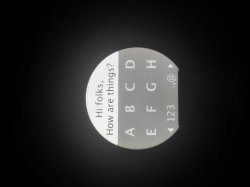
Hi folks,
i recently got my moto 360 (stunning build quality btw) and I'm tinkering around right now creating a messenger app. You can swipe the keys to get to the rest of the alphabet, there also is an automated function to give the user .com/.co.uk/.de when typing an url, also an easy copy-paste function. What you guys think so far?
I would also like to point out some challenges, first the round shape, the tiny space, the led backlight. Also the display isn't really displaying things the same it does on the macbook, colors look different.
Its really really hard because on the tiny space shapes can look easily cluttert, colors either overpoweringly dark, there also is little contrast on that screen.
The only way is really to go minimalist, retro-flat grainy, and going that route its really easy to make it look cheap. I think Apple will have an easier job just because of the OLED screen and its darkness and contrast. But all in all its an amazing watch. Too bad it doesn't run iOS.


