Become a MacRumors Supporter for $50/year with no ads, ability to filter front page stories, and private forums.

mkarthik

macrumors newbie
Original poster
Jul 25, 2012
2
0
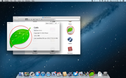
Some of the app colours look dull when displayed in Dock/Finder/Launchpad, but they show up correctly in Quicklook/Mission Control. I've included a screenshot to show it, in this case the app 'Coda', where the icon is clearly desaturated. Can anyone suggest me any fixes? (I've tried deleting the color profile, resetting caches, etc. but with no results)
 

Attachments

  • Screen Shot 2012-07-25 at 11.02.06 PM.png
    Screen Shot 2012-07-25 at 11.02.06 PM.png
    1.6 MB · Views: 653
Last edited:

bnpluss

macrumors newbie
Jul 26, 2012
2
0
Exact same issue here too!

I thought I was just seeing things, but I have the exact same problem, and using this method, I was able to get the same results as the OP.

I am running a mid-2011 MacBook Air.
 

Starhawk

macrumors regular
Jul 9, 2008
103
17
I think it's a stylistic change. I definitely noticed that the icons in my dock were more "muted" in color than before.
 

ninja9

macrumors newbie
Jul 17, 2012
12
0
Exact same problem as the OP. It's really noticeable with Chrome.

I'm on a MacBook Air Late 2010.
 
Last edited:

ScottishCaptain

macrumors 6502a
Oct 4, 2008
871
474
ColorSync support in 10.8 seems to be totally haywire.

It doesn't affect Dock or Finder icons, which is what you're noticing here. It also seems to affect WebKit rendering in Safari, which appears to try and take the monitor profile into consideration now (so untagged images are treated as sRGB tagged images by default).

Of course, this worked in 10.6.8 (remember when everything "just worked"?).

I'm guessing it'll be 10.8.1 or 10.8.2 before they get around to fixing it.

-SC
 

Stooby Mcdoobie

macrumors 6502a
Jun 26, 2012
834
45
Maybe my eyesight isn't as good as yours, but I honestly can't tell the difference between those. I think your eyes might be playing tricks on you and the new, shinier dock is making the icons seem duller in comparison.
 

Andrew Kinnear

macrumors newbie
Feb 8, 2012
7
4
Chester, UK
ColorSync support in 10.8 seems to be totally haywire.

It doesn't affect Dock or Finder icons, which is what you're noticing here. It also seems to affect WebKit rendering in Safari, which appears to try and take the monitor profile into consideration now (so untagged images are treated as sRGB tagged images by default).

Of course, this worked in 10.6.8 (remember when everything "just worked"?).

I'm guessing it'll be 10.8.1 or 10.8.2 before they get around to fixing it.

-SC

Agreed Captain,

This is changed behaviour in ML, see here for in-depth analysis.

Suspicions can be confirmed using the Digital Color Meter tool in the Utilities folder.

I've tried using the ColorFaker app made available in the linked article, this sorts the problem I have with Acrobat X falling back to sRGB, but sends all of the OS colour management out of sync. App Switcher icons don't match Dock or Finder Icons, desktop pictures and standard Finder labels change (become more or less saturated).

The Dock icons seem to have an extra layer of colour management applied as they don't change proportionally (on my system) with everything else when profiles are switched.
 

ianmacc

macrumors newbie
Aug 1, 2012
5
0
I have the opposite problem. The icon colours appear more saturated/vivid than before, but only on one upgraded Mac Pro of two

I have the same issue as you, Andrew.

My ML Dock Icons are way more saturated and contrasty than they should be on my Eizo CG241W monitor, colour calibrated using Eizo's own ColorNavigator.

However, images in Photoshop CS6, Bridge etc look correct and are comparable with Lion (which is on a separate partition just for safety.)

Interestingly, I have just done a Screen Grab of my ML Desktop, saved it and rebooted in Lion 10.7.3.

Looking at the Mountain Lion grab from within Lion, the problem has been "captured" in the grab i.e.: the colours of the Dock icons are way too saturated and contrasty, easily visible when shown against the actual Dock Icons in Lion.....

I don't know where I go from here, other than this issue everything else in ML is running smoothly.

Any other ideas/solutions would be welcome

Many thanks, Ian (Manchester, UK)
 

Andrew Kinnear

macrumors newbie
Feb 8, 2012
7
4
Chester, UK
I have the same issue as you, Andrew.

My ML Dock Icons are way more saturated and contrasty than they should be on my Eizo CG241W monitor, colour calibrated using Eizo's own ColorNavigator.

However, images in Photoshop CS6, Bridge etc look correct and are comparable with Lion (which is on a separate partition just for safety.)

Interestingly, I have just done a Screen Grab of my ML Desktop, saved it and rebooted in Lion 10.7.3.

Looking at the Mountain Lion grab from within Lion, the problem has been "captured" in the grab i.e.: the colours of the Dock icons are way too saturated and contrasty, easily visible when shown against the actual Dock Icons in Lion.....

I don't know where I go from here, other than this issue everything else in ML is running smoothly.

Any other ideas/solutions would be welcome

Many thanks, Ian (Manchester, UK)

Yes Ian, looks like we have the same symptoms.

The good news is that it's just a display thing/problem in the OS, it doesn't affect actual colour management across Adobe apps with the exception that PDF's in Acrobat de-saturate because of the defaulting to sRGB. This is a problem for me as I work in pre-press and use Acrobat for final visual proofing, but at least the underlying values are correct and not being bent. All other Adobe CS apps display fine.

Other apps I've noticed that are affected/not being recognised by Colorsync are Java apps running in a Safari window and Microsoft Remote Desktop Connection. I'm sure there are plenty more.

If you're in a similar situation ColorFaker sorts the Acrobat problem but the rest of the OS looks weird. Bizarrely, although file label colours and the dock look even more vivid using ColorFaker, App Switcher icons look de-saturated.

So, if you're dealing with artwork, need visually correct PDF's and you can put up with you're eyes hurting in the OS I think we'll have to use ColorFaker until it gets sorted (hopefully).

I've submitted a bug report to Adobe, will get on and do the same with Apple.
 

ianmacc

macrumors newbie
Aug 1, 2012
5
0
Thanks for the info Andrew, it's very interesting.

I will keep an eye on the forums over the next few days/weeks to see if a solution will be made available by Apple/Adobe - or both.

Regards, Ian
 

Tim3308

macrumors member
Jul 14, 2004
32
0
Andrew showed me this thread - thanks. Yes, it's the wide gamut displays that apple's dock is making the app icons look like some 4th grade girl's backpack - screaming color(firefox icon is hard to look at!), like adobe RGB tripled. Our iMac and Macbook Pro's docks icons look "normal", not wide gamut displays.
 

Stridder44

macrumors 68040
Mar 24, 2003
3,973
198
California
Agreed Captain,

This is changed behaviour in ML, see here for in-depth analysis.

Suspicions can be confirmed using the Digital Color Meter tool in the Utilities folder.

I've tried using the ColorFaker app made available in the linked article, this sorts the problem I have with Acrobat X falling back to sRGB, but sends all of the OS colour management out of sync. App Switcher icons don't match Dock or Finder Icons, desktop pictures and standard Finder labels change (become more or less saturated).

The Dock icons seem to have an extra layer of colour management applied as they don't change proportionally (on my system) with everything else when profiles are switched.


Thank God, I thought I was going crazy. I really hope they fix this in a point release update.
 

drewbiwan

macrumors newbie
Aug 18, 2012
2
0
It's definitely only WebKit for me - as soon as I turn on Chrome, the color palette for the entire OS goes blue (literally everything, dock, finder, etc). Once I turn Chrome off, it gets those nice warm reds and oranges back, and looks great.

Hopefully we'll get an update at some point, it's definitely a pain.
 

ixodes

macrumors 601
Jan 11, 2012
4,429
3
Pacific Coast, USA
I've just chalked it up to one more of the typical bugs that exists. I'm sure Apple will get it sorted out with time.

Despite their tendency to hype the product, making rather exaggerated claims, they mean well and usually back up the claims at some point in the future. They can't help themselves, they love to use their age old, and very effective marketing techniques.

Of greater concern from my perspective, is just how Apple will do now that Jobs, the ultimate salesman is gone. A guy that could sell anything to anyone, marketing was his best skill. Without him to whip the crowd into a buying frenzy, I wonder how long it will take before sales taper down.
 

ScottishCaptain

macrumors 6502a
Oct 4, 2008
871
474
Has anyone else had any success in finding some sort of random hack to fix this?

I'm well aware of ColorFaker, but as Andrew pointed out while it does fix some things it seems to mangle more other stuff then the hack is worth. This is the only issue preventing me from upgrading to ML, and I want to upgrade- but not at the expense of having red icons so oversaturated that they threaten to melt through my LCD screen.

-SC
 

EnzoFX

macrumors newbie
Jun 7, 2009
7
0
I just noticed this too on my ML install. Oversaturation. Most notable on certain red icons on the dock =P. This makes me weary of installing ML on my primary partition =/. I too have a wide gamut screen.

On another note, I noticed font smoothing was turned up significantly. I had to disable it in Sys Prefs. Anyone else experience this?
 

SuperTango

macrumors newbie
Aug 23, 2011
7
3
I just noticed this too on my ML install. Oversaturation. Most notable on certain red icons on the dock =P. This makes me weary of installing ML on my primary partition =/. I too have a wide gamut screen.

On another note, I noticed font smoothing was turned up significantly. I had to disable it in Sys Prefs. Anyone else experience this?

Wait...the OP said that the dock icons were muted, not oversaturated. This thread has completely flipped to oversaturated dock icons.

I'm having the same issue as the OP (muted dock icons).
 

Andrew Kinnear

macrumors newbie
Feb 8, 2012
7
4
Chester, UK
Wait...the OP said that the dock icons were muted, not oversaturated. This thread has completely flipped to oversaturated dock icons.

I'm having the same issue as the OP (muted dock icons).

Yep sorry, that's my fault. At first I thought they were two ends of the same problem, now it seems that the over-saturation is restricted to those with wide gamut monitors, they're both colour management problems but we're not going to be able to help each other. All we've established so far is that Colorsync implementation is incredibly inconsistent in ML.

If any of you psychedelic dock guys want to start a new thread it might be a good plan, I don't have any news at the moment other than I tried to run away and downgrade to SL (I know, I'm chickensh*t) but got stopped by email Mailbox issues. Another thread!
 
Register on MacRumors! This sidebar will go away, and you'll see fewer ads.