Got a tip for us?
Let us know
Become a MacRumors Supporter for $50/year with no ads, ability to filter front page stories, and private forums.
MR Re-Design
- Thread starter Me1000
- Start date
- Sort by reaction score
You are using an out of date browser. It may not display this or other websites correctly.
You should upgrade or use an alternative browser.
You should upgrade or use an alternative browser.
It looks nice and the articles made me chuckle...
Edit: Sorry I'm not the best person to be dishing out advice on web design at this point.
Edit: Sorry I'm not the best person to be dishing out advice on web design at this point.
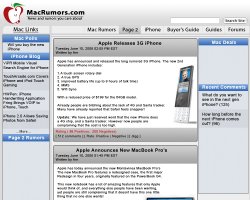
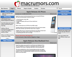
The color palette looks spot on, as do the gradients. As far as look, its fairly good, but the fonts all need to be scaled down a lot. The one lesson for design I've come to appreciate most is that fonts rarely look best when they are big and in your face.
Specifically, the nav bar along the top looks a little disjointed with the big blank space on the left. Also the use of rounded corners is pretty scattershot. The black hairline borders are also out of place. There also seem to be a lot of thin spaces between the various blocks and there doesn't seem to be any fixed width to them.
Specifically, the nav bar along the top looks a little disjointed with the big blank space on the left. Also the use of rounded corners is pretty scattershot. The black hairline borders are also out of place. There also seem to be a lot of thin spaces between the various blocks and there doesn't seem to be any fixed width to them.
no it's fine, I edited my post because I figured the only thing people would talk about would be the articles...It looks nice and the articles made me chuckle...
Edit: Sorry I'm not the best person to be dishing out advice on web design at this point.
Thank you.The color palette looks spot on, as do the gradients.
I agree, however it could also be the font itself. I dont like the "Mac Links" text, or the black text under the "mac Polls", "iPhone Blog" sections etcAs far as look, its fairly good, but the fonts all need to be scaled down a lot. The one lesson for design I've come to appreciate most is that fonts rarely look best when they are big and in your face.
I thought the same thing, Im just not sure how to fix it so that it looks better. Also remember the Mac Rumors site has a variable width design. So it needs to be scalable.Specifically, the nav bar along the top looks a little disjointed with the big blank space on the left.
Can you elaborate a little more on this?Also the use of rounded corners is pretty scattershot.
Really? I guess I could increase the transparency on them a little, causing them to gray out...The black hairline borders are also out of place.
You're right.There also seem to be a lot of thin spaces between the various blocks and there doesn't seem to be any fixed width to them.
When I create a website temple I dont really focus on giving everything the perfect spacing, because that stuff (at this point) is irrelevant to my work. The only purpose it would serve would be to be more ascetically pleasing to the eye for the client. However everything can/will be aligned perfectly using CSS when the template is made into a production page.
Thank you for your feedback...
Keep shooting away!
we should make this a thread where people post their own ideas of what a mr redesign could look like! i might post something later...
Can you elaborate a little more on this?
The "Mac Links" box has a rather large radius (but only on one corner), while the main articles down the middle have a smaller radius (but on both top corners). Then all the other boxes have square corners. There just isn't any consistency going on here. I'd say either go with one radius everywhere or one pattern for rounding corners (either only the top left or only both top).
Just a word more about the black hairlines. The left and right columns are outlines in black, but have no black lines breaking up the various sections within each column. The main article column down the middle, however has each article outlined individually. Furthermore, the header for each article, even though it is already defined by a gradient, also has a black hairline along its bottom edge (even the gradient for the footer in the articles doesn't have a black link on all sides). None of the other section headers have black lines. They just have the gradients.
I do like the direction you're going in, and these are all minor design issues.
If I might add one new bit of criticism/advice, along the top nav bar, you have doubled up on the visual separators between the links. For one, you have a nice wide space between links. That, along with the capital letters should be enough to give the reader the right idea. However, you also have faint grey lines between the links. This is a little redundant and just adds to the visual complexity. Having a different background for the current page works pretty well with or without these thin lines.
Ok, one final note: it would be interesting to see the search box get better integrated into the design of the site. I don't know how exactly, but I've always thought it looked a little out of place just sitting there at the top of the page.
Attachments
hmm...
I like that...
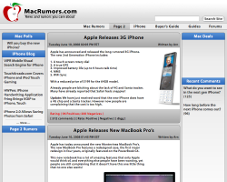
With this you also have the ability to fit the search bar into the nav bar on the left side. Ill shop something together, and update in a sec!
")
EDIT: well the color changed a little when I exported it from photoshop, but for the most part it looks fine...
I like that...
With this you also have the ability to fit the search bar into the nav bar on the left side. Ill shop something together, and update in a sec!
EDIT: well the color changed a little when I exported it from photoshop, but for the most part it looks fine...
Attachments
Looking at this now, the standard sized search bar looks cramped in the link bar we've got there. Plus, Apple has done a pretty consistent job of having search boxes on the right edge, not the left. If nothing else, keeping the search on the right (in some capacity) would be consistent with the current MR design. To be honest, I don't know what would be best here.
hmm...
I like that...
With this you also have the ability to fit the search bar into the nav bar on the left side.
Search on the left is very counter mac-intuitive, as spotlight is in the right hand corner, and counter web-browser-intuitive, as Ff and Safari have built-in search bars on the top right. Swap search and main tabs. In actual tab browsing, the tabs originate from the left, so going there for the main links is more intuitive, as well, so the swap would make for better ease-of-use.
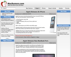
I was never a fan of the orangey brown that Mac Rumors use for the title, I did a little mock-up and I think all blue works pretty well:

Opinions?
Opinions?
I was never a fan of the orangey brown that Mac Rumors use for the title, I did a little mock-up and I think all blue works pretty well
Opinions?
The new branding at the top looks good, much better than before. I especially like the search bar and the "submit tip" button (although the two are awfully close to each other).
If I were to try to come up with some criticism, I would have to point out that the main article headlines really get lost in the page. There should probably be a more visual clue that they are important, either with font size, color, or something else. The use of only square corners actually comes out looking pretty good, but I do miss the softer edges. Then again, I was one of the few Mac users who still yearn for the rounded edges of the pre-Leopard Menu Bar. Pretty much all of the other design tweaks are really impressive.
One other thing I noticed was that you shied away from using capital letters (at least in some places). You have "page two" in the nav bar at the top, yet "Page 2" in the stories section in the left column. Alas, the system will always be unachievable as long as you have words like iPhone and iPod floating around on the site!
I agree I like the larger header...
I added a submit news button as well, however the roundness didnt look right with it, so I made it square which made the rest of the rounded corners for the blue parts look off too. So I just squared everything off. Though I dont know what font exactly you used for the text I didnt want to run through the 2000 typefaces I had just for a mockup...
I added a submit news button as well, however the roundness didnt look right with it, so I made it square which made the rest of the rounded corners for the blue parts look off too. So I just squared everything off. Though I dont know what font exactly you used for the text I didnt want to run through the 2000 typefaces I had just for a mockup...
Attachments
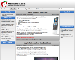
Thank you,the op's one is, sorry, hideous..
opinions on how to make it better would be more helpful!
Thank you,
opinions on how to make it better would be more helpful!
okay..
-first it looks to crowded.. maybe more spacing would be nicer..
-too many gradients
-I would make it wider
-less spacing between the article title and the window..
-maybe a more simple font.
Ill respectfully disagree,okay..
-first it looks to crowded.. maybe more spacing would be nicer..
The important thing is that spacing can always be easily adjusted though through CSS when the design is made into an actual page.
IMO that is nature of Apple, open up something like the finder, iTunes, Safari. You will see gradients on just about everything.-too many gradients
Fluid width design, just like it is now... This was already covered before!-I would make it wider
sorry, I find this funny because you said it needed more space above.-less spacing between the article title and the window..
Anyway, this is again something that is easily fixed with CSS.
You are limited to the fonts you can use in XHTML, I dont recall exactly what I used for this, but it was probably verdana or something like what is used now...-maybe a more simple font.
--------
I guess when I originally submitted this I didnt expect people to nitpick the picture because when I design a template in Photoshop I just do enough so that I can slice it up and make the images that are needed and get a general idea of how I want it to look. I dont slave over every pixel because it is pointless because im just going to have to slave over it again when I finally start coding the design.
And I hope it doesnt sound like im oppose to people not liking my design or people suggesting changes. Because I am not, not at all! I welcome changes to make it better (as you can tell from the changes that have already been made) I just think it is a little rude to say "this is hideous", if that is all you offer you might as well just not say anything. Suggesting changes like, "you should probably round all the corners, or square them off" makes a lot more sense, and is much more helpful!
I guess when I originally submitted this I didnt expect people to nitpick the picture
I understand your point, but if you throw it out and ask for feedback... you're gonna get it... good and bad... helpful and nitpicky. Roll with it and eat the fish and discard the bones.
Just remember, it is probably never as bad as some say it is, but it probably isn't as good as others say it is either.
Woof, Woof - Dawg

I'm not a web designer, or graphics designer (just an illustrator/animator), so take my words with a grain of salt.
I think it's fab that you are trying this, and shared it with us for feedback. The nitpicks are free, too.
Have you considered trying something totally different than the status quo? What are your likes and dislikes about how it is now? What changes are you aiming for? What do you think is great about how it is now, and think should remain the same?
Good luck to you.
Ill respectfully disagree,
The important thing is that spacing can always be easily adjusted though through CSS when the design is made into an actual page.
IMO that is nature of Apple, open up something like the finder, iTunes, Safari. You will see gradients on just about everything.
Fluid width design, just like it is now... This was already covered before!
sorry, I find this funny because you said it needed more space above.
Anyway, this is again something that is easily fixed with CSS.
You are limited to the fonts you can use in XHTML, I dont recall exactly what I used for this, but it was probably verdana or something like what is used now...
--------
I guess when I originally submitted this I didnt expect people to nitpick the picture because when I design a template in Photoshop I just do enough so that I can slice it up and make the images that are needed and get a general idea of how I want it to look. I dont slave over every pixel because it is pointless because im just going to have to slave over it again when I finally start coding the design.
And I hope it doesnt sound like im oppose to people not liking my design or people suggesting changes. Because I am not, not at all! I welcome changes to make it better (as you can tell from the changes that have already been made) I just think it is a little rude to say "this is hideous", if that is all you offer you might as well just not say anything. Suggesting changes like, "you should probably round all the corners, or square them off" makes a lot more sense, and is much more helpful!
I'm just being honest of what I personally find about the mockup you made. No need to get angry. These are maybe little changes I mentioned but they make a big difference.
Register on MacRumors! This sidebar will go away, and you'll see fewer ads.