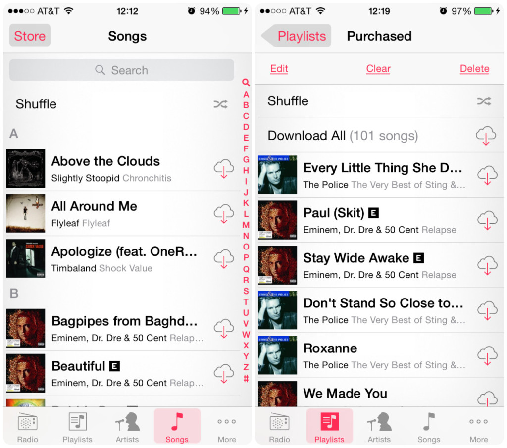
Just switched back to iOS after a while. Last time I used it the Music app was pretty good, could cycle between Artists, Songs etc. on the bottom tab (iOS8 maybe)

Now my entire library is crammed into the 'Libary' tab. All the bottom tabs are now useless. I don't care about 'Connect'. I don't care about 'Radio'. 'Search' used to be just a scroll up and a search box would appear (like in the above image). Why does it need it's own tab?!?
When I first opened the App, I had all my purchased music showing up when I didn't want them to. No option to remove them. Had to manually delete them from my library weirdly (where-as before there was a button to 'Hide all Purchased').
Even tiny things, like Artists, Albums, Songs in the Library view, are just text with no icons, so at a glance it's more difficult to navigate.
It's ugly. Cumbersome. Clearly aimed at making having your own library difficult and making you switch to Apple Music. It's sad to see really. The whole reason I got an iPhone originally was because I bought an iPod Touch. And the whole reason I bought an iPod Touch was because I bought an iPod Photo (back in the day). Now it's just a money grab.
Any decent alternatives that don't insist you 'subscribe to this' and 'buy this'? And works much the same as the Music app used to? And doesn't look cheap and ugly? Or am I going to have to downgrade to iOS8 or something? Any secret tips for making the App less awful?
I'm all for Apple Music, if people want that then that's up to them. But screwing over people who don't want Apple Music, making their experience noticeably worse is really bad and shame considering Apple's long history with music/iPod.
I hope that they create a separate Apple Music app for those who aren't interested, but lets be honest, the way it's going, it's going to become more and more Apple Music orientated, chip away at iTunes and having your own library until the app just becomes Apple Music. People either move to another app or just sigh and hand over their money to Apple.

