Got a tip for us?
Let us know
Become a MacRumors Supporter for $50/year with no ads, ability to filter front page stories, and private forums.
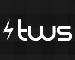
My Business Logo - Critiques/Suggestions Please
- Thread starter thunderweb
- Start date
- Sort by reaction score
You are using an out of date browser. It may not display this or other websites correctly.
You should upgrade or use an alternative browser.
You should upgrade or use an alternative browser.


you did the same thing as I thought of - a lightning strike but I then realised it wasn't thunder 
Well I figured the symbolism between lightning and thunder would go nice together. Were you thinking of doing something similar?
I thought of using 3 lightning strikes to give a w shape sort of like /// but as the strikes bif you get what I mean.Well I figured the symbolism between lightning and thunder would go nice together. Were you thinking of doing something similar?
I thought of using 3 lightning strikes to give a w shape sort of like /// but as the strikes bif you get what I mean.
Oh gotcha. Well don't let me stop you. Go right ahead.
Think you should try and integrate the bolt into the lettering. Right now it kind of seems like a typeface sitting next to a bolt instead of one logo. I would try and modify the font in illustrator and make it more of your own. Also, watch out that you dont mimic other logos like http://mac.appstorm.net/
Ok I'll try and play around with that a bit. Any suggestions on what letter to replace with it?
Ya I know what you mean. I didn't see the App Storm logo till just recently and I designed this 2 years ago and it's just been sitting on my hard drive.
Ya I know what you mean. I didn't see the App Storm logo till just recently and I designed this 2 years ago and it's just been sitting on my hard drive.
Think you should try and integrate the bolt into the lettering. Right now it kind of seems like a typeface sitting next to a bolt instead of one logo. I would try and modify the font in illustrator and make it more of your own. Also, watch out that you dont mimic other logos like http://mac.appstorm.net/
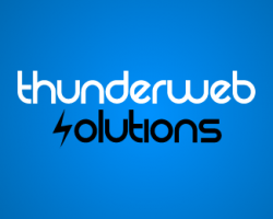
^^ I agree w/ this. Beyond that, I like the blue one. Has the most graphic punch to my eye.

Last time I did a workshop with a logo with a thunderbolt in it the focus group thought "SS" or "KISS"....
Although yours is nothing like that it's a nice concept to start with, I think the blue with the grey is a much nicer palette. Font wise, I am not sure it just doesn't look as though it's lining up correctly, try a few variations of different "tech" fonts.
Although yours is nothing like that it's a nice concept to start with, I think the blue with the grey is a much nicer palette. Font wise, I am not sure it just doesn't look as though it's lining up correctly, try a few variations of different "tech" fonts.
small point:
rather than changing the font, crank up the x-height on that t so the cross-bar lines up with the top curve of the h. It would make a lot easier to read. Especially considering that the t is the opening letter of the word
Agree with that, in fact to me the "u" and the "w" look a little out of proportion too; also the spacing seems strange around the "i" and "l". I do like the font; similar to Bauhaus.
As to the lightning bolt, IMHO it may work better as a separator rather than substituting a letter i.e. between thunder and web, or between web and solutions?
I don't like the "S" as a lightning bolt. It's been done too many times (and conjurs KISS and SS, as mentioned above). What about flipping the bolt and using it as the "N" in "thunder" instead?
Also, you might want to modify the font a little to make it your own. How about adjusting the "T" so the cross aligns with the tops of the other letters?
Here's a quick mockup of what I mean.
Edit: you'd also want to change the "T" in solutions...I just forgot to.
Also, you might want to modify the font a little to make it your own. How about adjusting the "T" so the cross aligns with the tops of the other letters?
Here's a quick mockup of what I mean.
Edit: you'd also want to change the "T" in solutions...I just forgot to.
Attachments

small point:
rather than changing the font, crank up the x-height on that t so the cross-bar lines up with the top curve of the h. It would make a lot easier to read. Especially considering that the t is the opening letter of the word
Ok I'll defiantly do that.
Agree with that, in fact to me the "u" and the "w" look a little out of proportion too; also the spacing seems strange around the "i" and "l". I do like the font; similar to Bauhaus.
As to the lightning bolt, IMHO it may work better as a separator rather than substituting a letter i.e. between thunder and web, or between web and solutions?
I really like that font you mentioned.
I don't like the "S" as a lightning bolt. It's been done too many times (and conjurs KISS and SS, as mentioned above). What about flipping the bolt and using it as the "N" in "thunder" instead?
Also, you might want to modify the font a little to make it your own. How about adjusting the "T" so the cross aligns with the tops of the other letters?
Here's a quick mockup of what I mean.
Edit: you'd also want to change the "T" in solutions...I just forgot to.
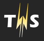
Wow thank you so much for taking the time to mock that up. I really appreciate it! I really like the way that you replaced the N with the lightning bolt. I'm really liking how you did that. Having the cross bar on the T line up looks much better as well. I'll work on it today and post my changes tonight. Thanks so much for the help!
Didn't work with 3 (I used your lightning as I was feeling lazyOh gotcha. Well don't let me stop you. Go right ahead.
)But I did pick up on a way that I think works although it obviously still needs some work. Also I didn't have your font so just picked one of mine (ERAS Bold ITC)
Attachments
I would say anything with the lighting in the letters is best avoided. Whatever you do it'll look cliched and give the company an amateurish feel.
As far as colours, blue is easily the best – it's a really nice shade you have there.
The typeface is nice, i've used it sometimes before. But you really have to do a lot of hand tweaking with it because although it's kind of right a lot of the letter shaped are very unbalanced. Like the poster above, the t's need changing (each time I used rez i've done this) the stem is way to tall. Also if you look at the 'UN' in thunder the letters look wonkey. I'd move the U down a little to make it visually line up a bit better.
Think you should try and integrate the bolt into the lettering. Right now it kind of seems like a typeface sitting next to a bolt instead of one logo. I would try and modify the font in illustrator and make it more of your own. Also, watch out that you dont mimic other logos like http://mac.appstorm.net/
hmmm, i think its absolutely fine the way it is. I personally have seen to many symbol/typeface integration lately which is driving me nuts. This simple 1-line logo is quite ideal.
But your opinion is still valued.
Oh, and I also like the blue/black colour cheme. Seems very internetish. The black one with the abreviation (tws) doesn't really fit together imo.
I like your original one with the blue, black and white the best.
The colours fit really well.
Although, its not really a logo is it?
The colours fit really well.
Although, its not really a logo is it?
It's just hackneyed to use the jagged lightning glyph idea. It only works if it's authentic, like say Rayovac's antique logo (see http://images.google.com/images?q=rayovac ). I'd give up on that. I'd also lose the lame trying-to-be-mod-minimalist-techy-feel font, it's very 2001. Web 2.x is about being elegant, revised, original, legible, people-friendly, print-mimicry, and blurring the line between painstakingly-well-crafted and effortlessly simple. This reads a first year design student's very first rough draft for a company he's making up in his head. I'm sorry that I don't have more specific, useful advice for you other than to get out a pencil and a sketchbook and start thinking up new permutations of identity, names, and logo concepts until you have 100, and then pick the best 5 to translate into vector. Then you'll only have a rough draft and still have work to do, but you'll have built character and lasting icon value.
Register on MacRumors! This sidebar will go away, and you'll see fewer ads.