Become a MacRumors Supporter for $50/year with no ads, ability to filter front page stories, and private forums.
The logo in the main page, and titles are blurry.

Try using text instead of images. The site will load faster, maintenance is easier, and Google will index your site better.
 
I'm on a windoze computer right now in Firefox, but your page took more than avg to load. (Edit: seeing that I even had time to do a screenshot while it was loading)

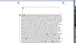
Also, while the page was loading, it looked like the image below, but then after a few seconds an image file with text was placed over the text that you see in the image below. You might want to drop the image with text to make the page load faster. Other than that it's a pretty clean looking website.
 

Attachments

  • website.jpg
    website.jpg
    112.6 KB · Views: 108
The site looks nice and clean and has the preppy look associated with fraternities. But...are you sure that's an SAE fraternity? I thought they didn't let non-whites in...
 
The site looks nice and clean and has the preppy look associated with fraternities. But...are you sure that's an SAE fraternity? I thought they didn't let non-whites in...

Haha who would have thought...and we are also located in Orange County.
 
Nice clean design. It's simple, uncluttered and informative.
Doing the text as images however is not a choice I would have made. It slows page loading considerably. Otherwise nice work.
 
http://web.mac.com/jack_archer/iWeb/Chapman SAE/Home.html

I am linking it to the domain chapmansae.com later this evening once everything is finalized. Would just like to get everyones thoughts, opinions and suggestions before this goes public. Thanks a lot!

-jack

Very Nice, Viewing on a 24" Samsung SyncMaster 204 BW and nothing was blurry. I use GO-Daddy, recommended to me by Chris Pirillo for my citrusairportshuttle.com site,very reasonable, good tech support:cool:
 
Text as images bad. The code is a bit frightening, but it was made in iWeb so can't expect too much there.

Loads a bit slow because of all the images.

Text is very small, hard to read.

Logo is blurry as others have mentioned. Not overly blurry, but still.

The code doesn't validate. Not sure there's much you can do about that with iWeb.

The overall look though is nice an simple.
 
Many of the text graphics are noticeably blurry and hurt my eyes to the point of wanting to look away, especially the main logo.

Don't use text as images so liberally. Yuck.

It also loads really slowly when navigating -- for some reason, images appear 'one-by-one', probably because of all the damn JavaScript.
 
Register on MacRumors! This sidebar will go away, and you'll see fewer ads.