Become a MacRumors Supporter for $50/year with no ads, ability to filter front page stories, and private forums.

Yeti89

macrumors member
Original poster
Dec 27, 2011
83
5
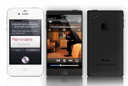
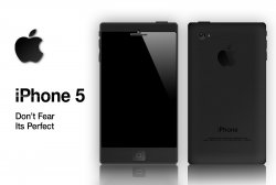
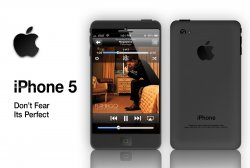
I just made this today and want to everyones' input. Let me know what you like and what you don't like.

I have also included a comparison photo with the white iPhone 4s.


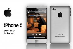
(Here, I have added a bit rounder and lighter version as well as a sort of white version.)
 

Attachments

  • iPhone Black3.jpg
    iPhone Black3.jpg
    216.5 KB · Views: 276
  • iPhone Black4 with White Iphone.jpg
    iPhone Black4 with White Iphone.jpg
    549.8 KB · Views: 212
  • iPhone Black4.jpg
    iPhone Black4.jpg
    248.3 KB · Views: 190
  • iPhone Black Rounded.jpg
    iPhone Black Rounded.jpg
    462.1 KB · Views: 149
  • iPhone More White Rounded.jpg
    iPhone More White Rounded.jpg
    642.3 KB · Views: 167
Last edited:

Yeti89

macrumors member
Original poster
Dec 27, 2011
83
5
Wirelessly posted (Mozilla/5.0 (iPhone; CPU iPhone OS 5_0_1 like Mac OS X) AppleWebKit/534.46 (KHTML, like Gecko) Version/5.1 Mobile/9A405 Safari/7534.48.3)

Haha, I take the HTC comment as a compliment. I like a lot of their designs.
 

mobilehaathi

macrumors G3
Aug 19, 2008
9,368
6,353
The Anthropocene
Wirelessly posted (Mozilla/5.0 (iPhone; CPU iPhone OS 5_0_1 like Mac OS X) AppleWebKit/534.46 (KHTML, like Gecko) Version/5.1 Mobile/9A405 Safari/7534.48.3)

Haha, I take the HTC comment as a compliment. I like a lot of their designs.

Wasn't meant to be an insult, just an observation. :)
 

stickybuns

macrumors 6502
Oct 22, 2011
384
0
Could you make a mock-up of a white one? I'd like to see how the narrower bezel looks in white. I personally find the squared edges/lines to be overly masculine.

Small correction for the text: it should say "it's perfect" not "its perfect".
 

Yeti89

macrumors member
Original poster
Dec 27, 2011
83
5
I was going for a brushed gun metal look. This is only my second day in Photoshop and so my skills are limited. I rounded the edges a bit but I think it could use a bit more still. I tried a couple of quick white renditions but i would need more time to get one that looks decent. I also lightened the color. Take a close up look to get a good feel.
 

Attachments

  • iPhone Black Rounded.jpg
    iPhone Black Rounded.jpg
    462.1 KB · Views: 136

Lostanddamned

macrumors 6502a
May 3, 2009
680
379
London, UK
I was going for a brushed gun metal look. This is only my second day in Photoshop and so my skills are limited. I rounded the edges a bit but I think it could use a bit more still. I tried a couple of quick white renditions but i would need more time to get one that looks decent. I also lightened the color. Take a close up look to get a good feel.

If you are using photoshop, you should have a font called myriad pro. That is the apple font. Try using that for the text and loosening the kerning a little, it will look more "Apple like". Check out this version of your username for an example
 

Attachments

  • Untitled-1.jpg
    Untitled-1.jpg
    26.3 KB · Views: 824
Last edited:

Caliber26

macrumors 68020
Sep 25, 2009
2,327
3,657
Orlando, FL
The only thing I disagree with is that you call it "iPhone 5". I will be floored if Apple actually names it that. Calling it the iPhone 5, would imply that it is their fifth generation phone when it's actually not. If they stick to a numeric name, I'm inclined to believe they'll call it iPhone 4G or even iPhone 4GS. The 5 just makes no sense and I wish people would just let it go once and for all.

As for the mockup, I think you actually did a good job with it.
 

Apple OC

macrumors 68040
Oct 14, 2010
3,667
4,328
Hogtown
your mockups look really nice ... however I actually like the iPhone the way it sits now ... I like to be able to reach everything on my phone with only one hand.
 

iCandii

macrumors member
Jul 7, 2010
85
0
Cool mockup. Looks like a moto razr too.

Do u think the ip5 is gonna be that square?
 
Register on MacRumors! This sidebar will go away, and you'll see fewer ads.