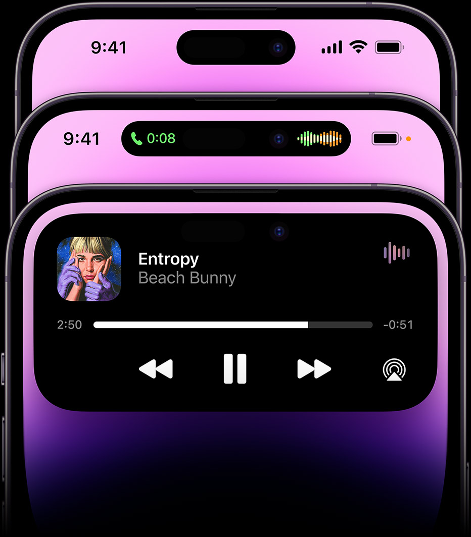
I like being able to see the status icons in the status bar, such as Do Not Disturb / Focus Mode, Rotation Lock, Battery Percentage, battery level of paired bluetooth device, etc. The notch took up so much space that you couldn't see those at a glance--you had to swipe down to the Control Center to see them. I was hoping that the smaller pill notch in the iPhone 14 Pro would free up space to show status icons, but from screenshots it looks like Dynamic Island actually shows even fewer status icons in some situations?


The Dynamic Island looks cool and fun and useful in a lot of cases, but these two examples make me sad. It's not a good day for those of us who still have iPhone 8/SE style phones and wanted to upgrade when the notch was small enough to show status icons again.
Example 1: Can't see bars during phone call
In the middle phone below, the cellular bars and wifi icons are hidden to make room for a waveform image when you're in a phone call. So if the call starts getting choppy you can't glance at your phone and see how many bars you have?
Example 2: Can't see time when receiving incoming phone call
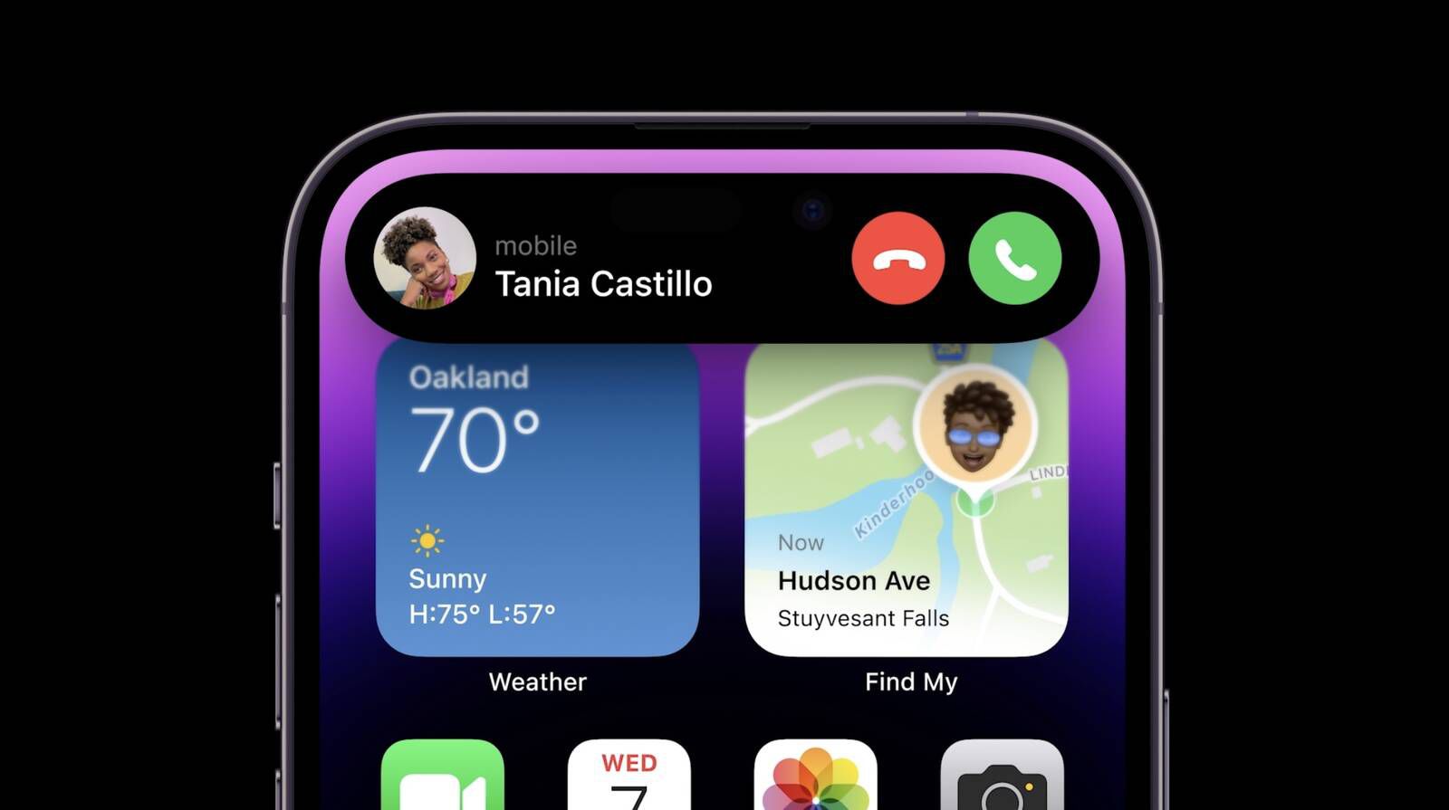
Receiving a phone call makes the Dynamic Island grow so large that it even hides the time. Want to make a quick decision about whether you have enough time to take this call before your next meeting starts? Too bad, you can't see the time.
The Dynamic Island looks cool and fun and useful in a lot of cases, but these two examples make me sad. It's not a good day for those of us who still have iPhone 8/SE style phones and wanted to upgrade when the notch was small enough to show status icons again.


