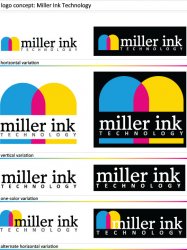
I've reviewed that first initial concept with the company, and have reworked the logo with their feedback as well as addressed some with the feedback received from other designers (here and other places). Would love to hear your thoughts before I present this next draft to them.
Specifically, what I don't like is the overlapping hues. They're intuitively wrong, because cyan and yellow overlapping do not produce magenta; a message that undermines the entire corporate mission statement. If they're overlapping to form an 'M' it's not clear enough.
That was one of the things that bugged me about the mark initially. They wanted the letter M as their mark while utilizing the colors C-M-Y (the K is used in the name). I tried several variants to try to achieve this and the first draft was the one I came up with that I liked the most from my concepts.
They did bring up the same issue that the M is not clear enough so I've tried to address that with this next round when I had an aha moment as well as the overlapping color issues.
If you're looking at the type, you've kerned the letters on the top deck, but overlooked the word spacing; there's a bit too much air between the word 'miller' and 'ink'.
I had initially less spacing between the two words but it was bordering on looking like one word when shrunk down.
The solution I'd be thinking along the lines of is something far more fluid and contemporary, perhaps colour think inks, drops etc within a heavier sans typeface with a generous x-height.
They didn't want to use a cliche for their mark (ink splatter, ink drop, colored registration mark) and unfortunately they specifically want a serif font for their primary name "miller ink".
ezekielrage_99 said:
Sorry but the logo I feel that I've seen it before for other printers, it has a certain look to it. It's a perfectly reasonable logo but it could be so much more IMHO
If it were I designing the logo my first stop would be to see the competition's logos, I think it would be able to clarify the overall creative direction. Font, well the Serif font is classic and I can see why you've chosen it but I would go in a different direction like maybe Verlag or Mercury would be better oxymoron of a fresh but classic mix?
Certain key words stick out for me
- 40 years experience
- customised solution (personable)
- commercial
Maybe a "retro" styled logo is what is needed, a really nice crisp wordmark with that good ol' fashioned style that showcases the idea they are a classic experienced company.
They specifically wanted a serif font for their primary name. Their major competitors (the list that they gave me) utilized a serif font in all caps for their names.
I definitely like the retro style but one thing they specifically addressed is that they don't want their logo to look "dated" and got the feeling from my conversations with them that they want something simple/classic/traditional/modern.
btbrossard said:
I've seen quite a few large ink companies use gradients in their logos.
http://www.vansonink.com/
http://www.bsink.com/
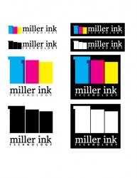
For the logo itself, I prefer the color chip look. After all, color chips are what ink is all about. Customers showing up to a press check with their own Pantone chips is pretty common (even if their swatch book is 10 years old and looked as if was left in the sun for most of it's life)...
http://www.hostmann-steinberg.net/
I actually ran into the hostmann-steinberg logo when I was doing research. They didn't list them as one of their competitors, but I wanted to get a broader range of what was out there. I think theirs is the only one that I liked out of a couple of hours of browsing through ink company logos.
CW Jones said:
My first impression of the overlapping colors is bad, BUT its a good starting point. I would try and do something else with the shape of the "ink" in the logo. I wish I knew what... maybe something that flows a little better? Again, not sure how you would show that but do a little research and see what you can come up with. Out of all the logos I like the 2nd row from the top where the company name is kind of in the middle of the blobs of ink. I like the balance of it and how it would look on either letterhead, or a website or buisness card. I think it would look pretty good once you get the blobs of ink into something a bit more flowing. I think unlike most logos on here, your first set isn't bad and your off to a pretty good start.
Keep us updated, I want to see where you can take this!
-Collin
Thanks, it's quite difficult to create a memorable mark that's not cliche in the industry but also delivers the same message as that cliche. LOL. I hope you like the 2nd interation of the logo.