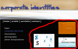
Become a MacRumors Supporter for $50/year with no ads, ability to filter front page stories, and private forums.
Agreed

Ya i would of but i was sort of pressed for time with the project so i wasnt too concerned about the font... but now that i am on break i might go and change them out.. if you noticed also, some of the pages have a different font, this is because that text is a picture from photoshop and wasnt typed into dreamweaver.. when i find the time ill tweak it some more...
thanks for your input.
 
It looks nice, although I'd suggest that if you're going to allow one picture to be enlarged when you click on it then you should do it with all of them, or not allow that one to be enlarged (here). Also when you click on photo manipulation for example and then select a picture you lose the main navigation. My last suggestion would be that when you go to portfolio and then you click on one of the next selections (logos, corporate identities etc.) that more than just the pictures to the right change, it just seems awkward to me, I would make it change such as when you go from profile to portfolio. Just my 2¢
 
It looks nice, although I'd suggest that if you're going to allow one picture to be enlarged when you click on it then you should do it with all of them, or not allow that one to be enlarged (here). Also when you click on photo manipulation for example and then select a picture you lose the main navigation. My last suggestion would be that when you go to portfolio and then you click on one of the next selections (logos, corporate identities etc.) that more than just the pictures to the right change, it just seems awkward to me, I would make it change such as when you go from profile to portfolio. Just my 2¢

are you talking about like putting one of those pictures i have straight across the top of my portfolio pages on all the pages? so the picture changes when you change pages? Thats a lot of work to change all that now, but ill keep that in mind, thanks for your input as well.
 
are you talking about like putting one of those pictures i have straight across the top of my portfolio pages on all the pages? so the picture changes when you change pages? Thats a lot of work to change all that now, but ill keep that in mind, thanks for your input as well.
No, I was talking about what I circled in the screenshot. Instead of just changing that part I suggested you make it seem more like a new page instead of just altering the pictures. (from first glance)
 

Attachments

  • Picture 2.png
    Picture 2.png
    177.1 KB · Views: 100
if this is your first attempt at making a website for others to use and see, and for you to learn on.

Dont use tables as you have.

learn CSS, it will make your like a whole lot easier!
 
if this is your first attempt at making a website for others to use and see, and for you to learn on.

Dont use tables as you have.

learn CSS, it will make your like a whole lot easier!

Tables aren't the problem as he uses Abode apps to make the site.. the problem is that what you did in GoLive or Image ready or whatever, could have been done by hand, probably much faster. It's a really nice design, but there's no reason to use images when all you need is a black background.

Instead try something like a div where all the content goes. Make the background black, and float a div to the left for the content, and float a div to the right for the images, and then do some troubleshooting. yeah it might be more work to get it to work the right way cross browser (although I don't think so), it'll load in milliseconds rather than seconds.

Also, the titles of the pages all end with .png, which just screams I MADE THIS IN A WYSIWYG EDITOR.

Overall, very nice design.. but very poor coding.
 
I would file your 'illustrations' under 'photo manipulation', because they look like you just used some auto-shaping in Illustrator off a real photograph. Apologies if I am wrong.
 
I agree with thejadedmonkey.

It will take a little bit of time to use <div>, but it will be worth it because you won't need to worry about bandwidth or loading time.

Steve
 
Why is the portfolio page different from the others? different font, the links drop and there's a picture.

The banner on the home page has a black line on the left, and I went to wipe my screen because of those little white flecks you have put in it.

The left margin of the text is different on each page.

The thumbnail for your Will Farrel Illustration is blurry compared to the one of you next to it. Could be my eyes though.

It's probably better than what I could have done at 16.
 
those illustrations are made using only the pen tool, tracing every single highlight and outline. I obviously have more to learn, hence why i am in a class.. thanks for your suggestions so far.
 
I like it. Especially the styling you used on that photo. I'd just use a sans-serif font instead of a serif. But that's just me.

you talking about the red pencil line looking style on the Will Farrell picture..?
 
Register on MacRumors! This sidebar will go away, and you'll see fewer ads.