Become a MacRumors Supporter for $50/year with no ads, ability to filter front page stories, and private forums.

klymr

macrumors 65816
Original poster
May 16, 2007
1,451
103
Utah
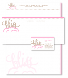
I have to design a logo for class for a boutique cookie company called Bliss. The professor said if I am going to do a typographical logo (which was my focus) to make the word bliss look blissful. He drew up a quick idea of what he was talking about, but I was wondering if you all had any other ideas. His was to arch the word bliss and then he had some sort of bursts coming off it. I'm not sold on the concept, and I doubt he was too. It was just an idea to get me thinking. Anyway, any ideas are appreciated!


bliss |blis|
noun
perfect happiness; great joy : she gave a sigh of bliss. See note at rapture .
• something providing such happiness : the steam room was bliss.
• a state of spiritual blessedness, typically that reached after death.


blissful |ˈblisfəl|
adjective
extremely happy; full of joy : a blissful couple holding a baby.
• providing perfect happiness or great joy : the blissful caress of cool cotton sheets.
 
How about blissfully paying someone to do your homework for you. :rolleyes:
 
if you want to post some of your ideas, we'll be happy to offer you some advice and criticism.

However, if you're unable or unwilling to initiate this project yourself and have to resort to asking complete strangers on a forum to be your brain and do the concepting work for you, then perhaps you need to reconsider your career choice.

_________________

EDIT: Okay. That was harsh. But my point still stands. You absolutely cannot be a successful designer if you're not willing to jump off the cliff. You need to be willing to take the risk yourself. You'll find some of your greatest works and accomplishments are actually born out of failure.

But please have enough respect for those of us who have put our time into becoming successful designers not to ask us to do your assignment for you. Like I said, we'll be happy to help along the way, but you have to show us an effort on your part.
 
if you want to post some of your ideas, we'll be happy to offer you some advice and criticism.

However, if you're unable or unwilling to initiate this project yourself and have to resort to asking complete strangers on a forum to be your brain and do the concepting work for you, then perhaps you need to reconsider your career choice.

I agree completely. Most of us on here will be willing to offer critiques and even some verbal and visual ideas but only after you initiate by showing your work and ideas first. Right now, you're asking for free work and concepts. So, please try again.:p
 
SwiftLives, I'm sure you haven't come up with every single design idea in you life on your own. macworkerbee, I wasn't asking for free work. A few ideas for concepts...maybe, but I didn't realize it was going to get everyone so riled up.

Forgive me everyone, I've been terribly sick for over two weeks straight and my antibiotics aren't working, my health insurance runs out in 5 days, and this project is due soon. I've missed nearly three weeks of school and I'm just a little stressed trying to catch up in 4 classes and was looking for a few suggestions. So, thanks anyway. I guess I'll have to figure out my life first and then see if I can figure this out on my own.

I'm sorry to hear about your personal troubles. I understand that you didn't think you were asking for free work, but you were. As said by others, feel free to post some of your ideas (even if they're rough) and we'll be happy to help you along on this assignment. Good luck to you.
 
klymer - you have my sympathy with your personal troubles. We've all been there in our own personal Hells before. You'll get through it.

Graphic Design is more than showing competency in a computer program. 90% of it is your ability to think. For this assignment, you're not being graded on how well you can use Illustrator. You're going to be evaluated on your approach and solution to the design problem.

Asking us to do the concepting for you is asking us to do your assignment, although I also don't think you realized that.

(And to respond to your comment - I have come up with every single design idea by myself or as a collaborative effort with my coworkers.)

Try to replicate the idea your professor had, post it on here, and we'll be happy to share our criticism. But you have to make a good-faith effort to show us that you have indeed started this project yourself and are not trying to get us to do it for you.
 
Sorry everyone for my misguided thinking. I haven't had time to even think about this project again. I started to get sick again yesterday afternoon and woke up even worse. Hopefully I'll be able to kick this soon! Two and a half weeks of straight illness is taking it's toll on all parts of my life.

Again, I apologize for my confusion and I'm sorry I even asked for ideas. I thought it was a harmless question, but I stand corrected. If I have time to post anything later tonight, I will. Anyway, thanks again.

Oh, and SwiftLives, sorry if I offended you by saying you didn't come up with every design on your own. What I meant was I'm sure you have had inspiration from other's designs, etc. We all do. I also have access to the Logo Lounge website. I'll check out some designs on there and she if anything goes off in my brain. And yes, it'll be for inspiration ONLY!
 
I thought I'd give everyone a little update. I am not on my Mac, otherwise I'd post the logo I created. I ended up doing a bit of research, which I now realize I should have done in the first place. That seems to be the key to success in great design. Research, research, and more research!

Anyway, I used a script font that said "bliss" sorta sitting on/emerging from a few puffy clouds. The professor liked it, except for the clouds. He said they reminded him of the dust cloud that follows behind Pigpen from the Peanuts comics. I need to refine the clouds and make them look a little more "sophisticated," then I should be set. I'll try to remember to get a before and after screen shot when I'm done, then see what other suggestion everyone has. Anyway, thanks again for you patience. It's been a crazy month! Only one more to go until I'm done...for a few weeks. Then it all starts up again in January. :(
 
You are an inspiration to the rest of us with your perseverance. Good luck on your projects and I hope you're all better.

I think Skype has a classy cloud logo... as far as cloud logos go.
 
Ok, so I finally got this finished. Here is the logo I came up with, as well as the business card, envelope, and letterhead. Feel free to leave feedback, but due to time restraints I won't be able to make (m)any changes before I turn in this part of the project in 6 hours. Anyway, enjoy (I hope)!
 

Attachments

  • Picture 6.png
    Picture 6.png
    78 KB · Views: 166
Overall, I *really* like that. I'm really digging the color scheme. The clouds certainly read as clouds. The typography works very well with the cloud forms. You've got a strong cohesion between the pieces.

I do think the logo is a tad too big on the envelope, but that's subjective on my part. I've been on this minimalist white space kick lately. So take that with a grain of salt.

Good job.
 
I think that you've got a good solution going here. I'm sure with some more time you could have added some more details (not to the logo but the system) Great job considering the circumstances.
 
I do think the logo is a tad too big on the envelope, but that's subjective on my part. I've been on this minimalist white space kick lately. So take that with a grain of salt.

Good job.

I think I agree with you on the logo on the envelope. After seeing it all laid out like this I have decided to shrink it down a bit. It just looks a tad over powering I think.

Thanks everyone. After I got working on this I had a few other ideas rolling through my head as far as logos and stationery packages go. I'm happy with what came out here, but I'm not 100% satisfied. It should work just fine for class though. :cool:
 
You have blossomed from someone who seemingly desired something for nothing to a budding designer of whom others will welcome future advice. As a comp, this is a very nice job.

ENVELOPE (quick 'n' easy):
You do not want to get text too close to the postage canceling area which may sometimes extend close to the center of the envelope.

1) Reduce size of logo.
2) Remove phone, fax, and website.
3) Slide address toward logo. (It doesn't have to be center on envelope.)

BUSINESS CARD (quick 'n easy):
Text in bottom right corner runs together. For legibility, consider moving "ph" and "fx" after associated numbers (perhaps in alt color) and adding paragraph space above address. On all pieces you may be able to drop the "www" from the URL. It's not bothersome on the letterhead but since it crowds the business card, perhaps it can be removed (optional).

LOGO (future):
You nailed the clouds. Logo begins with clean, whimsical letterforms. Loops and kerning start to degrade with "iss." As a concept the design is strong. If it were a real project, some finessing would be in order. A good reference work in this regard is called Logo Font and Lettering Bible (which I reviewed at this link).

COLOR SCHEME (discussion):
The selected colors work well together. However, when most people think of clouds, they may instinctively envision powder blue sky. Is the selected palette based on comparative color studies, "client" requirements or personal preference?

PRODUCTION AND PRINTING (FYI):
Though this class project may never make it to press, remember people who design with production and printing in mind are valuable to studios. Color bleed on letterhead requires printing on oversize sheet and trimming down. Similarly, envelopes need to be printed flat and converted. For a deep-pocket customer ordering quantities of many thousands this may not matter much. But for a small shop wanting limited quantities, printing cost can either eat into the design budget or be prohibitive.

STATIONERY (FYI):
As you become a professional designer for such (or even when submitting projects for school), keep in mind the spelling difference between "stationary" (immovable) and "stationery" (writing paper). The former is indicated in your thread topic title.

Overall, I am quite impressed (especially considering your obstacles)! Perhaps you can post your instructor's comments or results from class discussion.
 
Aw, that's so cute. I love it. Especially nice job - and considering your terribly sick!
 
Absolutely cute! You could nitpick little things like dropping letters from the URL or inclusion of a fax number, etc, but I think as a whole it is a cohesive and attractive package. Even though I absolutely hate that pepto-bismol pink... but I'm sure it's a part of the client's pretend preferences or client's customers' pretend demographics that it was picked. :) Thank you for sharing!
 
Overall, I am quite impressed (especially considering your obstacles)! Perhaps you can post your instructor's comments or results from class discussion.

Thanks Kwill for the suggestions. Some are outside of my control as far as project parameters. Others I can work on, such as dropping the www. from everything. The professor also told me that the type on the business card needed a little attention. He thought I needed to fix the character spacing on the card. Overall he liked it. The color choice was mine. The pink clouds are just from the nice sunset hitting them. :p There was one girl in my class that said it reminded her of a lingerie company and not a cookie company (she is not the type that would be purchasing lingerie either).

Just for future reference, I'm a guy. I know it's a "cute" design, but I thought I'd tap into my "feminine side" for this project since it was a branding assignment for a boutique cookie company owned by a lady named Helga Snodgrass. Personally I feel good that I was able to create something so "girly" as some have put it. I was kinda able to push past what I would normally do and create something that fits the assignment a little better. Plus the ladies in class loved what I did. ;)

Thanks for alerting me to the correct spelling of the paper products definition of "stationery." We are now working on the final part of this assignment, package design. I'll probably post that when I get further along with it. Stay tuned...

Oh, you may not be interested, but my health still isn't the best. I've been sick since October 19th. If I don't start to feel better in the next few days I'll have to head to the doctor again. I took an antibiotic that didn't have a lot of effect on me, although I did stop coughing up large amounts of crud. It may be working inside me still afterall. My 26th birthday was this last Saturday and I thought I was going to loose my health insurance then, but I'm covered until December 1st. I've had some financial problems this semester due to not being able to work as much because of class schedules. I haven't had a vehicle to drive since the middle of September. In fact, the last time I bought gas was September 10th. I have had barely enough money to pay bills, and not even enough to buy food. Luckily my mom lives in town so I was able to raid her fridge. :p Those are some of the other obstacles that I've had to dodge this past few months. I'm getting pretty far behind in my illustration concepts class. We are supposed to be designing a pair of Skullcandy headphones for possible production. I haven't really started on that yet. I'll be cranking on that one all weekend. I've at least got a few good ideas. Anyway, thanks again everyone for understanding my stress levels and frustrations. It'll all be over soon enough. Just a couple more weeks of class and I'll be finished until January. Wish me luck!
 
Thanks Kwill for the suggestions.... my health still isn't the best.... If I don't start to feel better in the next few days I'll have to head to the doctor again. I took an antibiotic...

You're quite welcome. Believe me when I say: "I feel your pain." It's been a few years now but three times in a row (Spring-Fall-Spring) I caught the flu which lasted a month followed by acute bronchitis for another month. By the third time, I realized it was not possible to will myself to good health after a week or two. Bedrest and antibiotics were the only cure. What I didn't realize at the time is that following a multi-day course of antibiotics, there's a need for restoration of good bacteria in the digestive system with probiotics. Various kinds are available from health food stores and some cultures are even in yogurt. Though happy that's in the past, I do suffer from periodic migraines which can wreck havoc on deadlines. So I know how hard it is to be creative when you're sick. This makes your work that much more impressive.

BTW: Take my amateur health advice for what it's worth. I'm an artist, not a doctor. ;)
 
Looks great!

Sure, you could tweak it, but it looks decent already.

I'd probably change the text font, but I like the colour scheme actually. Reminds me of ice cream - bliss!
 
Thanks AlexisV. The font is actually a nice rounded sans serif font that I thought matched the little dot pattern quite nicely. It looks much better actual size compared to this screen shot. I still have to tweak a few things on this since we are turning in a complete package, including this stationery and 3 cookie package mock-ups. It does look rather ice cream like.
 
Well all, I thought I'd report back on how things are. I'm over that crazy illness after taking an antibiotic for 3 weeks. Classes are over and I've started a second job for the time being working on some graphics for a friend. The hard part is going to be using his Windows only software called Canvas to do all the work in. I only own the student license version of CS3, so I technically can't work on it with my software.

I just got my grades back for 4/5 classes.

Brand identity (which this project was for): A
Illustration concepts: A
Greek and Roman art history: B
Science, technology, and modern society: A-
Communication arts seminar: ? (haven't got it yet, but it's a safe bet it's an A)

And that ends another semester. I was looking over my transcript and realized I haven't got a grade in a graphic design class lower than an A. :D I should be able to keep it that way through at least the summer. I'm headed to Switzerland for a study abroad for the month of June! There are four classes being taught while there; European visual culture, Swiss guild signs and symbols, drawing for illustration, and creative thinking. I can't wait for this trip. Roughly 166 more days!
 
Register on MacRumors! This sidebar will go away, and you'll see fewer ads.