Become a MacRumors Supporter for $50/year with no ads, ability to filter front page stories, and private forums.

DesertFox

macrumors member
Original poster
Nov 25, 2004
72
0
Hello,

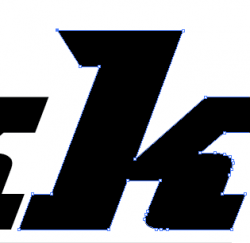
Im trying to make a font look look like the font from a logo. I found the particular font being used which is City-BQ Bold Italic, but I cant quite make my font (the black k) to look like the red k.

The size of the letter seems to be correct but the red k has a longer tail on top of the stem of the letter. I havent found a way to extend the tail on my k (the black one). I have been tweaking all sorts of setting in the Photoshop Character window, but havent had much success.

Are there more character config palettes hidden away somewhere in photoshop ot should I be using a different program?

Also, is there an option to outline text in photoshop?

Any advice is much appreciated.

Thanks in advance.
 

Attachments

  • have.png
    have.png
    2.6 KB · Views: 228
  • target.png
    target.png
    6.7 KB · Views: 191
Also, is there an option to outline text in photoshop?

Yeah. I'm using PS CS3 for walking through here.

Make your character with the text tool in the usual way. Select the text layer, then Layer->Type->Convert to Shape.

Over by the layers palette, click on the Paths tab and pick the newly created vector mask.

Press shift-A until the cursor is a white arrow (or direct selection tool over in the tool palette). Click once somewhere in the character so that the points are shown. If you can drag a box around the points making up the serif, do that, otherwise you can shift-click to select the points you want slid over. Once you've got the points, you can use the left arrow key to drag them on out (or just stay in the direct select tool and drag them with the rodent, shift to keep it straight in the usual way).

[ed: adding stuff]
At this point, you can ctrl-click and turn it into a custom shape to make it easier to work with.

[& more…]
If you meant outline in the other sense, Layer->Layer Style->Stroke… is an easy non-destructive way to get there.
 
Make your character with the text tool in the usual way. Select the text layer, then Layer->Type->Convert to Shape.

After I add the outline around the character ( i used the "inside" outline) and convert it to a shape, I get this weird pink glow around the characters...

Is there any way to prevent this?

Thanks for replying guys.

Maybe you could help me just a bit more :)
 

Attachments

  • glow.png
    glow.png
    7.4 KB · Views: 80
That's antialiasing. Turn off antialiasing or feathering on the selection.

Also, before you rasterize the type, make it insanely large - like 300 or 400 points, so that you don't get low res stairstepping. Once you have modified it, then reduce the size to the desired.
 
I have the anti-aliasing turned off, but it still places that pink glow around it when I convert to shape. Is there some "convert to shape" config somewhere.

I also tried converting to "work path", which does not place the pink glow, but it doesnt stretch the image either the way that I want.
 

Attachments

  • work_path.png
    work_path.png
    6.8 KB · Views: 96
I have the anti-aliasing turned off, but it still places that pink glow around it when I convert to shape. Is there some "convert to shape" config somewhere.

I also tried converting to "work path", which does not place the pink glow, but it doesnt stretch the image either the way that I want.

You are still attempting to do it too small. Make that K BIG first.
 
ok, i made the K size 500 font before converting to shape. How do i reduce its size?

Also, the pink glow is still visible when you look at the edge of the big K. Will this disappear after I reduce the size?

Thanks again!
 
ok, i made the K size 500 font before converting to shape. How do i reduce its size?

Also, the pink glow is still visible when you look at the edge of the big K. Will this disappear after I reduce the size?

Thanks again!

Use the Transform: Scale Menu in Photoshop. Or if its the whole image, the Image size menu. But don't make it small until you have completed the artwork. This will have the effect of hiding or minimizing artifacts.

Remember: Create at high resolutions, save, then save a copy and scale it down to the desired size/resolution at the end of the process.
 
Hmm, i made it huge and then small again and the pink glow still shows. I think the mistake occurs when I convert to shape because it creates the pink glow effect for no reason. The letter that i am converting to shape is a solid color and there is no outline.

Are there any option for when "converting to shape"? Or do I have some mysterious option on that is creating the pink glow/artifact effect?


Also, I was playing around with the "convert to work path" option and it seems to create a vector outline of the letter. Im thinking that if a stretch the work path and later fill it with the same color as the letter, I will have a modified letter. But when I try to fill the work path, I get some dialog about rasterizing....

Could someone please explain how it possible to fill a work path with color and make it a layer...

thanks.
 
Type the word at a large point size at 300dpi, rasterize, and lop off the extra with the marquee tool.

You're working in bitmap, so you can either keep the antialiasing to smooth the edges ('pink glow' which will make it look smooth if you look at it at 100% zoom) or turn it off and have horrible jaggies that will look terrible. You'll always get the pink glow if you zoom right in. Only vector programs can keep lines smooth.

If you want to create paths, when you've finished, you can rasterize (convert to bitmap) or drag the path into a vector program like Illustrator.

You can't work in vector in Photoshop - it's a bitmap program.
 
I have typed that "k" as font in Illustrator. Do I need to convert it to some vector map in order to drag out the top tail of it? Or can I manipulate the font as is?

Thanks.
 
Register on MacRumors! This sidebar will go away, and you'll see fewer ads.