Become a MacRumors Supporter for $50/year with no ads, ability to filter front page stories, and private forums.

aliciavr6

macrumors newbie
Original poster
Jul 19, 2010
4
0
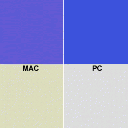
Hello, I'm a PC user of 10 years, and got my first mac a few days ago, 27" imac core 2. Anyway, I LOVE it but... I'm a graphic designer, sent client something last night, and the colors displayed very differently on a PC. Purple on my mac was blue on a PC, tan beige is 100% unsaturated grey on PC. I knew there were slight differences between platforms, but didn't know they'd be THIS different.

I tried to calibrate by sight just so I could get this project done, but it's still off. And to get it as close as I could, had to drag the sliders to extreme levels, ie all the way to the top/bottom. (Gamut is 2.2)

Can anybody help? :(
 
You should use the colour matching in the applications you're using if available. Adobe includes this in their CS suite for precisely this reason.
 
Color matching? What am I supposed to match them to when I'm creating something from a blank white document?

It will still display completely wrong. Isn't only in Photoshop, it's browser, email, the whole display. I cannot design something looking at it in purple and beige, and have it turn out blue and grey on PCs.
 
That's okay. I looked into the screen "yellowing" issue (since yellow would make blue purple and grey beige), but its definitely not that, it's the whole screen, and the white is white. Attached is color differences I'm seeing
 

Attachments

  • colors.gif
    colors.gif
    2.3 KB · Views: 391
When you were calibrating the screen did you use the right hand boxes on the gamma correction or just the up-down sliders on the left of the little Apple logo box?
 
I don't even know, I just played with settings til it looked similar to the image on my PC laptop... those colors above are pre-calibration.
 
I think that's where your answer is. The interface is a little confusing because on some of the calibration steps it doesn't even show a blob in the box to move around, but one appears if you click your mouse onto it. It gives you a lot more control, so definitely worth a try even if it takes you a little while to get the correct setting.
 
calibration is key

Hi, I noticed your old thread about iMac calibration.
Not sure what kind of work you do, but if you do any sort of printing output you should really (really) calibrate your monitor so your screen matches your output.

If you are doing web stuff, or just send files to PC folks, a gamma setting of 2.2 is OK, but if you are doing print work you will want to use 1.8 gamma, and a color temp of 5000 (which is a warmish white tone). Also, I would recommend investing in a cheap hardware calibration device (like Spyder2 or 3), which ranges between $80 to $130. Especially if you are working professionally.

You might be able to do a manual calibration with the Apple monitor calibration tools, but the hardware device is usually much more accurate.

Here is a good read that might help...
http://www.gballard.net/photoshop/osx_22_gamma.html

cheers,
michael

PS: if you read the info at gballard.net, he recommends calibrating/setting the gamma to 2.2 & using a temperature of d65/6500. This is markedly different than the long established 1.8/5000 advice for prepress. I emailed Gary and he confirmed the recommendation (even for prepress work). The advice seems good for most users, but I am not sure about the prepress part. Also a little known fact about a lot of higher end RIPS on platemakers is that often they strip out all the color profiles that are embedded. So custom profiles make work on your own in-house set-up, but may be worthless when the files are run on the outside world. Checking with RRDonnelley to see what they advise...
 
I feel ya

I understand what you're talking about.

But I don't have a real solution though.

But the mac pro does the same thing. Even when using eye-one calibration tools which help calibrate the monitor to our epson printers.

Then again, the monitors are not specialized graphic monitors, just regular dell lcds... but I don't think it's a problem with the monitor.. most likely the mac color profile.

But again, no real solution.

I haven't tried it myself, but have you tried going into system preferences and change the color management and adjusting for color profile... and then setting at least illustrator or photoshop to that same one?

Man... all I have to say is.. pantone... :/
 
more...

Apple has a page on color & gamma for print and web (http://support.apple.com/kb/ht2026)

Choosing gamma and white point
During the calibration of your display, you will need to choose gamma and white point settings. The correct choice depends on how you are most likely to use your images. The best rule of thumb is this: Unless you have a color management expert instructing you otherwise, select a 2.2 gamma and a D65 white point.

Because Windows PCs use 2.2 gamma, images edited in the traditional Mac 1.8 gamma will appear incorrectly to most viewers on the Internet—this of course means that your Mac friends need to switch their displays to 2.2 gamma when perusing your 2.2-savvy work. Mac-using photographer Gary Ballard maintains a handy demonstration of this phenomenon here.

Labs and Internet-based services using the RA-4 wet process, such as in a Fuji Frontier minilab, almost universally expect you to use a 2.2 gamma in the sRGB IEC1966-2.1 color space. That's true for services such as Pictage, Smugmug, and Shutterfly.

Why D65 over D50?
Well, the D50 white point was all the rage among pre-press professionals 10 years ago, and you'd even find talk of D50 in advertising materials. Not so much anymore. D50 comes from a time when the dominant method of photo processing still involved paper, light tables, and viewing lamps. Now the emphasis on digital editing and Internet publishing makes the D65 native white point of modern displays a dominant factor.

The difference between D50 and D65 may still be automatically worked out "under the hood" without your awareness, using a technique known as "chromatic adaptation." That's why D65 is recommended now, unless you are a highly trained expert user
.

Interesting, and it makes sense. I haven't worked with a viewing box in years. Also, Apple refs Gary Ballard in their page... so 2.2/d65 or 6500 seems to be the best choice...
 
2.2 PC Gamma Vs 1.8 Mac Gamma

...differences I'm seeing

The problem with your example is specifically EITHER 1) a bad monitor profile, 2) the wrong profile is being applied on one of the machines, or 3) BOTH.

BECAUSE Apple defaults untagged-unmanaged color to its Monitor Profile, and also defaults that profile (systems Classic thru 10.5) to 1.8 gamma standard — the old Mac OS gamma standard can be a bit, er, "challenging".

Moreover, even under Snow Leopard, 10.6, the difference between your Mac monitor RGB and his sRGB environment will cause similar color issues that you need to be aware of and work around.

For example, if your file is based on YOUR Default monitor profile (a custom device, 1.8 or 2.2 gamma color space), when it goes to an unmanaged PC environment, Windows applies sRGB to it (and therein lies a big problem).

A second example is surfing the Web on Mac Safari using 1.8 gamma Monitors: THE MAC OS (Classic thru 10.6) DEFAULTS TO MONITOR RGB — THAT MEANS 99.9% OF THE INTERNET DISPLAYS LIGHT, WASHED OUT FOR 1.8 MAC USERS.

If you are in a color critical environment, ALWAYS embed an ICC Profile and be sure the person on the other side knows how to bring your profile into his work flow.

If you are delivering your color to a person, device, work flow and/or environment that "doesn't use profiles" for whatever reason (like some commercial RIPs, the Internet, and ignorant color shops — you will need to CONVERT your color to their native profile, ie: his working space, the target profile (such as is sRGB to the Internet, or his press CMYK)....
 
Register on MacRumors! This sidebar will go away, and you'll see fewer ads.