Become a MacRumors Supporter for $50/year with no ads, ability to filter front page stories, and private forums.

Echoes1024

macrumors member
Original poster
Feb 10, 2006
32
0
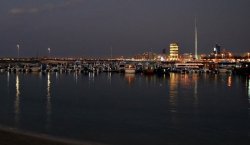
hey guys, I took these shots in the UAE. I was wondering what's wrong with them... a friend whose also a photographer thought they lacked a subject.

I told him the entire frame is the subject, I wanted to capture the boats as well the coast and the buildings in the background. But I don't know, is he right? Do these images lack a subject?

Also, its the same shot in B&W and in color. Which one do you like? I really like the nostalgic feeling the B&W gives off.

408858533_dd5e9b14d7_o.jpg


408851371_874dab7e47_o.jpg


I'd really appreciate any sort of comments on this, positive or negative.

Thank you!
 

PlaceofDis

macrumors Core
Jan 6, 2004
19,241
6
i am by no means a photography professional. but heres my take on it....

they do seem to lack a bit of focus. the sky is rather plain, if thats your focus, and the buildings lack any sort of priority given their proportion to the rest of the photo. i did a quick crop that seems to my eye bring things into better proportion and focus.

just my two pennies.
 

Attachments

  • 408851371_874dab7e47_o.jpg
    408851371_874dab7e47_o.jpg
    39.5 KB · Views: 96

b0tt094

macrumors 6502
Sep 2, 2006
402
0
I would have to agree there is no clear cut subject. I personally believe that with a more clear subject and a more appealing sky the picture would appear 10x better
 

Georgie

macrumors member
Aug 25, 2006
85
0
Columbus, Ohio
i am by no means a photography professional. but heres my take on it....

they do seem to lack a bit of focus. the sky is rather plain, if thats your focus, and the buildings lack any sort of priority given their proportion to the rest of the photo. i did a quick crop that seems to my eye bring things into better proportion and focus.

just my two pennies.

Cropping does help quite a bit, I agree. And I agree the photo lacks a subject. You want the entire frame to be the subject, but this looks like the equivalent of bad elevator music--it's nothing but background. One significant problem is that you can't actually see anything. There are bumpy lights in the distance, I guess those are buildings, and I can make out the form of boat-butts, but there's nothing interesting about that. Even in landscape photography, where the entire frame is ostensibly the focus, there's always something unique, catching or dominating about the scene.

The skyline also needs to be corrected. It looks like it's tilted two or three degrees clockwise.
 

Echoes1024

macrumors member
Original poster
Feb 10, 2006
32
0
Thanks a lot guys, for your suggestions. There's always next time, I suppose.

Heres another one, a different shot at the same location. It probably suffers from the same fate, I suppose.

407820293_4cb495bc71_o.jpg


And what about this one?

407824512_8096076f46_o.jpg
 

Seilenos

macrumors newbie
Jan 29, 2007
7
0
On my faithful donkey
I too would have cropped much of the sky (and tried to get the horizont even more level than I got it):

408851371_874dab7e47_o.jpg

I think that makes it a bit better, but it still lacks something to go from a nice picture to a good (or very good) one... :)
 

Kirbdog

macrumors regular
The image you posted is a good starting point. The first thing that came to mind was all the dead space in the foreground. I like to condense the image to get rid of that dead space. I cropped it and kept the tower centred for balance.
The photo now has a panoramic feel to it, makes the harbour look a bit bigger.
 

Attachments

  • 407820293_4cb495bc71_o.jpg
    407820293_4cb495bc71_o.jpg
    64.5 KB · Views: 129

Georgie

macrumors member
Aug 25, 2006
85
0
Columbus, Ohio
Thanks a lot guys, for your suggestions. There's always next time, I suppose.

Heres another one, a different shot at the same location. It probably suffers from the same fate, I suppose.

And what about this one?

These are better. The second photo would benefit from more closely following the rule of thirds. I think I'd shift that fountain to the right, then crop in quite bit, almost to the point where you can't tell what it is. That could make the photo really dynamic and interesting.

The skyline photo is better now as well (though read up on the rule of thirds--photos are very rarely attractive when centered like that). I think I'd try going the other direction to what others are suggesting here though. First correct the rotation. Then crop the photo so the skyline is very close the bottom of the frame (crop out the foreground water). Focus on the huge expanse of sky. The nothingness. I know it sounds counterintuitive, but I don't think you're going to get anything out of that distant smear of light that is the skyline except to set the stage.

I wish I were at my Mac so I could try it myself and see. Do try it though. I think you can salvage the skyline by breaking the rule of thirds, moving the skyline to the lower edge of the frame, and focusing--counterintuively--on the vast expanse of nothing. And the reason I think this will be interesting is because the sky does appear to be a nearly flat nothingness, which we're not used to seeing, as opposed to the foreground which isn't really nothing, it's just boring.
 

Echoes1024

macrumors member
Original poster
Feb 10, 2006
32
0
Thanks a lot guys. Here are the cropped versions as suggested by others and George.

409628227_30b94289b3_o.jpg


409628617_2d06d90efc_o.jpg


Better now?

Thanks again.

Oh and heres one more, how is this?

409024180_5b719de10f_o.jpg


and this?

409672303_58da547270_o.jpg
 

Mantat

macrumors 6502a
Sep 19, 2003
619
0
Montréal (Canada)
This is my general rule:

if you want to take a landscape, do a panorama and make sure the horizon is at 1/3 or 2/3 of the frame.

Also, the frame would have benefit much from a HDR shot. With a tripod its very easy to make and allow low light pictures to have a much richer gradation of color.
 

compuwar

macrumors 601
Oct 5, 2006
4,717
2
Northern/Central VA
Oh and heres one more, how is this?

409024180_5b719de10f_o.jpg

You should study image composition, and you should think about a longer lens, you're just not isolating enough subject at these distances with your lenses to produce anything interesting eye-wise.

The top 20% of the image is completely uninteresting sky.
The entire left third has no subject (and that's not always bad, negative space sometimes helps) BUT it also has *two* white objects in it that the eye is lead to, but which don't have any value in the picture and are therefore just annoyances.
The wall is a great eye-leader, it's bright which means the eye is lead to it, it goes from near a corner into the center, which is good too, but it leads us to *nothing*. Our eyes are lead to the horizon, and then scanning it, we quickly find the bright building on the left and the wake of the boat- neither of which are a valid subject or the least bit interesting. Up from there is empty sky, and if we're still looking at the image, we finally see the parasails, but without enough detail to be too interesting.

The parasails are too far out, and not arranged well, if the first one was low and closer to the end of the sea wall, and the second was higher up nearer the corner, then a vertical shot without the useless space on the left would have been good.

It also looks like it was shot in the middle of they day, so the light's flat. A polarizer might have helped with the sky. A square crop on the right at least gives you something, though it's still not good with the sea wall leading the eye out of the frame. The big silver building doesn't help either (if it lead the eye to a parasail, it might not be so bad.)

and this?

409672303_58da547270_o.jpg

Nothing at all compelling there. If the three boats on the left had been better spaced in the foreground, not up by the horizon, then you might have had a good starting point. A more interesting sky or water (or both) would have helped too. Interesting silhouettes of boats with the horizon at the top third might have made a good image. The horizon at the bottom third with an interesting sky might have made a good image. With this, there's so much bright that my eyes are lead over to the right where there's tree silhouettes and nothing else.

Geez, now I feel all Simon Cowell...
 

.JahJahwarrior.

macrumors 6502
Jan 1, 2007
438
0
Rule of thirds!!! Your horizons are dead middle, and your subjects are dead centre. That's one huge problem, and you can solve it by cropping in post sometimes.


Also, your images do not draw the eye to any point inthe image. They aren't bad, but they are just "reporting the facts," not presenting them in any interesting way. If your dad was on that parachute thing, then maybe it's a great scrapbook photo. Otherwise, it has ver little artistic value: nothing in it is very interesting, and it is not composed well.

Go look at some of the Picture of the Day pictures. Most of them are decently interesting and have artistic value. Try to mimic some of those photos, and see if you find you like some of them. It might help you think about composition of photos. And never ever snap a photo without a reason. If you don't have a clearcut reason to take it and compose it like you did, then the world has no reason to want tolook at it. If you see a coffee mug sitting on a reflective surface and you notice that the light interacts with the reflection, making an aurora borealis of sorts on the table, well that's a darn good reason to want to take a photo! "It's beautiful." "it's interesting," "it's different."

I don't think your entire life should be spent copying other's work, but I look at other pictures to get ideas on how to look at life differently, it helps my photography immensely to know that I want to try photographing some buildings like so and so on mac rumors because it's a nifty effect, you know?

What are you shooting with?
 

Echoes1024

macrumors member
Original poster
Feb 10, 2006
32
0
Thanks for the suggestions guys. I'll try to improve, I hope I can. I understand now what .JahJahwarrior. meant by "reporting the facts".

Thanks again, I appreciate it.

What are you shooting with?

I have a D40 with 18-55mm stock lens.

If you want, you can see some other photos I took - which are probably (hopefully) better then the ones I posted here:

http://www.flickr/photos/psychedelic_breakfast/
http://www.flickr/photos/seashoretrees/

Both are my accounts. I lost the password to one of them and had to make a new one. :eek:
 

.JahJahwarrior.

macrumors 6502
Jan 1, 2007
438
0
Echoes--many of your pictures are very good! However, some of the "good" ones could be great. For example, the thorns on the cactus one. Read about the rule of thirds, then draw lines on that picture. If you had put the uppermost set of "horns" right on the meeting point of the upper right "rule of thirds" lines, I think it would be much more powerful. At this point, I'd say crop it. :)

Several of your pictures lead the eye well--but alotof them have the subject dead centre. Try looking at everything with a rule of thirds mentality, like, in classes or whatnot, you know? Think about it all the time. "If I were to shoot the girl in front of me, how would I compose the shot?" "Oh, what about this newsstand?" See, I don't propose that every shot must follow the rules to a T, but you have to know the rules in order to break them.

Your photos are good though, they generally have a point and are well focused, etc, I think composition is the next thing you should work on.

However, I'm no genius myself. I happen to know the rule of thirds from filmography, and I've just shot a rollof film here, a roll of film there. (and now my camera is dead as a doornail, so no more photography for me for a while. My Flickr If you look at my shots, some of them do follow the Rule of Thirds, and others don't. The railroad picture is virtually centred. Other pictures follow other rules, sort of, which I have read about on some photo website, which I took before reading about the rules, but in hindsight, my brain composed the photos in the viewfinder for me for a reason. The rules aren't rules as much as they are "this is what tends to look good, so lets callit a rule."

Anyways, if you had put up different pictures from your accounts, lots of people probably would hav said they looked darn near perfect :)
 

compuwar

macrumors 601
Oct 5, 2006
4,717
2
Northern/Central VA
Thanks for the suggestions guys. I'll try to improve, I hope I can. I understand now what .JahJahwarrior. meant by "reporting the facts".

Thanks again, I appreciate it.


I have a D40 with 18-55mm stock lens.

You may fare better with a longer lens, I know that it's easier to compose when you can isolate a subject.

The best explanation of composition elements I've seen in a good while is in Ron Reznick's inanely named "Sure Shot" system DVD. It's relatively expensive, but covers composition very well. It also covers a host of other issues, including exposure and post processing.

http://www.sureshotsystem.com/store.html?Iit=6&Ict=1

If you want, you can see some other photos I took - which are probably (hopefully) better then the ones I posted here:

http://www.flickr/photos/psychedelic_breakfast/
http://www.flickr/photos/seashoretrees/

Both are my accounts. I lost the password to one of them and had to make a new one. :eek:

There's some good stuff there- try to avoid using the center focus point as much, and maybe shoot from lower in some shots.
 

Echoes1024

macrumors member
Original poster
Feb 10, 2006
32
0
Thanks for taking a look at my work and the encouragement! I'll try to get that DVD you mentioned, and yeah, I agree my composition does need more work. I'll try taking shots of a single subject with different compositions and see how they come out... I think that would be a good idea, no?

Anyway, I edited/cropped the fountain photo a bit. In the first one, I just moved it to the left and in the 2nd, I cropped in, about 66.67%. How do they look now? I know the 2nd one is more interesting, but I was more keen on hearing about how the 1st one looks? Is it more interesting then it was before?

Btw, I didn't give the editing much time, I'm in a bit of a hurry and just wanted to post it. I'll definitely work on the editing more later on (if you guys like it); I used the clone stamp to clone the background.

How would you guys recommend I compose a single object, where there aren't leading lines, like the fountain picture?

411644824_d7b4301726_o.jpg


411656979_e51fbe16c8_o.jpg


Thanks once again, I'm really glad I was able to learn from this thread.
 

.JahJahwarrior.

macrumors 6502
Jan 1, 2007
438
0
Well, if you've got the fountain handy, go back and shoot from different angles. Try some from underneath (not underwater!), some from above, some from the same plane. Take some of them up close, find a particular subject in the way the water plays with the surface of the water.....eh...yeah.... Or, how it shoots into the air. Find a pattern or something cool about it.


They both look better. Try cropping the zoomed in one like you cropped the top one, you might find it looks different. It looks good though, I would advise trying to reshoot it! Why be happy with one good shot when you can get 3 more from the same subject? :)
 

compuwar

macrumors 601
Oct 5, 2006
4,717
2
Northern/Central VA
Thanks for taking a look at my work and the encouragement! I'll try to get that DVD you mentioned, and yeah, I agree my composition does need more work. I'll try taking shots of a single subject with different compositions and see how they come out... I think that would be a good idea, no?

Anyway, I edited/cropped the fountain photo a bit. In the first one, I just moved it to the left and in the 2nd, I cropped in, about 66.67%. How do they look now? I know the 2nd one is more interesting, but I was more keen on hearing about how the 1st one looks? Is it more interesting then it was before?

Btw, I didn't give the editing much time, I'm in a bit of a hurry and just wanted to post it. I'll definitely work on the editing more later on (if you guys like it); I used the clone stamp to clone the background.

How would you guys recommend I compose a single object, where there aren't leading lines, like the fountain picture?

411644824_d7b4301726_o.jpg


411656979_e51fbe16c8_o.jpg


Thanks once again, I'm really glad I was able to learn from this thread.

The first one is ok, western-centric viewers will come at it from left to right though, so I'm not sure that the negative space on the right works as well as it would on the left. Without leading lines, you're really into space, patterns, light, negative space, shapes offsetting one another, colors and things that work well in abstract art.

Some things just don't photograph well, some do- differing angles will help you find something in stuff that's difficult to photograph.
 
Register on MacRumors! This sidebar will go away, and you'll see fewer ads.