Got a tip for us?
Let us know
Become a MacRumors Supporter for $50/year with no ads, ability to filter front page stories, and private forums.
New Architectural Website (feedback appreciated!)
- Thread starter ChrisWB
- Start date
- Sort by reaction score
You are using an out of date browser. It may not display this or other websites correctly.
You should upgrade or use an alternative browser.
You should upgrade or use an alternative browser.
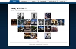
ChrisWB said:Hello everyone. I've been working on my father's website for some time and it's finally been released. My father is a consulting architect located in Chicago, IL. He's needed a website he can easily update himself so I designed this one to be flexible to his needs. The site is fairly apple-esque. I'd appreciate any feedback.
Bayley Architecture
I think It looks really nice. My only worry is just how apple-esque it is. You didn't steal any apple.com code, did you? 'Cause you might get a call from apple legal if you did...
")
oh maybe a dash of colour & texture.
I'm not trying to bust balls here, but the apple/OS X thing has been done to death, and to be quite frank, it was never that great of a theme anyways (in terms of use on the web). It's a very nice OS, but I think it's pretty weak to copy it as much as people do.
just fyi: One my personal favourite architecture sites: Philip Koether
I'm not saying you need to use flash, but notice how it's got some nice colours & textures?
Attachments
ChrisWB said:Stridey,
Nope. Apple legal won't be calling any time soon.
Dorno,
That's pretty cool. I like Mr. Koether's site, but to be frank I don't have the skill to do something like that.
Yeah I was just pointing it out to bring up the fact that a site can be colourful without taking away from the photos & content.
Well, here it is and I am not at all trying to be a bitch. When you work in a field that looks for your creativity just as much as it looks for your ability to be functional you're always being looked at for just that. If your site is a complete ripoff of a very established design, then what will your architecture look like? Sure, most of anything an average person can think about for a website has been done over and over, but there are still options to use similar functionality without looking like apple's site. I think you should be aware of how your father is being represented. His work is important, but I'll be honest, with 13 years of coursework under my belt in architectural design, i opted not to look at his work because i was very focused on the design being so similar to apple's. I hope that helps and makes sense.
I find the navigation on the photo galleries to be quite annoying (using Firefox). The way the scroll buttons disappear every time the mouse goes near them makes browsing the photos into a very annoying game. I also couldn't quite figure out whether I needed to click on the buttons to change photo or just mouseOver them - sometimes it seemed to need clicks but not at others.
The navigation div does look nice (and again, sort of Appley) but it you need to either improve on its behaviour or just make it constantly visible.
The navigation div does look nice (and again, sort of Appley) but it you need to either improve on its behaviour or just make it constantly visible.
1) as others have said.....the "Apple Look" is a distraction
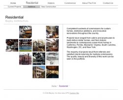
2) also, many of the photos are too dark and hard to see
3) it's strange that "multifamily housing" is grouped under "commercial" instead of "residential" which is how most architects would group apartments.
2) also, many of the photos are too dark and hard to see
3) it's strange that "multifamily housing" is grouped under "commercial" instead of "residential" which is how most architects would group apartments.
dornoforpyros said:Yeah I was just pointing it out to bring up the fact that a site can be colourful without taking away from the photos & content.
I'm going to disagree about the Philip Koether site....I thought the site design does indeed distract from the photos and the content.
The architect's work is more elegant than the web site's design which I found to be overly busy, and not especially attractive graphically......and the music! a most unfortunate choice I thought.....also, the brushed metal look of the home page is not a good choice given the nature of the architect's own work.
If the Bayley site is too simple, then the Koether site is a good expample of a site that's "too much"
L
Lau
Guest
Just to chip in - when I clicked on the link the top tab graphics didn't load straight away, so it just had the text without the tabs around them. I was thinking "What's Appley about this? This is nice and simple." and then the tabs loaded. So a quick solution might be to change (or even remove) the tab graphics. They looked fine as text in my opinion (see image below).
Attachments

It is not easy to design a static website that is simple and elegant. I think on that front you have done a really, really nice job. You should be very proud of this.
Macky-Mac said:I'm going to disagree about the Philip Koether site....I thought the site design does indeed distract from the photos and the content.
doh, than I guess I'll never be building a website for you cuz we have very different opinions on what works and what doesn't!
To each their own I suppose
Just out of interest, what did you do this in?
Because I really like the navigation in the images.
::20ROGERSC::
Because I really like the navigation in the images.
::20ROGERSC::
Register on MacRumors! This sidebar will go away, and you'll see fewer ads.