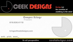
I have to go with the consensus here and say that the business card is too busy. Remember this is not a brochure, all you want on it is a logo w/ name, your full name (first, last), what you are or service you offer, contact info, website, and maybe a (short) tagline.
Some quick tips based on a fast observation:
- I would loose the the definition on the top right. You could put that on your website or other collateral.
- Do something else with the logo that it's in the main context area. Maybe make is larger, only showing a part of it....that is if it still read as the logo is intended - be sure it doesn't look like some random thing but just a cropped portion of the logo.
- Either have the phone number and email address align with the name or just have them indent a little with the name....and have "president" left aligned with the name (although someone mentioned they didn't like the word "president"). Nonetheless, I would left align it.
- I have mix feelings with the "web, print, more..." I think it's ok to put somewhere, but I don't know where it could go based on a different layout.
- For the "its all perspective", maybe put that with the logo as a tagline? Or move it to the left edge of where it's at currently.
Also be wary of things to close to the edge; they make get cut off if you print them at a printer. Always keep guides as "borders" as to how close elements can get to the edge.
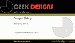
Just take give it some time, and play with it. Take these constructive criticisms as good advice not insults. Of course design and art in general is subjective and in the end it's the client opinion that matters....they're the one's that will give you $$$$ for this.....not us.
")
Good luck!