Become a MacRumors Supporter for $50/year with no ads, ability to filter front page stories, and private forums.

skadd

macrumors regular
Original poster
Mar 5, 2010
246
91
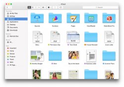
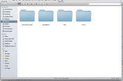
Hopefully they'll tweak the design of the folders.
It's not the shade of blue, but the saturation and brightness. Maybe make the gradient more subtle and remove the ridges at the bottom.
 

Attachments

  • 1401736934-apps_finder_icloud_2x.jpg
    1401736934-apps_finder_icloud_2x.jpg
    130.2 KB · Views: 726
  • Screen Shot 2014-06-03 at 22.45.56.png
    Screen Shot 2014-06-03 at 22.45.56.png
    154.3 KB · Views: 250

virginblue4

macrumors 68020
Apr 15, 2012
2,027
700
United Kingdom
Hopefully they'll tweak the design of the folders.
It's not the shade of blue, but the saturation and brightness. Maybe make the gradient more subtle and remove the ridges at the bottom.

I must say, I love the new folder design! Seems that I am one of the only ones! :p
 

mojolicious

macrumors 68000
Mar 18, 2014
1,565
311
Sarf London
I think I'm a bluephobe. For example, I'm pretty sure that the only blue clothing I've ever bought is jeans.

Folder icons have been far too blue for my liking ever since Mac OS 8, but this just takes it to a whole new level of offensive bluey blueness.
 

snorkelman

Cancelled
Oct 25, 2010
666
155
bit garish to view in main finder window but I find em particularly difficult in the finder path bar
 

sshhoott

macrumors 6502
Feb 6, 2010
304
0
I like the design of the icons. Like others have said, the color is good but it's over saturated and too bright. It sticks out a little too much compared to the rest of the UI. Some may even think the color makes it look childish.

Would be better if they can tone down the color to something like the bottom left of the Finder Icon or Messages app in Yosemite.
 

Attachments

  • Screen Shot 2014-06-03 at 3.57.01 PM.png
    Screen Shot 2014-06-03 at 3.57.01 PM.png
    19.4 KB · Views: 698
  • Screen Shot 2014-06-03 at 3.56.41 PM.png
    Screen Shot 2014-06-03 at 3.56.41 PM.png
    22.3 KB · Views: 681

3282868

macrumors 603
Jan 8, 2009
5,281
0
One of the first things I dislike about the GUI are the generic folder icons. They're too "Miami Vice" 80's blue. Thankfully you can change them in /System/Library/CoreServices/CoreTypes.bundle/Contents/Resources. Changing the "GenericFolder" icon makes a difference, but it seems sporadic with 10.10 for some reason. I have custom icons I use as OS X icons have grown worse since 10.6.
 

Attachments

  • Screen Shot 2014-06-06 at 7.39.51 PM.jpg
    Screen Shot 2014-06-06 at 7.39.51 PM.jpg
    41.8 KB · Views: 185

haravikk

macrumors 65832
May 1, 2005
1,501
21
I'd prefer they go back to the more graphite look of Mountain Lion etc., either that or let developers provide a second icon for their apps so the user can choose between a colourful, or more duotone, option.

Personally I really don't like all the colour, it's distracting; I'm one of those people that really liked the change to duotone in the Finder sidebar, and would like to see that in more places. Icons should be iconic, not colourful (unless they're an in-icon preview of something colourful).
 

GerritV

macrumors 68020
May 11, 2012
2,257
2,711
The folder icon is merely a rough first idea, made by of one of Apple designers' 10 year old kid.
The GM will have taken this idea to a professionally refined level.
The baby blue of course will be matured.
All of this will prove that passing onto a simple UI is so much more than flattening down just about anything.

Yeah, right :eek:

Yosemite will kill each and every software / hack to change the system icons.

Yeah, right :)
 

Mk.82

macrumors newbie
Jun 7, 2014
3
0
H
Hopefully they'll tweak the design of the folders.
It's not the shade of blue, but the saturation and brightness. Maybe make the gradient more subtle and remove the ridges at the bottom.

The new one reminds me from KDE 4.0-4.7 era Oxygen icons for folders.

yha2ysej.jpg


And the new one has nice colors

ane2ebu3.jpg
 

PsykX

macrumors 68030
Sep 16, 2006
2,714
3,883
Agreed. I don't really mind the color so much, but the shape and gradient simply don't cut it.
 

yeldarbnamdlog

macrumors member
Jun 3, 2014
52
0
I have to say, I like the entire appearance of 10.10, as it is now, in DP1...That includes the folder icons, and even the blue in the finder icon in the dock, exactly the way they are, now, in DP1.

Plus, according to the info on this page:
Code:
http://en.wikipedia.org/wiki/Aqua_(color)

Apple are now closer to 'Aqua' than they have ever been!

That being said, I don't have eyesight problems, and have no need for spectacles...Make of that what you will.

Finally, at least now, for the first time since the initial OS X Beta, the shade of blue Apple have used, is uniform and identical, across the board: The blue in the Mail app icon is the same as the blue in the Safari icon, which is the same as the blue in the App Store icon, which is the same as the blue in the Finder icon, which is the same blue as the Messages app icon, which is the same blue used in the icon for the folders, which is the same blue as used by MACRUMORS in their question mark post icon!!!

Now, if that, in and of itself, isn't a case for the current blue, then all those who dislike the new blue, may want to go the Windows route, and NOT UPGRADE, in the desperate hope that the next release - Presumably OS X 11.0, will be the saving grace, for those who dislike change!
 
Last edited:

GerritV

macrumors 68020
May 11, 2012
2,257
2,711
H

The new one reminds me from KDE 4.0-4.7 era Oxygen icons for folders.

Image

And the new one has nice colors

Image

Both of these are looking gorgeous IMHO, the Oxygen being my favorite.
If only Apple could come up with this kind of quality.
 
Register on MacRumors! This sidebar will go away, and you'll see fewer ads.