Got a tip for us?
Let us know
Become a MacRumors Supporter for $50/year with no ads, ability to filter front page stories, and private forums.
New iTunes
- Thread starter retrospek
- Start date
- Sort by reaction score
You are using an out of date browser. It may not display this or other websites correctly.
You should upgrade or use an alternative browser.
You should upgrade or use an alternative browser.
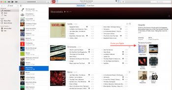
Is there now a option to disable the fu**ing "Biography" and "Similar Artist" Column in iTunes?
Screenshot is from OX 10.11 with iTunes 12.4 (!)
Screenshot is from OX 10.11 with iTunes 12.4 (!)
Attachments
Last edited:
God...they really, really need to change the font that they rendered "Browse" in. That thick, chunky bold text just looks so ugly and so out of place with everything else.
God...they really, really need to change the font that they rendered "Browse" in. That thick, chunky bold text just looks so ugly and so out of place with everything else.
It's probably a placeholder. They might not have decided on the final look for that design element.
It looks hideous on iOS 10 as well.
It's probably a placeholder. They might not have decided on the final look for that design element.
It looks hideous on iOS 10 as well.
It was consistently used throughout the Music demo, and also the new News App demo. I think it's here to stay... which sucks, because it sucks.
It feels like Apple's response was, people don't understand the tabs in Music. What can we do? Let's make the titles massive, then they'll know...

It's probably a placeholder. They might not have decided on the final look for that design element.
It looks hideous on iOS 10 as well.
I don't think it's a placeholder, unfortunately. They really think that it is good design.
I don't think it's a placeholder, unfortunately. They really think that it is good design.
I believe we have to thank the Beats people for that. The old Beats app had such big fonts too, from what I’ve seen. More proof that Apple Music isn’t truly Apple and now they’ve finally taken over the Music app completely.
The biggest problem I had with Apple Music was just that it was a bit too complicated and messy. I just wanted it streamlined and consistent. That, and improve the New section. The design itself was actually nice. Now we have this foreign design which clearly does not respect AppKit/UIKit and Human Interface Guidelines anymore and I bet that all of it is still based on WebViews too. They just don’t get it.
I'm still saying that about the UIs from iOS 7/macOS 10.10...I don't think it's a placeholder, unfortunately. They really think that it is good design.
I believe we have to thank the Beats people for that. The old Beats app had such big fonts too, from what I’ve seen. More proof that Apple Music isn’t truly Apple and now they’ve finally taken over the Music app completely.
The biggest problem I had with Apple Music was just that it was a bit too complicated and messy. I just wanted it streamlined and consistent. That, and improve the New section. The design itself was actually nice. Now we have this foreign design which clearly does not respect AppKit/UIKit and Human Interface Guidelines anymore and I bet that all of it is still based on WebViews too. They just don’t get it.
Yeah, it just doesn't look Apple-like in any way. It's looks like a completely foreign music service has been loaded into iTunes for some reason. The current, but soon to be old, design of Apple Music was nice looking at the very least. This is completely ugly. Apple should get rid of the Beats team pronto.
Yeah this is differently a new version. Current stable version is 12.4.1, the one in 10.12 is 12.5.0.48.
They have long forgot to apply the HIG to their own designs...I believe we have to thank the Beats people for that. The old Beats app had such big fonts too, from what I’ve seen. More proof that Apple Music isn’t truly Apple and now they’ve finally taken over the Music app completely.
The biggest problem I had with Apple Music was just that it was a bit too complicated and messy. I just wanted it streamlined and consistent. That, and improve the New section. The design itself was actually nice. Now we have this foreign design which clearly does not respect AppKit/UIKit and Human Interface Guidelines anymore and I bet that all of it is still based on WebViews too. They just don’t get it.
Nothing new, just another milestone in the demise of proper UX.
Glassed Silver:mac
I think both iTunes and the Music app have become really really garbage. There are bugs and too much nonsense packed into one app.
I wish the Mac App Store and the iOS App Store merged, especially with so many continuity/iCloud based apps.
I'm hoping 10.4.1 will still run under Sierra, as it does under El Cap. Haven't liked the direction iTunes is moving in some time.Yeah, it just doesn't look Apple-like in any way.
It was consistently used throughout the Music demo, and also the new News App demo. I think it's here to stay... which sucks, because it sucks.
It feels like Apple's response was, people don't understand the tabs in Music. What can we do? Let's make the titles massive, then they'll know...
That was exactly the impression I hot seeing it in ios. But se I got it on a 27" iMac, I don't mind it at all. The Mac version of Apple Music f let like it was wasting a lot of screen estate and looked like much of it was the iOS version on a big screen.
This time it looks like they have improved the Mac version insomuch as making use of the full width, and looks much better. The For You and Browse sections look fine now, with the design language of the scrollable columns. Looks much more in keeping with iTunes, and is a lot like the BBC iPlayer layout on Apple TV.
Unfortunately this time it looks like they are reverse engineering the big screen version into iOS - so all the big bold fonts look terrible on the iPhone, not least because space is at a premium. So even relatively short titles and artists are being cut short. Hopefully they'll lose th big type and bold fonts opinions, but on larger screens when it's just the headings, I think they get away with it.
I'm pretty confused too. It's like they went with ultra-thin fonts beginning with iOS 7 and had nowhere else to go short of making it invisible. Now, it's ultra thick fonts? Are they going to loop through a cycle of thicknesses or what?God...they really, really need to change the font that they rendered "Browse" in. That thick, chunky bold text just looks so ugly and so out of place with everything else.
Agreed, that thick font reminds me of this:God...they really, really need to change the font that they rendered "Browse" in. That thick, chunky bold text just looks so ugly and so out of place with everything else.
Agreed, that thick font reminds me of this:

That's it! That's what I've been thinking of; I had it on the tip of my tongue, but couldn't connect the dots.
You know, many people complain about Jony Ive, his supposed total control over Apple's UI's, and how he apparently makes everything look so ugly. But, I think that the new Apple Music/News apps just prove that he isn't much of an influence on UI design...at least not anymore. I think that he would have put a stop to that horrible design the first moment he saw it. That stark, barren white design with thick, chunky, Windows 98 text has no place in an OS where all of the rest of the text is super thin (and attractive looking, IMO).
This might be reading into it a bit too much but I think the rMB might have been the last of 'Ive-ian' design.That's it! That's what I've been thinking of; I had it on the tip of my tongue, but couldn't connect the dots.
You know, many people complain about Jony Ive, his supposed total control over Apple's UI's, and how he apparently makes everything look so ugly. But, I think that the new Apple Music/News apps just prove that he isn't much of an influence on UI design...at least not anymore. I think that he would have put a stop to that horrible design the first moment he saw it. That stark, barren white design with thick, chunky, Windows 98 text has no place in an OS where all of the rest of the text is super thin (and attractive looking, IMO).
The lack of new design on the iPhone 7, the god awful UI, and the inclusion of the OLED bar to me sounds like there has been a massive shift in the design philosophy of Apple and for me that can only mean that Ive is no longer the sole decision maker...
This might be reading into it a bit too much but I think the rMB might have been the last of 'Ive-ian' design.
The lack of new design on the iPhone 7, the god awful UI, and the inclusion of the OLED bar to me sounds like there has been a massive shift in the design philosophy of Apple and for me that can only mean that Ive is no longer the sole decision maker...
Well, he is still head honcho of Design and no one is higher than him, so he should have final say, right? So why isn't he doing anything? Even if he offers up no suggestions for improvement, he can still put his foot down and refuse to allow them to do it. I mean, I think the new redesigned lock screen is a vast improvement, so it's not like Apple's designers are incompetent.
As for the lack of design for the iPhone 7, it could be the result of time constraints (and the OLED iPhone not being ready in time), rather than a shift in design philosophy. We just can't know yet. And the OLED bar? Well it could be really cool and innovative. I'm willing to wait until Apple unveils something before I pass judgment.
Register on MacRumors! This sidebar will go away, and you'll see fewer ads.