Become a MacRumors Supporter for $50/year with no ads, ability to filter front page stories, and private forums.

hotwire132002

macrumors 65816
Original poster
Jan 24, 2004
1,209
1
Cadillac, MI
As many of you know, I run a small video production company (Freelancer Productions; freelancerproductions.com) here in Cadillac.

I'm considering designing a new logo, as my current one just seems too plain -- it's simply made up of stylized text.

I'm having a bit of a tough time coming up with a true logo of any sort.
While one other production company in town, Fahrenheit Pictures, brands their business around temperature ("Let's ignite your marketing message," "We use the hottest equipment," etc.), it's tough to use the same sort of concept to brand Freelancer Productions.

I was thinking about using a stylized sword as my logo, and use "sharp," "edgy," etc. in the branding. The concept came about from "FreeLANCER" -- as in sword. I think that may be too much of a stretch for people to catch on, though. I'd certainly love to hear some opinions on that one.

In any case, I'd love any input -- thanks in advance!
 

Attachments

  • Freelancer-Logo-1-Color.gif
    Freelancer-Logo-1-Color.gif
    10.3 KB · Views: 102
I agree, the lancer will go over most peoples heads, and even for those who did get it, it has a sort of D&D geek feel to it. No offense.

Id like to give you some more feedback/ideas on your logo but its been a long day at work and my brain is fried.
 
faustfire said:
I agree, the lancer will go over most peoples heads, and even for those who did get it, it has a sort of D&D geek feel to it. No offense.

Id like to give you some more feedback/ideas on your logo but its been a long day at work and my brain is fried.

None taken. :)

I'd love to hear any other feedback or ideas you have -- if you're a little less fried over the weekend, that is. ;)
 
Absolutely, Im a motion graphics designer and am thinking about going freelance. Im in the process of putting a website together, all I need to do is come up with a name and logo so we're kind of in the same boat.
 
The logo leaves me a bit flat at this point. Here's a couple ideas from my POV.

If you like using 2 different fonts make them very different, like a sans vs a serf. Two sans fonts very often don't work together. It's kind of like painting your house with two slightly different colors hue wise, it doesn't work. Or try playing within one type family for variety.

The font of the word Freelancer feels a bit retro and not something for company doing modern tech work, is that what you want? I would try a very simple but more modern face. Spend some time looking at different fonts.

I don't mind letterspacing once in a while, some people hate it. It is not working here. Letterspacing sets up a rhythm, the two words have different rhythms and are fighting each other. Try closing up Freelancer. Also if you use letterspacing make sure your pre spaced word is kerned well before tracking it out.

The P and S of productions are way too close to the outside edges of the bar. The bar in general feels a bit too tight around the word.

Maybe add a small video related icon to the logo instead of a sword. When I create icons I like to add a conceptual twist to them. When I say a twist it could be as subtle as the arrow made out of the negative space in the FedEx logo. Something more than just adding a graphic video reel if you know what I mean.

Coming up with good logos is hard work. Designing logos for yourself is even harder. ;) Hope that helps.


ATD said:
The logo leaves me a bit flat at this point. Here's a couple ideas from my POV.

If you like using 2 different fonts make them very different, like a sans vs a serf. Two sans fonts very often don't work together. It's kind of like painting your house with two slightly different colors hue wise, it doesn't work. Or try playing within one type family for variety.

The font of the word Freelancer feels a bit retro and not something for company doing modern tech work, is that what you want? I would try a very simple but more modern face. Spend some time looking at different fonts.

I don't mind letterspacing once in a while, some people hate it. It is not working here. Letterspacing sets up a rhythm, the two words have different rhythms and are fighting each other. Try closing up Freelancer. Also if you use letterspacing make sure your pre spaced word is kerned well before tracking it out.

The P and S of productions are way too close to the outside edges of the bar. The bar in general feels a bit too tight around the word.

Maybe add a small video related icon to the logo instead of a sword. When I create icons I like to add a conceptual twist to them. When I say a twist it could be as subtle as the arrow made out of the negative space in the FedEx logo. Something more than just adding a graphic video reel if you know what I mean.

Coming up with good logos is hard work. Designing logos for yourself is even harder. ;) Hope that helps.


Thanks very much for your advice! You gave some extremely helpful tips.

I'll work on some new concepts and post them here for critique. Thanks again! :)
 
Well, here's what I came up with this morning. I tried a simple new look for the stylized text. I'm still having trouble working on a graphical logo. I've been contemplating perhaps a stylized tape, clapboard, or camera, though I haven't made anything work just yet.

In any case, I'd like to hear any feedback on the new concept. Thanks in advance :).
 

Attachments

  • newlogoconcept.gif
    newlogoconcept.gif
    8.5 KB · Views: 68
It's coming along but it needs more contrast in a number of ways. Try these

Black type on a white background.

More contrast in the type weights, using the same font family try making Freelancer bolder.

Contrast the the sizes more, try making Productions smaller.

Letterspace Freelancer tighter and open up Productions.


When it looks better, then try more solutions, no need at this point to bring it down to one only. Play more, different type faces, different contrasts. When you have a handful try working in a icon. Again, work with a few symbols. Narrow it down after you explore. HTH


Thanks dogbone :) , my way of giving back.


ATD said:
It's coming along but it needs more contrast in a number of ways. Try these

Black type on a white background.

More contrast in the type weights, using the same font family try making Freelancer bolder.

Contrast the the sizes more, try making Productions smaller.

Letterspace Freelancer tighter and open up Productions.


When it looks better, then try more solutions, no need at this point to bring it down to one only. Play more, different type faces, different contrasts. When you have a handful try working in a icon. Again, work with a few symbols. Narrow it down after you explore. HTH


Thanks dogbone :) , my way of giving back.


Thanks again for the tips!

Here's the latest revision. I made "productions" smaller, "freelancer" bolder, and tried a first attempt at an icon. Again, I'd love to hear any suggestions on how to improve this version.
 

Attachments

  • flpr2.gif
    flpr2.gif
    12.9 KB · Views: 73
hotwire132002 said:
Thanks again for the tips!

Here's the latest revision. I made "productions" smaller, "freelancer" bolder, and tried a first attempt at an icon. Again, I'd love to hear any suggestions on how to improve this version.

Much better.

You gonna make it 2-color?

Maybe a different font.
 
i'm no good with this stuff honestly, but i'll throw my opinions out there...

i don't like the letter spacing in productions. i wonder if it would look more cohesive together.

i also wonder how it would look with the text working with the graphic rather than having them seperate. (for example have freelancer go diagonally up across the screen from bottom left corner to top right, with productions coming down the side or resting underneath). might not work, but worth a try.
 
PlaceofDis said:
i'm no good with this stuff honestly, but i'll throw my opinions out there...

i don't like the letter spacing in productions. i wonder if it would look more cohesive together.

i also wonder how it would look with the text working with the graphic rather than having them seperate. (for example have freelancer go diagonally up across the screen from bottom left corner to top right, with productions coming down the side or resting underneath). might not work, but worth a try.

I gave the integration concept a try, and it really didn't work for me.

I personally like the flexibility of having the "icon" and text set up separately (speaking of which, I think the icon might still need some work -- any suggestions on that one?). I like the flexibility -- for instance, it's nice ot be able to use the icon on the back of a DVD case and the text on the front.
 
hotwire132002 said:
I gave the integration concept a try, and it really didn't work for me.

I personally like the flexibility of having the "icon" and text set up separately (speaking of which, I think the icon might still need some work -- any suggestions on that one?). I like the flexibility -- for instance, it's nice ot be able to use the icon on the back of a DVD case and the text on the front.

thats cool. i totally understand what you mean by wanting to be flexible, firgured i would throw it out there.

i do like the icon/graphic as it is right now. it simple, and gets the point across well in my opinion.
 
iGary said:
Much better.

You gonna make it 2-color?

Maybe a different font.

I personally like the font, but I'm certainly open to suggestions if you think there's a better font I should be using.

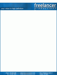
As to coloration -- Generally, my current logo is printed in white on a blue backdrop. The new logo would probably have the same usage. (A mockup of my letterhead with the new logo is below; this is the general coloration)

I tried tweaking the TV icon/logo a bit (see below) -- The lines around the "screen" are a bit thicker now. I like this more, though I'm still open to suggestions.

EDIT: The letterhead is a GIF; the grey in the thumbnail is transparency. That's supposed to be white; if you view it full size it looks OK.
 

Attachments

  • flp-letterhead.gif
    flp-letterhead.gif
    69.3 KB · Views: 97
  • flpr3.gif
    flpr3.gif
    12.8 KB · Views: 79
Now that's looking like a logo, good job. I'm a restless designer, 4 more points if I may, then I will give it a rest. :D You have more solid logo at this point so you can take or leave these last 4.

The line weight of your rule should match the stroke weight in the Productions type. Just like the paint example, match things or push the contrast.

An alt design with Freelancer a step bolder?

I like the TV icon. It's thick and thin weights + the irregular shape are a nice contrast to the even weight type. I would push it more. The thins thiner and thicks thicker. I would also try making the lines more irregular, much like the legs of the TV start thick and slope to a thiner line.

The logo in the letterhead feels too big.


ATD said:
Now that's looking like a logo, good job. I'm a restless designer, 4 more points if I may, then I will give it a rest. :D You have more solid logo at this point so you can take or leave these last 4.

The line weight of your rule should match the stroke weight in the Productions type. Just like the paint example, match things or push the contrast.

An alt design with Freelancer a step bolder?

I like the TV icon. It's thick and thin weights + the irregular shape are a nice contrast to the even weight type. I would push it more. The thins thiner and thicks thicker. I would also try making the lines more irregular, much like the legs of the TV start thick and slope to a thiner line.

The logo in the letterhead feels too big.


Here's the latest revision. I thinned the line just a bit, so it would better match the stroke of "productions." I made "freelancer" bolder -- I think that really adds to the logo. I contrasted the thickness of the lines on the TV a bit more -- I tried making them less regular, but it looked sloppy to me.

A new version of the letterhead is attached as well -- you're right, the logo was way too big at first.

Thanks for all your help with this -- you certainly know what you're doing!

I'd love to hear what you think of this latest revision, as well. I'm thinking that it's pretty much final... what are your thoughts?
 

Attachments

  • flp-letterhead.gif
    flp-letterhead.gif
    67.1 KB · Views: 91
  • flpr4.gif
    flpr4.gif
    12.6 KB · Views: 79
hotwire132002 said:
Here's the latest revision. I thinned the line just a bit, so it would better match the stroke of "productions." I made "freelancer" bolder -- I think that really adds to the logo. I contrasted the thickness of the lines on the TV a bit more -- I tried making them less regular, but it looked sloppy to me.

A new version of the letterhead is attached as well -- you're right, the logo was way too big at first.

Thanks for all your help with this -- you certainly know what you're doing!

I'd love to hear what you think of this latest revision, as well. I'm thinking that it's pretty much final... what are your thoughts?


Nice. Try even smaller on the letterhead.


hotwire132002 said:
How's this?


I think the bar itself feels too big/heavy and the logo/type are too close to the sides. I'll will have to come back later... deadlines.

 
hotwire132002 said:
I contrasted the thickness of the lines on the TV a bit more -- I tried making them less regular, but it looked sloppy to me.

I'll have to agree with ATD here, and suggest that you persevere with the irregularity, because the tv already has a funky 50's cartoon look.
 

Attachments

  • tv.gif
    tv.gif
    2.4 KB · Views: 64
dogbone said:
I'll have to agree with ATD here, and suggest that you persevere with the irregularity, because the tv already has a funky 50's cartoon look.

That certainly looks a lot better than my attempt at giving the lines an irregular width, but (no offense) I'm not as fond of that look as I am of my latest revision.
 
hotwire132002 said:
Here's the latest revision. I thinned the line just a bit, so it would better match the stroke of "productions." I made "freelancer" bolder -- I think that really adds to the logo. I contrasted the thickness of the lines on the TV a bit more -- I tried making them less regular, but it looked sloppy to me.

A new version of the letterhead is attached as well -- you're right, the logo was way too big at first.

Thanks for all your help with this -- you certainly know what you're doing!

I'd love to hear what you think of this latest revision, as well. I'm thinking that it's pretty much final... what are your thoughts?

Best yet.
 
Register on MacRumors! This sidebar will go away, and you'll see fewer ads.