I've finished the Design portion of my page, well mostley.
I would love some critiquing, want to make sure that it is as perfect as possible before we post it.
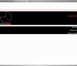
http://www.kidneysocal.org/cmsms
I still need to add some css stuff that I'm still working on how to do, such as making the top nav an unordered list so that I can create onovers and the 'you are here" effect.
This is also said about the nav on the left, I'm working on making also sub-UI's (cant figure out how to make the sub UI not effect the onover of its parent). and also a 'you are here effect'.
This site will be put into a content Management system.
I might add a news section below the left navigation.
Most Importantly I would really like to thank all of your guys here at MacRumors in the Web Development (should be the Web Development / Web Design) Forum. You have been very helpfull with the project, and myself as well as the entire staff at the National Kidney Foundation thank you very much
http://www.kidneysocal.org/cmsms
Cooper Krings
I would love some critiquing, want to make sure that it is as perfect as possible before we post it.
http://www.kidneysocal.org/cmsms
I still need to add some css stuff that I'm still working on how to do, such as making the top nav an unordered list so that I can create onovers and the 'you are here" effect.
This is also said about the nav on the left, I'm working on making also sub-UI's (cant figure out how to make the sub UI not effect the onover of its parent). and also a 'you are here effect'.
This site will be put into a content Management system.
I might add a news section below the left navigation.
Most Importantly I would really like to thank all of your guys here at MacRumors in the Web Development (should be the Web Development / Web Design) Forum. You have been very helpfull with the project, and myself as well as the entire staff at the National Kidney Foundation thank you very much
http://www.kidneysocal.org/cmsms
Cooper Krings