Got a tip for us?
Let us know
Become a MacRumors Supporter for $50/year with no ads, ability to filter front page stories, and private forums.
New look, what do you think???
- Thread starter janitorC7
- Start date
- Sort by reaction score
You are using an out of date browser. It may not display this or other websites correctly.
You should upgrade or use an alternative browser.
You should upgrade or use an alternative browser.
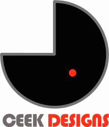
I am sorry but I do not like it because of the pacman thing going on there that does not say "design" to me. I also don't know if the name is "ceek designs" or "geek designs". I think the shape and the type are a bit weak and the fact that the pacman shape there is a bit too big and steals a lot from the type does not help. The outline around the shape should either be thinner or as thick as the type, otherwise the logo is still gonna lack unity. The orange circle inside the shape is very distracting and it looks as if it doesn't belong there.
Try to play with other colours and type to try to make it more professional and more current looking.
Sorry If I am a bit too harsh, but I am just trying to help. I am a designer and I am pretty used to criticize and being criticized.
Try to play with other colours and type to try to make it more professional and more current looking.
Sorry If I am a bit too harsh, but I am just trying to help. I am a designer and I am pretty used to criticize and being criticized.
I just wanted to eco the comment on the orange / red shape... it really does a lot of damage to the logo as it is now. Good luck!
i had 4 years of undergraduate design at a college, which pretty much taught me that you can make a decent living making something look good, and in the modern world that is easy. I knew after graduating, that i hadn't learned anything valuable, unsatified i used that portfolio to get me into one of the top 4 art colleges in the nation, where i learned that design is not about how things look, but what they say, and that really doesn't communicate well, for what ever it's worth. Think about what you want to say about youreself, and then start desigining.
i had 4 years of undergraduate design at a college, which pretty much taught me that you can make a decent living making something look good, and in the modern world that is easy. I knew after graduating, that i hadn't learned anything valuable, unsatified i used that portfolio to get me into one of the top 4 art colleges in the nation, where i learned that design is not about how things look, but what they say, and that really doesn't communicate well, for what ever it's worth. Think about what you want to say about youreself, and then start desigining.
 lol....calm down buddy. no need to show off.
I too went to an art school and probably learned the same stuff as you, but I just don't feel the need to talk about how good I am and other stuff.
And yes, the message is #1, but part of the job is to make that clear message attractive.
Can you make the dot the same red as the text? I'm a big fan of using the LEAST amount of colors possible.
I echo the comment against the grey border.
Otherwise, I actually like the logo - although I'm not sure whether it's "ceek" or "geek"...seriously...
I echo the comment against the grey border.
Otherwise, I actually like the logo - although I'm not sure whether it's "ceek" or "geek"...seriously...
Can you make the dot the same red as the text? I'm a big fan of using the LEAST amount of colors possible.
I echo the comment against the grey border.
Otherwise, I actually like the logo - although I'm not sure whether it's "ceek" or "geek"...seriously...
Thank you all for all you have told me.
To address a few things.
1. Its Ceek Designs, I'm kinda married to the name. Just kind of a childhood dream of mine to name a company ceek. Namily because C and K are my initials, as for the E's, I guess I just like that letter
2. As for the similarity to the similarity to the Pac-Man guy. While I did not intend on it to begin with, I kind of like the similarity, It sends a familure message.
3. The Red Dot. Is a Hal Message from 2001. While maby not the best memory of technology, I did kind of make a universal symbol of Technology and AI for that matter as a Red dot. Its the Same Color as the Hal Dot
4. THe color of the red dot and the color of designs is the same color as far as HEX is concerned. It just seems to look different because of the perspective that it is being viewed in.
5. I liked this logo because of the simplicity that it explains
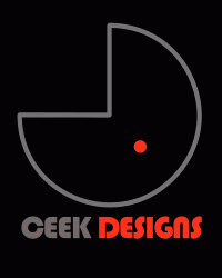
I uploaded in this message another version of the logo. Its the same logo, just on a black backround, which is where this version of the logo will be used. I have about 4 other different versions of the logo that will be used depending on where it is being used, i.e, Color Black and white, greyscale, Insignia VS Logo, and differnt colors regaurding its importance on the page, I look forward to any other opinions and I taken what you have said into consideration and find that most of your opinions are very helpful and will put some of them into any further changes to the logo
Thank you very much
Cooper
Attachments
I too went to an art school and probably learned the same stuff as you, but I just don't feel the need to talk about how good I am and other stuff.
And yes, the message is #1, but part of the job is to make that clear message attractive.
wasn't showing off, was just giving my experience to relay to him something that he may not have thought of. Because what i learned is the opposite, it's not to make it attractive, appearance is a byproduct. for example his deisgn looks good, except the type, but it doesn't say anything and thats why its bad. an maybe looking at how to approach it differently, or viewing desing differencly will provide a different result.
Thank you all for all you have told me.
To address a few things.
1. Its Ceek Designs, I'm kinda married to the name. Just kind of a childhood dream of mine to name a company ceek. Namily because C and K are my initials, as for the E's, I guess I just like that letter
2. As for the similarity to the similarity to the Pac-Man guy. While I did not intend on it to begin with, I kind of like the similarity, It sends a familure message.
3. The Red Dot. Is a Hal Message from 2001. While maby not the best memory of technology, I did kind of make a universal symbol of Technology and AI for that matter as a Red dot. Its the Same Color as the Hal Dot
4. THe color of the red dot and the color of designs is the same color as far as HEX is concerned. It just seems to look different because of the perspective that it is being viewed in.
5. I liked this logo because of the simplicity that it explains
I uploaded in this message another version of the logo. Its the same logo, just on a black backround, which is where this version of the logo will be used. I have about 4 other different versions of the logo that will be used depending on where it is being used, i.e, Color Black and white, greyscale, Insignia VS Logo, and differnt colors regaurding its importance on the page, I look forward to any other opinions and I taken what you have said into consideration and find that most of your opinions are very helpful and will put some of them into any further changes to the logo
Thank you very much
Cooper
With regard to number 5. What does it explain?
*gong*
please try again
every designer has to go through a lot of bad designs before they get good, learning "good design" is very much trail and error. This example being more of the later.
I'm not trying to be rude, I'm just saying that in 2 years you'll look back on this and cringe. But having said that, stick with it, this is a very rewarding career when you do manage to make a living at it.
2. As for the similarity to the similarity to the Pac-Man guy. While I did not intend on it to begin with, I kind of like the similarity, It sends a familure message.
It also sends a message that you, as a design firm, couldn't be bothered to come up with something original, which is something your clients will definitely want.
Your logo defines who you are.
Are you a design firm that seeks creative (read: unique, original) solutions to your client's problems, or do you eat pellets and get chased by ghosts?
wasn't showing off, was just giving my experience to relay to him something that he may not have thought of. Because what i learned is the opposite, it's not to make it attractive, appearance is a byproduct. for example his deisgn looks good, except the type, but it doesn't say anything and thats why its bad. an maybe looking at how to approach it differently, or viewing desing differencly will provide a different result.
I agree with you Mashinhead. It does not communicate anything at all. It doesnt say design or technology.
I too have a degree in design communications (graphic design). The first lesson you are taught is that your work must 'communicate' the clients needs/wants.
Heres my stuff: http://www.stuartluff.co.uk
Are you a design firm that seeks creative (read: unique, original) solutions to your client's problems, or do you eat pellets and get chased by ghosts?
I am sorry to interupt but that is the quote of the month on macrumors.com. Thanks for the laugh.
Humm, personally I don't find red and black to be customer appealing at all, especially in western culture, of course there are companies who use that same color scheme successfully.
I agree with the comments that the brand is too big compared to the type, definitely... and the red dot is kinda "floating", your eye kinda focuses on that point and it's not where you want people to focus their attention I suppose
And avoid using both RGB and HEX color to create logos, you'll be amazed to see the color distortion that can happen when you print it in CMYK or PANTONE, just a warning. Anyway, keep working on it, it'll only get better in time.
BTW, in which design App did you make this logo?
and Macboobs, went to see your website, you have some interesting work I liked your Branding sections, nice logos! I'm trying to put together my own portfolio, when I get it online I'll post the link too, eheh.
I agree with the comments that the brand is too big compared to the type, definitely... and the red dot is kinda "floating", your eye kinda focuses on that point and it's not where you want people to focus their attention I suppose
And avoid using both RGB and HEX color to create logos, you'll be amazed to see the color distortion that can happen when you print it in CMYK or PANTONE, just a warning
. Anyway, keep working on it, it'll only get better in time.BTW, in which design App did you make this logo?
and Macboobs, went to see your website, you have some interesting work
I liked your Branding sections, nice logos! I'm trying to put together my own portfolio, when I get it online I'll post the link too, eheh.
Register on MacRumors! This sidebar will go away, and you'll see fewer ads.