Got a tip for us?
Let us know
Become a MacRumors Supporter for $50/year with no ads, ability to filter front page stories, and private forums.
New Microsoft Logo. Do you like it?
- Thread starter HarryPot
- Start date
- Sort by reaction score
You are using an out of date browser. It may not display this or other websites correctly.
You should upgrade or use an alternative browser.
You should upgrade or use an alternative browser.
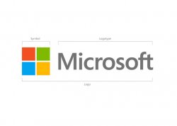
Im not convinced by it. In their official blog they said that the colored squares are meant to represent the company's diverse portfolio of products (Windows - Blue, Office - Red, xBox - Green, Yellow - Bing...?) but as it stands, with their choice of colors and the way the squares are aligned, it looks way too similar to the previous Windows logo. In that sense the current logo actually goes against the idea of showcasing the various products the company offers and instead reinforces a single product: Windows.
This is so common a logo it is bad. The company I worked for previously used this logo just different colour break. I know of at least a dozen companies that use this logo, just different colour variations, and have been in business a lot longer than MS. For such a large corporation to continue to copy is such a shame when the have almost unlimited resources.
You have to look at it as a "whole thing". As a Corporate Identity is quite OK:
https://www.youtube.com/watch?feature=player_embedded&v=OzkZWvAJUr0
https://www.youtube.com/watch?feature=player_embedded&v=OzkZWvAJUr0
It's not Apple so it sucks.
What an enlightening comment.

I like it how it's a new brand across all their products.
Methinks it's Landor being rather overpaid for kerning Segoe UI while mind a toddler with some building blocks.
It's not bad; it don't create any emotion but fit well into tiled metro design. It's consistent. I stay with 
It's better that the old one, I'm not inspired or anything by it though. I know you should always keep it simple, but that simple?
I agree with this. It's nice and simple and reflects the move to tile interface of 8 on WM7. I like it.fit well into tiled metro design. It's consistent.
It's just a logo. People who judge companies by their logos and not their products or services are, well... idiots. ::looks at previous posts::
The logo looks great, it's clean & simple. It also matches the Microsoft Metro look they're trying to achieve in Windows 8 so I think it's a job well done. Now lets see who tries to mimic it.
It's just a logo. People who judge companies by their logos and not their products or services are, well... idiots. ::looks at previous posts::
Same with looks ... hair ... clothes ... cars ... etc.
People judge on outward appearance when it's the only information available.
It's what people do. If that makes them idiots, then we are all idiots.
Come to think of it ... we pretty much are.
As for the logo, it fits the trend for simplicity. IMO, perhaps a bit too much so.
At least a little square should be cut off on the right side. And the leaf should be rectangle too (maybe with round corners
)
Register on MacRumors! This sidebar will go away, and you'll see fewer ads.