Got a tip for us?
Let us know
Become a MacRumors Supporter for $50/year with no ads, ability to filter front page stories, and private forums.
New Portfolio Design(draft). Tell me what u think.
- Thread starter bntz313
- Start date
- Sort by reaction score
You are using an out of date browser. It may not display this or other websites correctly.
You should upgrade or use an alternative browser.
You should upgrade or use an alternative browser.
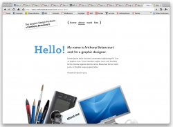
I'm working on a new portfolio design for a class that I have, I wanted to go very simple, but may have gone too simple. Portfolio
-The content is not all there, looking for more thoughts on the layout. Theres a couple mispelled words I have to fix also.
-Thanks
bntz
I like it.
I like it as a start. Simple is good these days. A lot of younger designers today seem to think that they have to toss every skill they have into every single piece. You state that this is a work in progress. What do you intend to use as a background color? The white page has a cold feel to it, warm it up a bit. Nice.
When I read the title of this thread, I was prepared to rail over the lost use of the English language. I was pleased to see coherent sentences")
Dale
When I read the title of this thread, I was prepared to rail over the lost use of the English language. I was pleased to see coherent sentences
Dale
I like it as a start. Simple is good these days. A lot of younger designers today seem to think that they have to toss every skill they have into every single piece. You state that this is a work in progress. What do you intend to use as a background color? The white page has a cold feel to it, warm it up a bit. Nice.
When I read the title of this thread, I was prepared to rail over the lost use of the English language. I was pleased to see coherent sentences
Dale
I haven't thought of an background color yet, but I see where your coming from with the coldness.
I'm going to be working on it more, and will certainly post updates.
I don't think theres a problem with going simple, but it does have a bit too much white space making it appear very empty. Perhaps putting a centered white box/column behind your content and then a light background would help? The 'work' could be made more natural to browse. Clicking on a thumbnail and waiting for the screen to dim and then the controls to appear takes longer than I'd like to wait. You've got a lot of space, why not enlarge the thumbnails more so the user can more accurately choose what they'd like to see enlarged? The images that come up are also the same size as the thumbnails, not sure if thats just a glitch on my end...
I don't think theres a problem with going simple, but it does have a bit too much white space making it appear very empty. Perhaps putting a centered white box/column behind your content and then a light background would help? The 'work' could be made more natural to browse. Clicking on a thumbnail and waiting for the screen to dim and then the controls to appear takes longer than I'd like to wait. You've got a lot of space, why not enlarge the thumbnails more so the user can more accurately choose what they'd like to see enlarged? The images that come up are also the same size as the thumbnails, not sure if thats just a glitch on my end...
What size monitor are you using? I have a 13" macbook, 20" cinema display, and my girlfriends 15" dell laptop. I was just wondering if your using that 30" beast then it would be a lot of space.
Please let me know. The size of PSD I used was 800 x 600
Alright you have a point there... it is partially to blame
Even your 20" (1680x1050 px) screen however there'd be a good amount of white space, approx half the horizontal screen width. Off the top of my head I think generally when I've seen websites that stay confined to a small box like yours does they center the content (automatically adjusts to the screen res) to make it look a little less awkward and perhaps box it in somehow. I'm by no means a graphic designer so take that with a grain of salt, was just sort of stating what first stood out to me.
Even your 20" (1680x1050 px) screen however there'd be a good amount of white space, approx half the horizontal screen width. Off the top of my head I think generally when I've seen websites that stay confined to a small box like yours does they center the content (automatically adjusts to the screen res) to make it look a little less awkward and perhaps box it in somehow. I'm by no means a graphic designer so take that with a grain of salt, was just sort of stating what first stood out to me.
Attachments

Alright you have a point there... it is partially to blame
Even your 20" (1680x1050 px) screen however there'd be a good amount of white space, approx half the horizontal screen width. Off the top of my head I think generally when I've seen websites that stay confined to a small box like yours does they center the content (automatically adjusts to the screen res) to make it look a little less awkward and perhaps box it in somehow. I'm by no means a graphic designer so take that with a grain of salt, was just sort of stating what first stood out to me.
UGH... i seriously don't get why people maximize their web browser window when they're on any resolution beyond 1280x768. you're not seeing more of the picture, your just creating a really awkward white space.
what about rearranging your photo elements to be a floating footer at the bottom? (see attached)
and i'd highly recommend not placing body copy text in an image. it's annoying to update, search engines can't read it, and its annoying to update
overall i'd say experiment abit more, be more playful with the whole collage look, here's some cool ones that are in a single page (very heavy on the illustration but you could do collage images... separating the different sections)
http://www.ormanclark.com/
http://www.volll.com/
so instead of going to a new page it just moves you further on down when you click on the links in the main nav. that can get abit tricky in the coding department though!
good luck, its a good start.
Attachments
UGH... i seriously don't get why people maximize their web browser window when they're on any resolution beyond 1280x768. you're not seeing more of the picture, your just creating a really awkward white space.
I respectfully disagree. Most websites require vertical scrolling so it makes sense to use the entire screen height, on a 24-30" screen there would be enough blank space for it to look awkward. I won't bother trying to justify my browsing habits but I think its worth mentioning that because the designer can't control this aspect it's best to create a scalable design that at least mitigates the effect somewhat. As a graphic designer you're trying to show that you have a keen eye for aesthetics - details like this that would typically be insignificant matter a lot more to your target audience. I agree with your other comments.
I respectfully disagree. Most websites require vertical scrolling so it makes sense to use the entire screen height, on a 24-30" screen there would be enough blank space for it to look awkward.
I'm all for vertically strecthing your browser as far as possible, but having a window over 1280 pixels wide is generally unneeded. Most websites these days are centered in the middle and are no wider than 1000 pixels. Like you said personal preference tho!
Register on MacRumors! This sidebar will go away, and you'll see fewer ads.