I skipped the betas and got the rc and wow the bottom safari is nice you can use it there but when you scroll down a page there so much wasted space and you lose a lot of the web site, at the top the whole bottom part of your phone is the web site and even know it’s moved the top to the bottom part I compared both and you loose out, I don’t wanna move it back as I like the swipe to change tabs
Got a tip for us?
Let us know
Become a MacRumors Supporter for $50/year with no ads, ability to filter front page stories, and private forums.
New safari on iOS is so much worse at the bottom
- Thread starter Kylo83
- Start date
- Sort by reaction score
You are using an out of date browser. It may not display this or other websites correctly.
You should upgrade or use an alternative browser.
You should upgrade or use an alternative browser.
Well, it can’t be that much worse then, since you prefer to keep it that way, with the ability to swipe between tabs?

I thought I was going to hate it but I updated to iOS 15 yesterday and I’ve been loving it. Bottom was definitely the move.
I think it's a lot more user friendly personally
It is depends on user isn't it?
I love tab bar where it disappear when you scroll up, so you have more content. Also means I don't have to reach up top to change URL or Google search.
But what I found is that I always accidentally swipe tabs, effectively accidentally switch tabs. I can't get over my muscle memory where I am constantly reaching up top.
In the end of the day, I switched back to old Safari style.
At this point they can’t put the toothpaste back into the tube, they won’t make everyone happy no matter what.
Need to give it a decent amount of time, to get past muscle memory.It is depends on user isn't it?
I love tab bar where it disappear when you scroll up, so you have more content. Also means I don't have to reach up top to change URL or Google search.
But what I found is that I always accidentally swipe tabs, effectively accidentally switch tabs. I can't get over my muscle memory where I am constantly reaching up top.
In the end of the day, I switched back to old Safari style.
Still, Apple giving options is nice.
So I got used to it but one major problem
Is I alway swipe down a site near the bottom and it keeps activating multi tab look when you swipe up on the address bar; I find when my natural placement is to swipe up on a site it launches that so annoying
Is I alway swipe down a site near the bottom and it keeps activating multi tab look when you swipe up on the address bar; I find when my natural placement is to swipe up on a site it launches that so annoying
Also another major problem is in all tab mode you should be able to close a tab by swiping up like in multitasking, swiping to the left is hard when the tabs start at the top of the page not the bottom with the pro max you have to reach higher and swipe left; they should start at the bottom and let you swipe up to close them
The new UI on the tab page is absolutely terrible.What happened to easy to open new page ? Who had this crazy idea of adding “+” button on the left ?!
Yep it’s completely janky for me as well.My issue is with all the animation. You close a tab and so much janky animation takes place. It used to be so smooth lol.
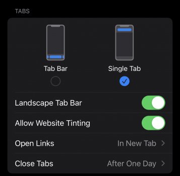
It’s easier than that, if you want to…..Easy to turn off into single tab mode.
Yea. I miss the B5 version. It felt better.I love it. I wished they kept the floating bar as well
Well mate, that's why theres an option to disable it. Seems like you're not liking either option though, maybe it's time to change OSes?I skipped the betas and got the rc and wow the bottom safari is nice you can use it there but when you scroll down a page there so much wasted space and you lose a lot of the web site, at the top the whole bottom part of your phone is the web site and even know it’s moved the top to the bottom part I compared both and you loose out, I don’t wanna move it back as I like the swipe to change tabs
Press and hold the tab, then swipe on the left. If you were on the last one, it open a new tab.What happened to easy to open new page ? Who had this crazy idea of adding “+” button on the left ?!
You only have to swipe on the last one. No need to press and hold. 🙂Press and hold the tab, then swipe on the left. If you were on the last one, it open a new tab.
Register on MacRumors! This sidebar will go away, and you'll see fewer ads.