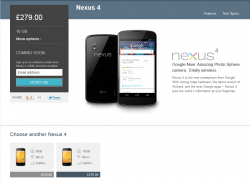
Everything we knew it would be, plus release date and pricing:
• Chipset: Qualcomm Snapdragon S4 Pro processor with 1.5GHz Quad-Core Krait CPUs
• Operating System: Android 4.2, Jelly Bean
• Network: 3G (WCDMA), HSPA+
• Display: 4.7-inch WXGA True HD IPS Plus (1280 x 768 pixels)
• Memory: 8GB / 16GB
• RAM: 2GB
• Camera: 8.0MP rear / 1.3MP HD front
• Battery: 2,100mAh Li-Polymer (embedded) / Talk time: 15.3 hours / Standby: 390 hours
• Size: 133.9 x 68.7 x 9.1mm
• Weight: 139g
• Other: Wireless charging, NFC
• Available November 13th
• $299 (8GB) / $349 (16GB) unlocked. Or $199 through 2-year contract with Tmo.
The Verge's hands on and visit to the Google building really showcase the hardware and software of the device. Some great new features to 4.2: http://www.youtube.com/watch?feature=player_embedded&v=66-4uMQqerA
New features:
Photo Steer Panaroma mode, futuristic camera UI, widgets in the lock screen, Quick Settings pull down, Swipe-like gesture base typing in the default keyboard...
----------

I'd like to add:
15.3 hours talk time / 330 standby time _vs_ 8 hours talk time / 225 standby
It might also be worth pointing out that on the iPhone side, the price should really start at $649. -_-
-----------

Front of the Nexus 4 is beautiful. The back... love or hate. I can see both sides of the argument. I started out liking it, then hating it, now I'm liking it again because 1) it's an homage to the first Nexus live wallpaper, and 2) all the hands-on videos show that the back design is very subtle (phew).
The iPhone 5 still looks weird to me. Like it's more a chocolate bar than a phone. The back I think is love or hate too like the Nexus 4. I will say though that the diamond cut band around the iPhone 5 is absolutely gorgeous, especially the white one. The chrome around the Nexus 4 is unfortunate.
------------
Engadget's hands on: http://www.engadget.com/2012/10/29/google-nexus-4-hands-on/
• Chipset: Qualcomm Snapdragon S4 Pro processor with 1.5GHz Quad-Core Krait CPUs
• Operating System: Android 4.2, Jelly Bean
• Network: 3G (WCDMA), HSPA+
• Display: 4.7-inch WXGA True HD IPS Plus (1280 x 768 pixels)
• Memory: 8GB / 16GB
• RAM: 2GB
• Camera: 8.0MP rear / 1.3MP HD front
• Battery: 2,100mAh Li-Polymer (embedded) / Talk time: 15.3 hours / Standby: 390 hours
• Size: 133.9 x 68.7 x 9.1mm
• Weight: 139g
• Other: Wireless charging, NFC
• Available November 13th
• $299 (8GB) / $349 (16GB) unlocked. Or $199 through 2-year contract with Tmo.
The Verge's hands on and visit to the Google building really showcase the hardware and software of the device. Some great new features to 4.2: http://www.youtube.com/watch?feature=player_embedded&v=66-4uMQqerA
New features:
Photo Steer Panaroma mode, futuristic camera UI, widgets in the lock screen, Quick Settings pull down, Swipe-like gesture base typing in the default keyboard...
----------

I'd like to add:
15.3 hours talk time / 330 standby time _vs_ 8 hours talk time / 225 standby
It might also be worth pointing out that on the iPhone side, the price should really start at $649. -_-
-----------

Front of the Nexus 4 is beautiful. The back... love or hate. I can see both sides of the argument. I started out liking it, then hating it, now I'm liking it again because 1) it's an homage to the first Nexus live wallpaper, and 2) all the hands-on videos show that the back design is very subtle (phew).
The iPhone 5 still looks weird to me. Like it's more a chocolate bar than a phone. The back I think is love or hate too like the Nexus 4. I will say though that the diamond cut band around the iPhone 5 is absolutely gorgeous, especially the white one. The chrome around the Nexus 4 is unfortunate.
------------
Engadget's hands on: http://www.engadget.com/2012/10/29/google-nexus-4-hands-on/
Last edited:


