Got a tip for us?
Let us know
Become a MacRumors Supporter for $50/year with no ads, ability to filter front page stories, and private forums.
Non-Retina Displays
- Thread starter brerlappin
- Start date
- Sort by reaction score
You are using an out of date browser. It may not display this or other websites correctly.
You should upgrade or use an alternative browser.
You should upgrade or use an alternative browser.
With the latest preview, do non-retina displays look better than before? Thanks!
I see no improvements on this.
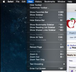
I noticed immediately that the bookmarks bar in Safari is easier to read in Beta 2. I also think there have been subtle changes to text elsewhere, but this was the change that stood out most for me.
I've also noticed a significant improvement in animation smoothness with my integrated GPU (mainly Mission Control), and I'm no longer getting an alarming graphics glitch when the dedicated GPU kicks in.
Lots of little improvements. I like this new beta a lot, and it's making me more excited about the GM/final release!
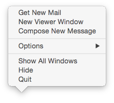
I want to know when they are going to clean up the jagged edges on all popovers throughout the OS.
I don't know if this looks like way on Retina displays or not.
That box on the dashboard is a little bit jagged on Retina as well but not nearly as much as yours. It's only visible if i look really close. Other boxes seems fine.
Yes, I agree that in PB 2 the text overall looks 'crisper' overall, and I like that they made the active tab in Safari stand out more.
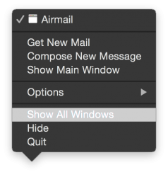
indeed, dark mode menu font does suck less overall. Over dark texture it is pretty smooth. It tends to suffer when the dropdown is over something light though e.g. this site. The white text gets visibly "stickier", I guess. This problem was also present in pb1.
Generally things look great on my 2011 iMac.
Generally things look great on my 2011 iMac.
Attachments
I don't know that this has anything to do with Non-retina display, however I have noticed that when scrolling a webpage, the text looks ever so slightly blurred or pixelated rather than crips. When you stop scrolling it is crisp again.
And no it is not my eyes! This does not occur when running SL on the same computer.
And no it is not my eyes! This does not occur when running SL on the same computer.
It's more of a general property of LCD displays. My Air's display blurs fast-scrolling text, and always has.I don't know that this has anything to do with Non-retina display, however I have noticed that when scrolling a webpage, the text looks ever so slightly blurred or pixelated rather than crips. When you stop scrolling it is crisp again.
And no it is not my eyes! This does not occur when running SL on the same computer.
It's more of a general property of LCD displays. My Air's display blurs fast-scrolling text, and always has.
Both my Imac and Macbook running Snow Leopard don't have blurred/pixelated text when scrolling. It is more pixelated than blurred and it is nothing to do with my eyes. I also did not notice it in Yosemite PB1 (but can't be certain). However it certainly is there in PB2 on both Imac & macbook.
I can live with it... but I thought maybe it had something to do with being a non-retina display - but I really have no idea.
Register on MacRumors! This sidebar will go away, and you'll see fewer ads.


